

Scroll
Văn Phú "Muôn Vị Nhân Sinh" Brand Campaign
Beyond property, a brand platform built around human living.
Overview
Resonating with the heart of the city
Following significant achievements in Hanoi, Hai Phong, Thanh Hoa, and other major localities, Van Phu is proud to herald a new chapter in its development journey with its official entry into Ho Chi Minh City. This dynamic and modern urban center demands a rigorous approach to quality, substance, and sustainable thinking—values that are central to their vision.
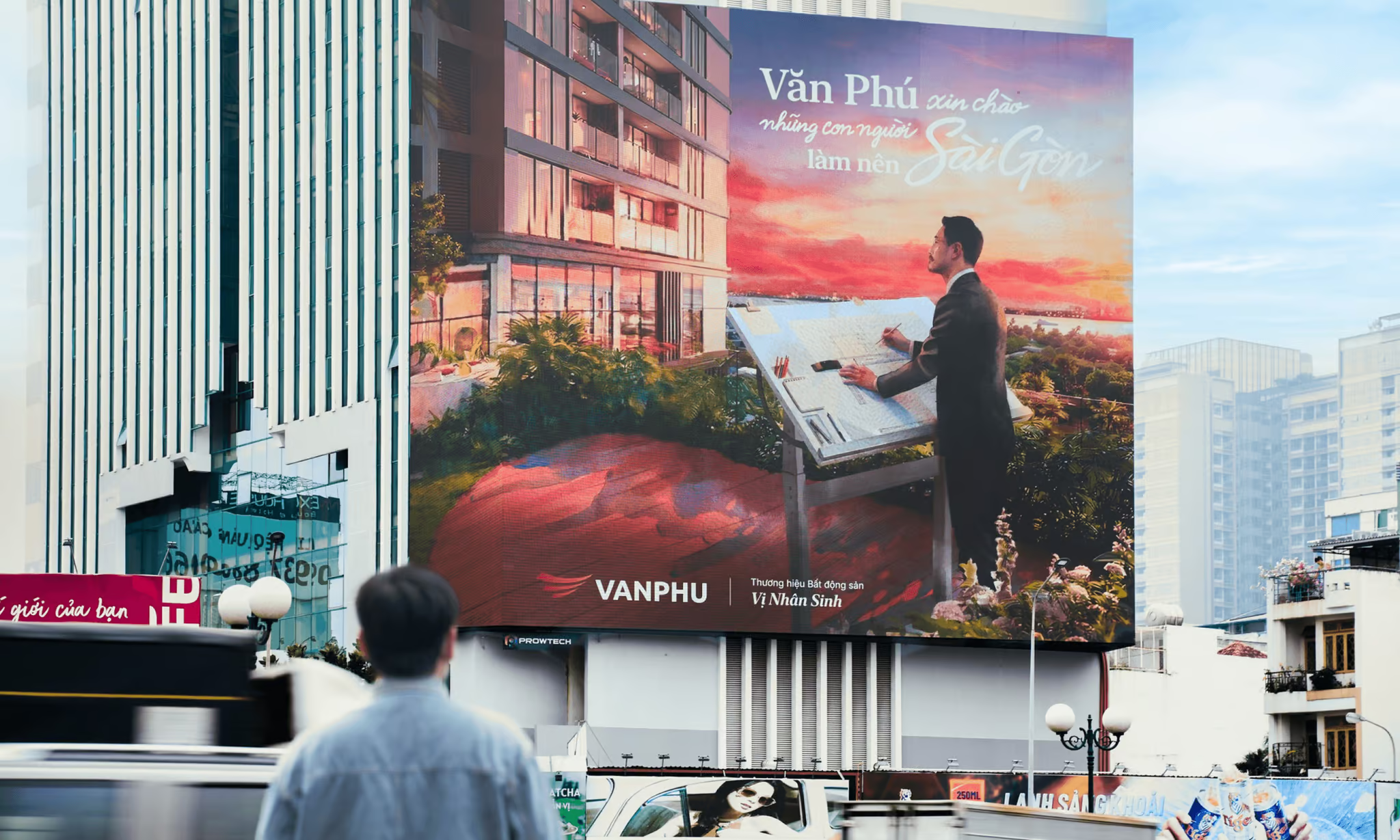
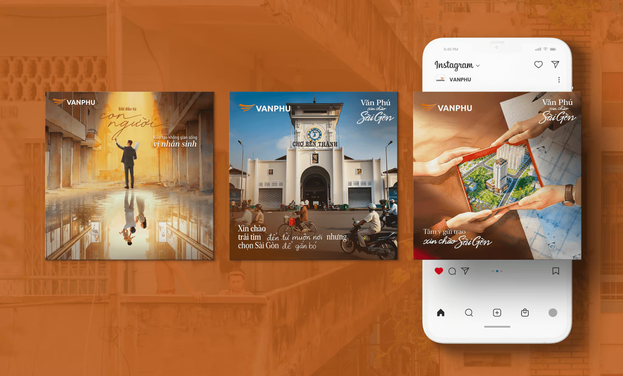
Embracing the concept of 'Life's Myriad Flavors' (Muôn Vị Nhân Sinh), Van Phu seeks to resonate with Saigon through the art of deep listening—tuning into stories ranging from the daily pursuit of livelihood and humble dreams to the nurturing of future homes. An integrated multi-platform campaign (spanning OOH, Social Media, Music Video, and Exhibitions) has been orchestrated with a singular focus: to forge authentic emotional connections with the people of this city.
The narrative arc artfully guides the audience from curiosity to profound empathy, culminating in the unveiling of Vlasta with a gentle yet resonant message: 'Vlasta. Where all efforts lead home.' Yet, before this journey unfolds, the campaign will commence with an impactful and memorable salutation: 'Van Phu sends its greetings to Saigon.
CREATIVE CONCEPT
Through every frame of life
Saigon is a realm where every individual harbors a unique ambition, a personal story, and a distinct sentiment: the desire to live authentically, unconfined by convention.
Van Phu honors this pursuit of individuality by creating 'frames' through which people can capture the very essence of what makes life worth living. Within this space, every moment of joy, tranquility, or daily endeavor is woven into a complete and vibrant tapestry of life
Key Visual Stucture
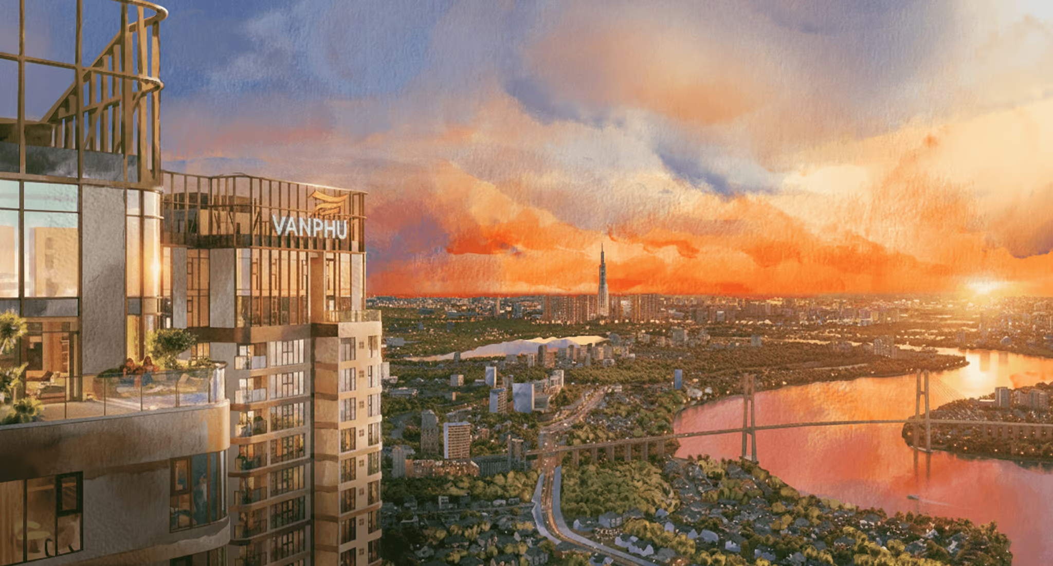
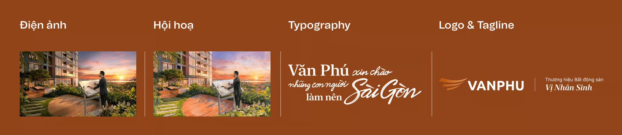
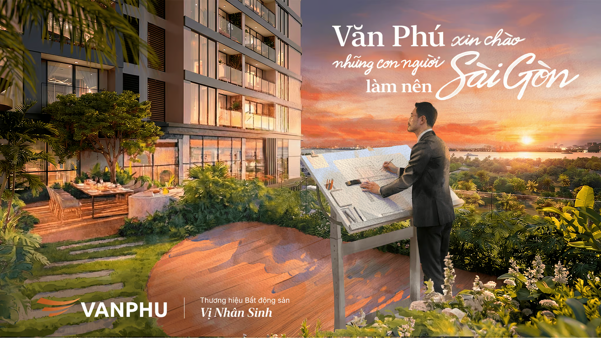
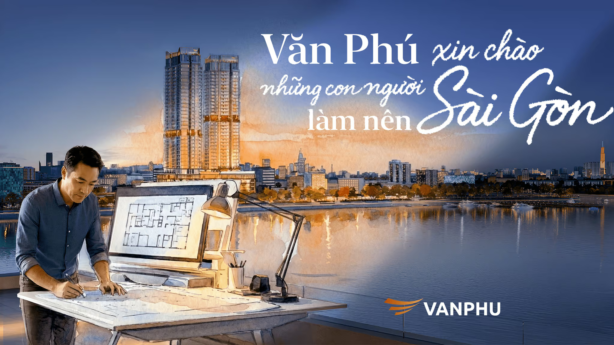
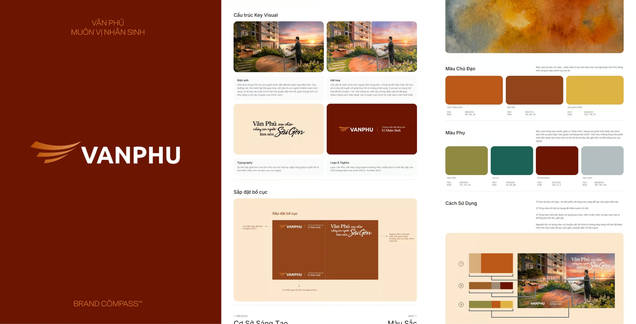
The imagery of architecture and humanity is guided by a cinematic language. Within this frame, structural lines and geometric forms intersect with the human element through the medium of light, forming a sophisticated, harmonious whole capable of self-expression and narrating its own story.
With the human experience as the focal point, fine art emerges as the ideal bridge between reality and aspiration. We employ art to weave narratives, to 'paint' the future, and to shape the horizons to come.
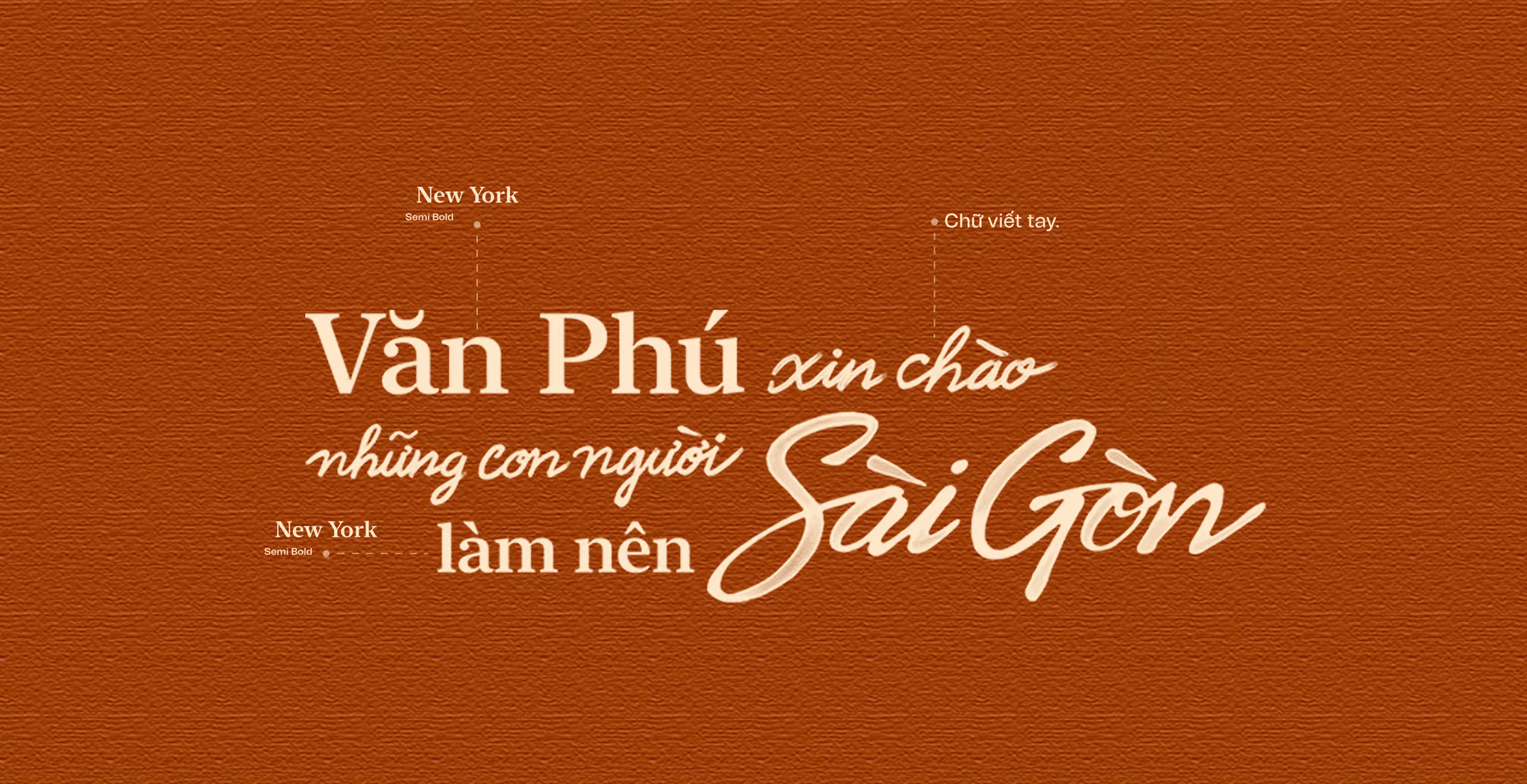
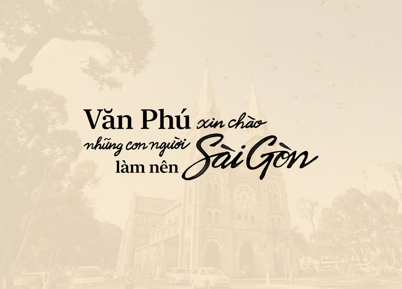
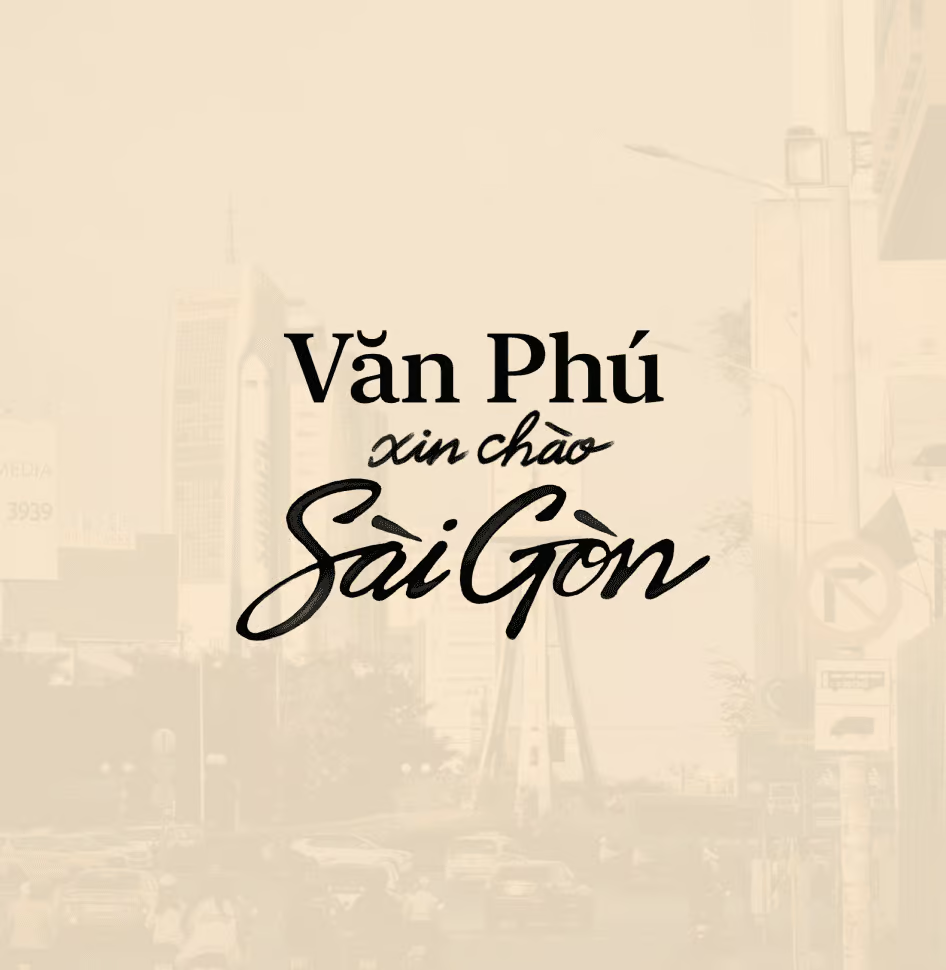
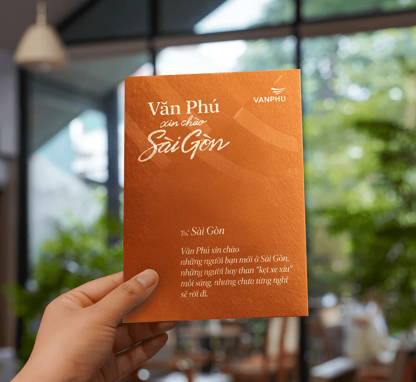
The visual identity merges Van Phu’s corporate typography with the human element, expressed through spontaneously created handwriting—imbued with a profound sense of humanity."
Color Palette
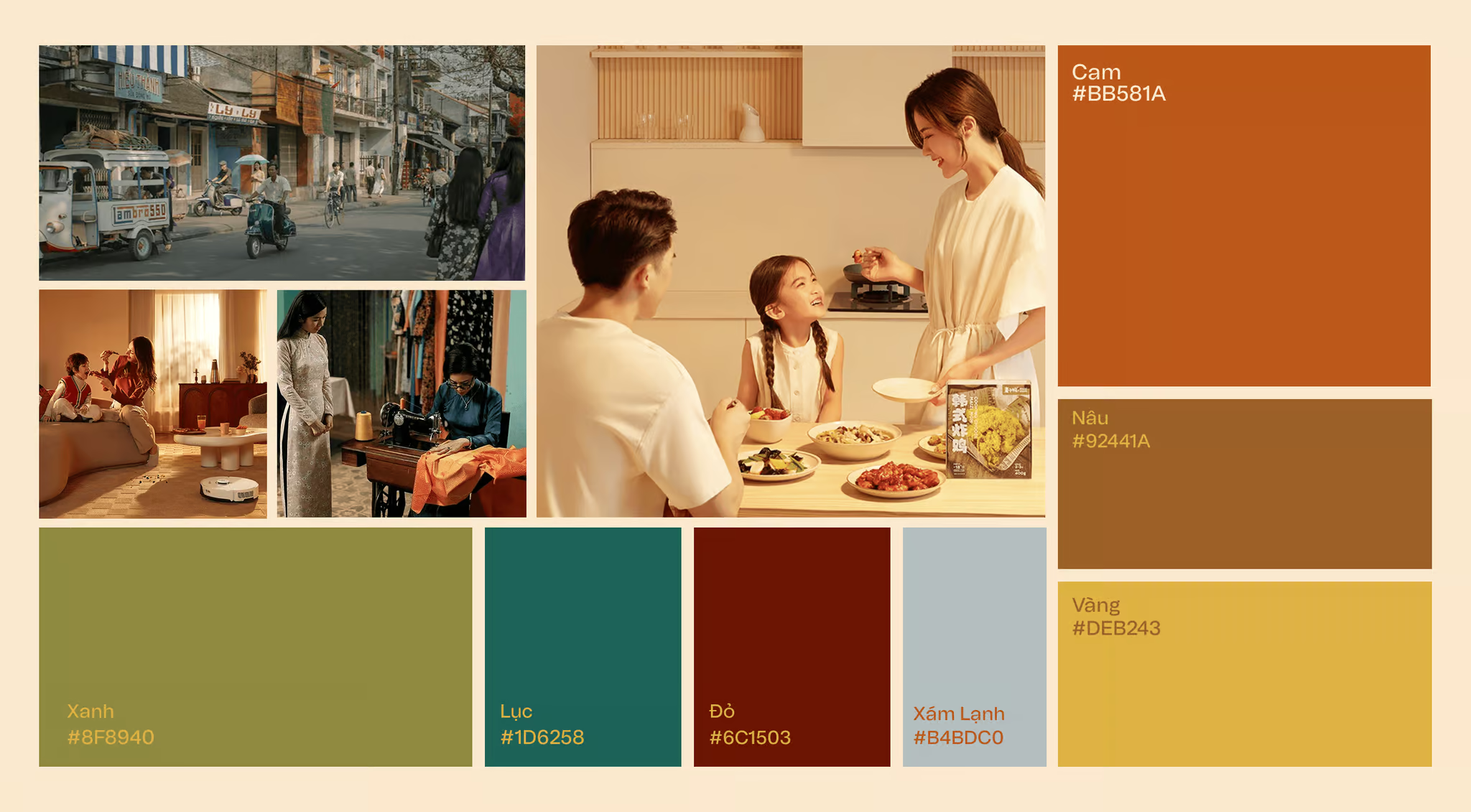
Orange takes the lead as the dominant color, evolving from Van Phu Group’s brand identity to become the defining tone of this project.
Accompanying this is a supporting palette featuring Brown and Yellow. This combination brings a sense of warmth, vividly embodying the 'flavor of life' while maintaining a delicate balance to create a space of elegance.
Alongside the main color—which is deeply imbued with the spirit of life—the secondary colors are chosen to blend perfectly with the primary theme. Ultimately, these additional tones are grounded in a fundamental truth: they are the colors of everyday existence
Artistic Principles
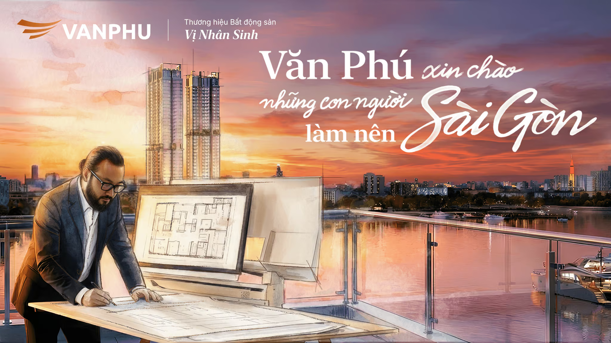
While the Real Estate element is not the protagonist, it remains a mandatory component, indispensably present in every creative asset. The color blending—a fusion of fine art and cinematic styles—is neatly applied within the lighting zones. This is defined as 'active lighting,' a required feature in all visuals to establish a signature brand impression.
In addition to the Real Estate element, the core essence of Saigon must also be highlighted—specifically landmarks contextually linked to the properties, such as the Saigon River.
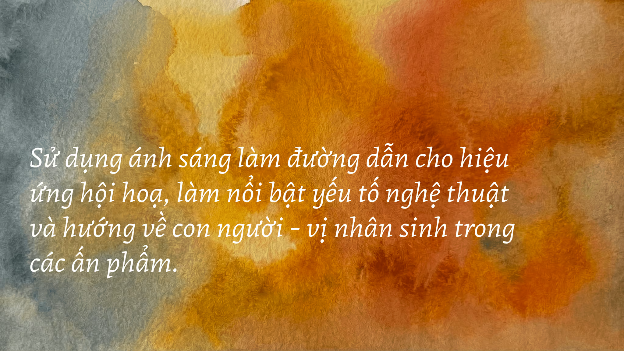
The intensity and tonal value of the watercolor effect depend on the lighting quality of the original image. However, the absolute prerequisite is that the human subject must always be positioned within this specially treated zone
Brand Application
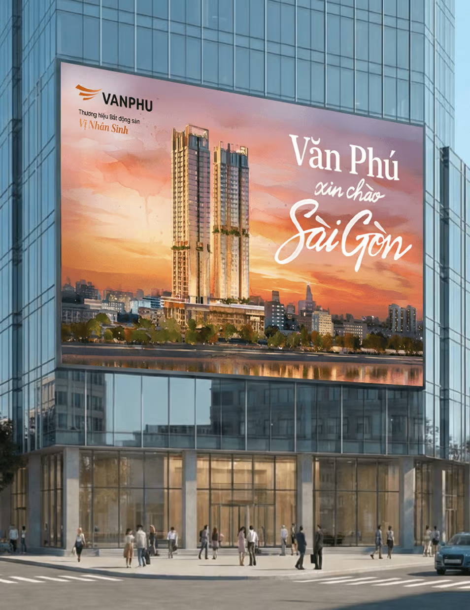
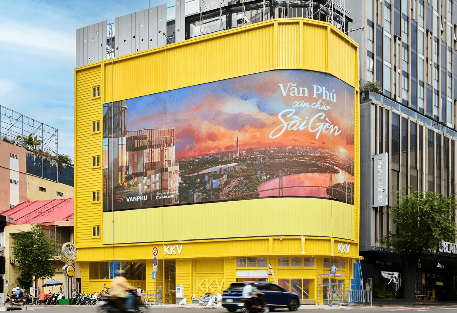
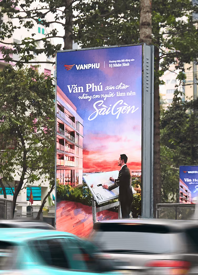
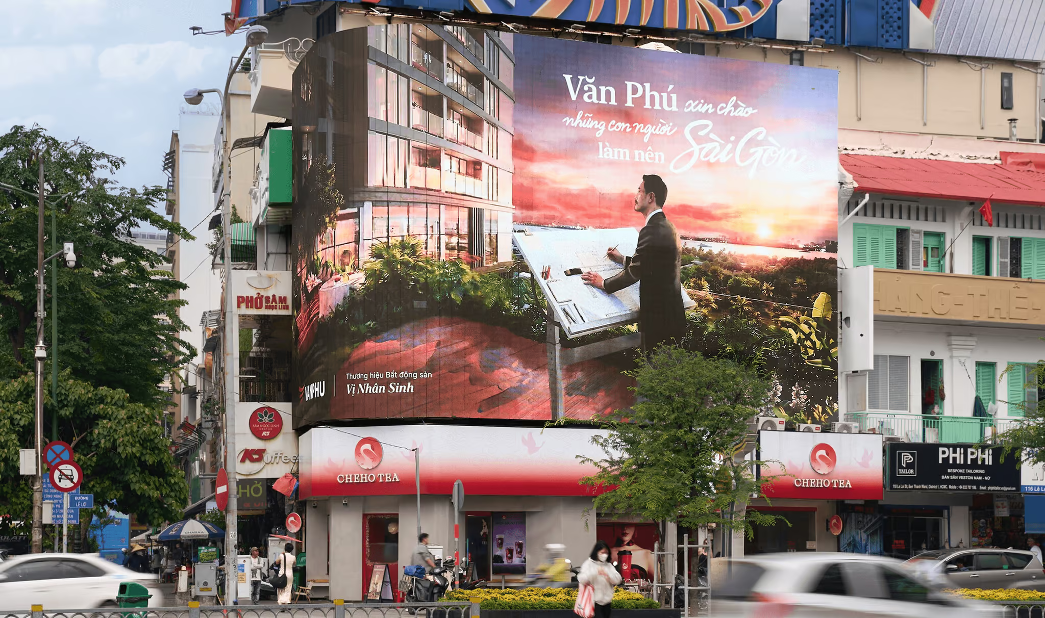
Adapting the Key Visual for OOH and social media requires a strategic balance between scale and intimacy. On large-format OOH, the 'active lighting' and cinematic depth are amplified to arrest the viewer's gaze, seamlessly integrating the real estate backdrop with iconic Saigon landmarks.
Conversely, social media assets prioritize the human expression within the watercolor frame to drive immediate emotional engagement. Across all touchpoints, this consistent artistic language ensures that Van Phu’s message remains distinct, cohesive, and deeply resonant
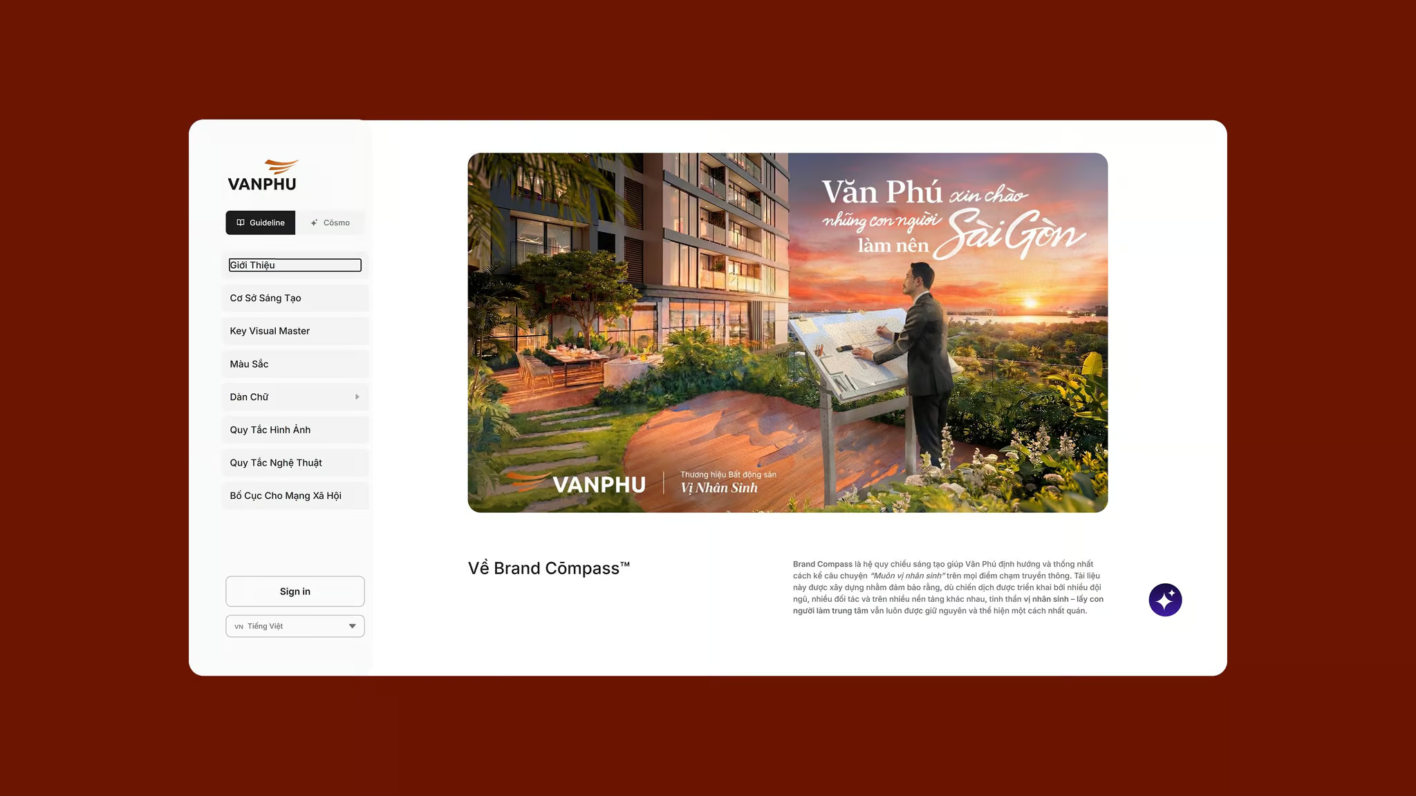
Brand Cōmpass™
Centralizing the brand platform through the Brand Cōmpass™
"Muôn Vị Nhân Sinh" transformed a market entry into a long-term brand platform. CDA helped Văn Phú establish that human-centered perspective on home and living through stategy, creative concept, and visual identity, all through our proprietary brand management system Brand Cōmpass™
Our Brand Cōmpass™ centralized assets, guidelines, and storytelling principles in one accessible system - enabling the internal team to execute consistently across future projects without losing the platform's original intent.
BRAND DESIGN AGENCY
Cōllective Design Agency
PRODUCER
Thai-Yves Bui
CREATIVE DIRECTOR
An Bui
Sonny Vu
PARTNERSHIPS
Daisy Nguyen
BRAND STRATEGIST
Minh Do
ILLUSTRATOR
Duy Torao
3D MOTIONS DESIGNER
3D ANIMATOR
MV PRODUCTION
Antiantiart
MAC Media
Double U Agency
PROJECT CURATOR
Vu Nguyen
Nam-Bao Tran
SPECIAL THANKS TO
VAN PHU BRAND TEAM
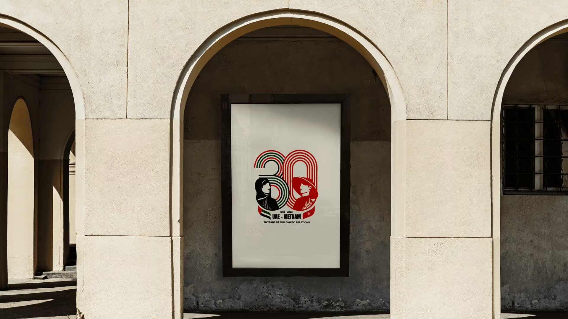
30Y Anniversary Vietnam - United Arab Emirates Logo
We designed the official mark for Vietnam and the United Arab Emirates 30-year diplomatic anniversary. The work gave the celebration in Abu Dhabi a shared visual language rooted in both cultures.
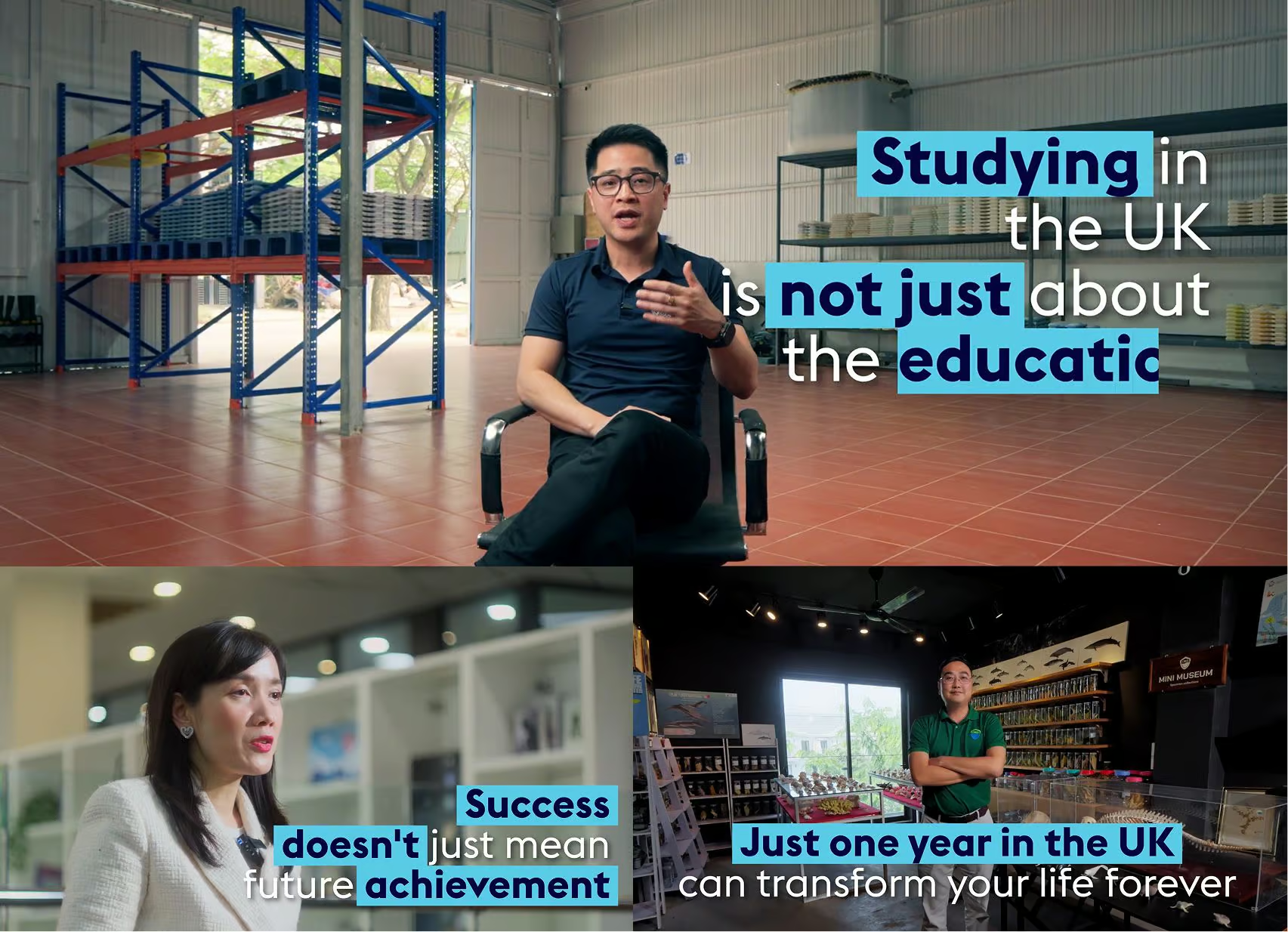
GREAT Study UK Alumni Documentary Interview
Turning alumni achievements into credible, human stories for the British Embassy Hanoi’s Study UK campaign.