

Scroll
Mơ Ly
Crafted from the finest apricots of Mộc Châu’s highlands in the North of Vietnam, this liqueur is sweet and youthful—awakening emotions and spreading joy in every gathering.
Overview
Plum Wine for Emotions to Blossom
Mơ Ly is a peachy plum wine with a light, sweet flavor that’s easy to enjoy, perfect for friendly gatherings and moments of connection. The project aims to build a brand image that feels youthful, joyful, and approachable spreading emotions and creating lasting memories with every sip.
OPPORTUNITY
Sparking Moments, Spreading Emotions
Mơ Ly had the chance to carve out a space where drinking wasn’t about routine, but about resonance where a sip could spark warmth, laughter, and connection. For an audience craving both lighthearted joy and genuine feeling, that duality wasn’t a challenge it was the opportunity. Mơ Ly could become more than a drink: a catalyst for shared emotions, moments, and memories.
LOGO DESIGN
Typography with a Flavor
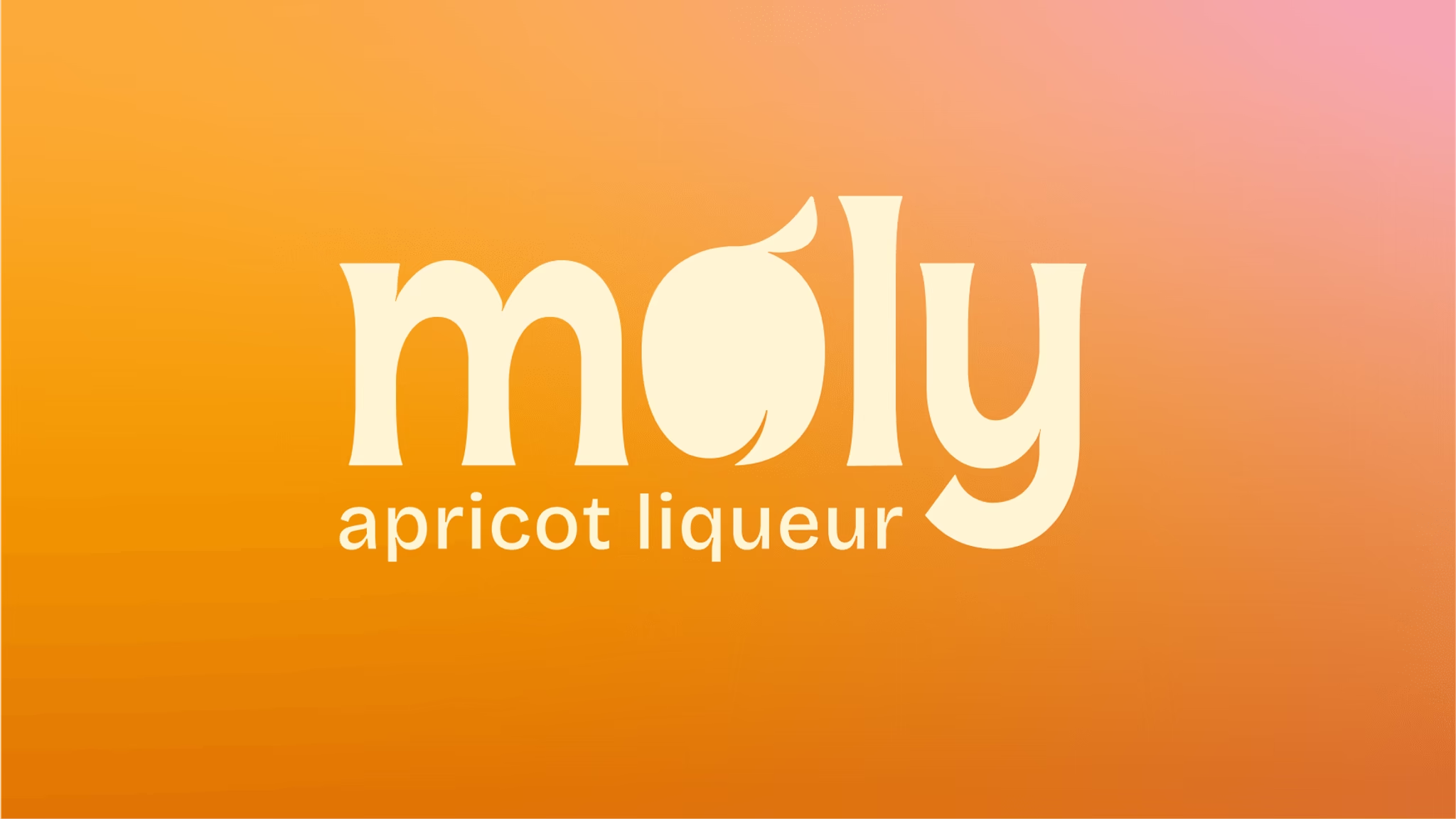
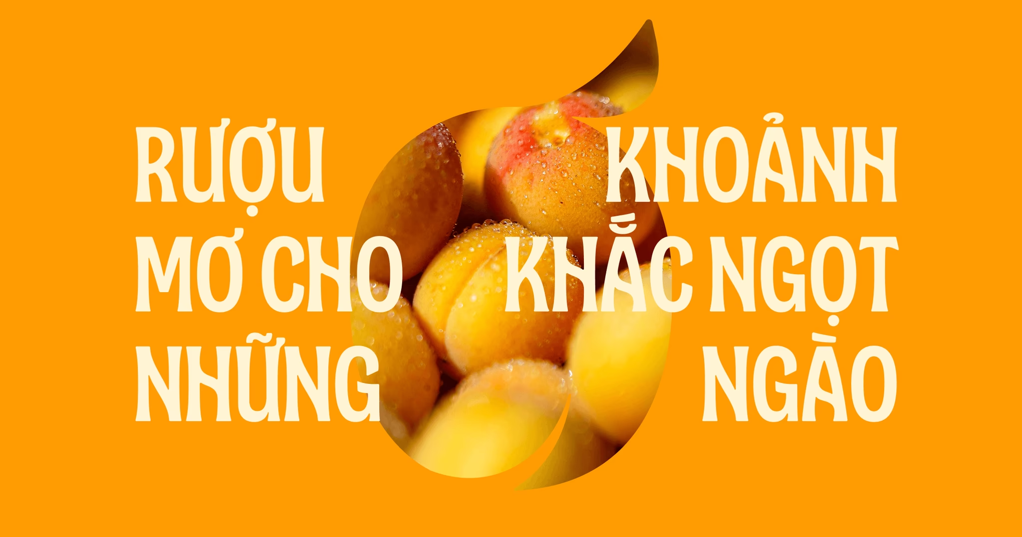
The Mơ Ly logo turns typography into storytelling. By transforming the letter “ơ” into a soft, rounded apricot shape, the mark instantly connects the brand name with its essence. It’s playful without losing elegance, a visual cue that feels both familiar and fresh. More than a letter, it becomes a symbol of flavor, warmth, and the emotions Mơ Ly is meant to spark.
TYPOGRAPHY
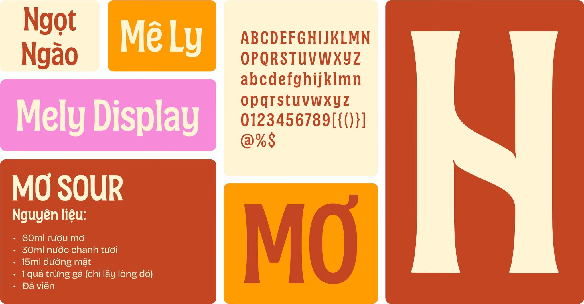
Mê Ly – Rooted in ancient apricot trees
The Mê Ly typeface draws inspiration from the ancient apricot trees of Mộc Châu, where strong roots and organic curves tell stories of time and tradition. Its rounded strokes and natural flow reflect both resilience and softness, embodying a harmony of heritage and modernity just like Mơ Ly, a brand that turns deep roots into delightful new expressions.

COLOR SYSTEM
Colors of flavor and nature
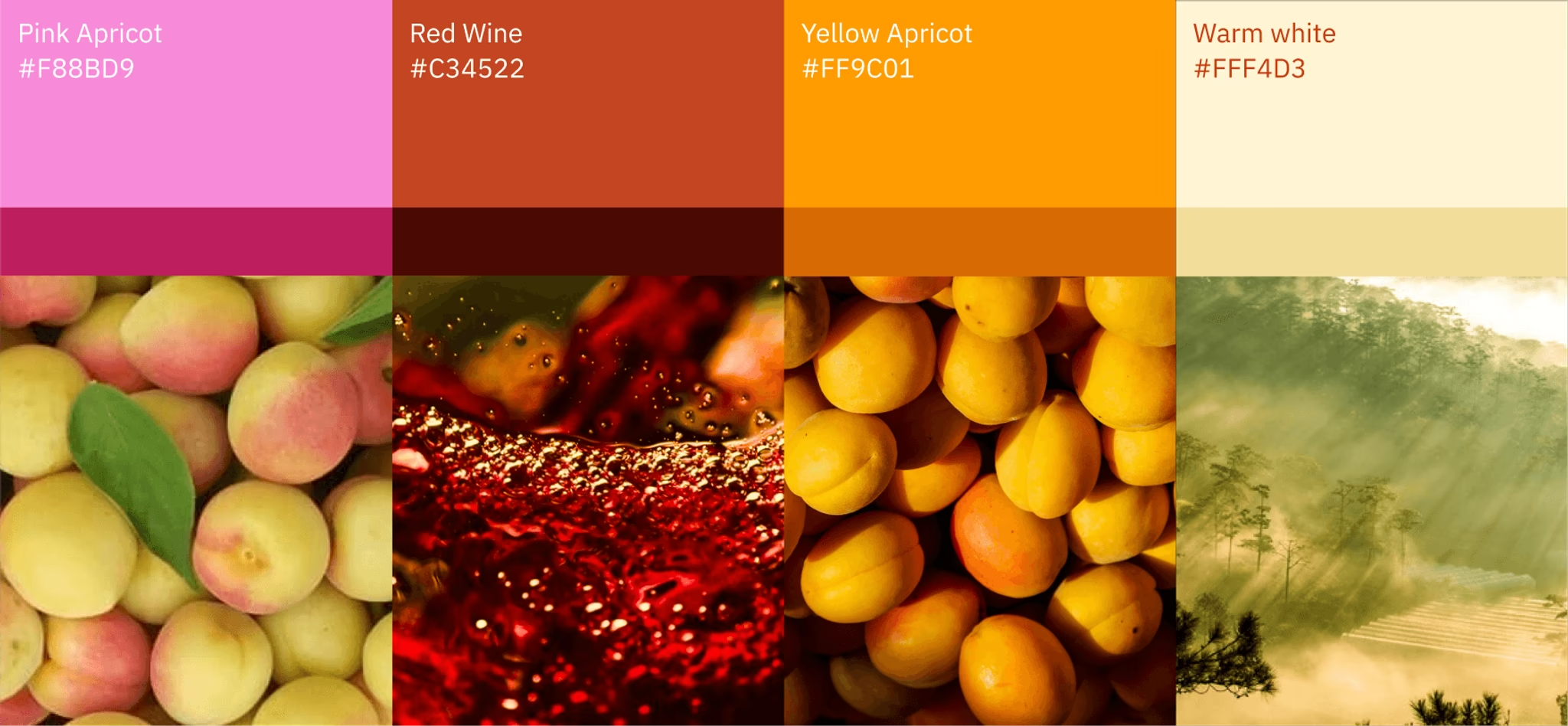
The color palette of Mơ Ly draws directly from the essence of the apricot and its landscape. Pink Apricot brings a playful, youthful touch; Red Wine adds depth and richness; Yellow Apricot radiates warmth and vitality; while Warm White evokes the gentle mist of Mộc Châu mornings. Together, they capture both the vibrancy of fruit and the serenity of nature, embodying Mơ Ly’s balance of joy and authenticity.
VISUAL MOTIF
Taste of time – depths of feeling
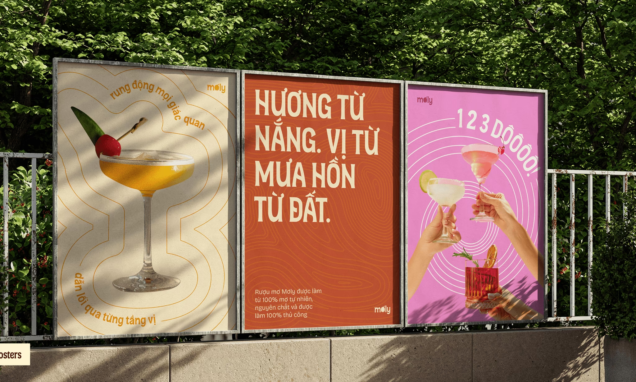
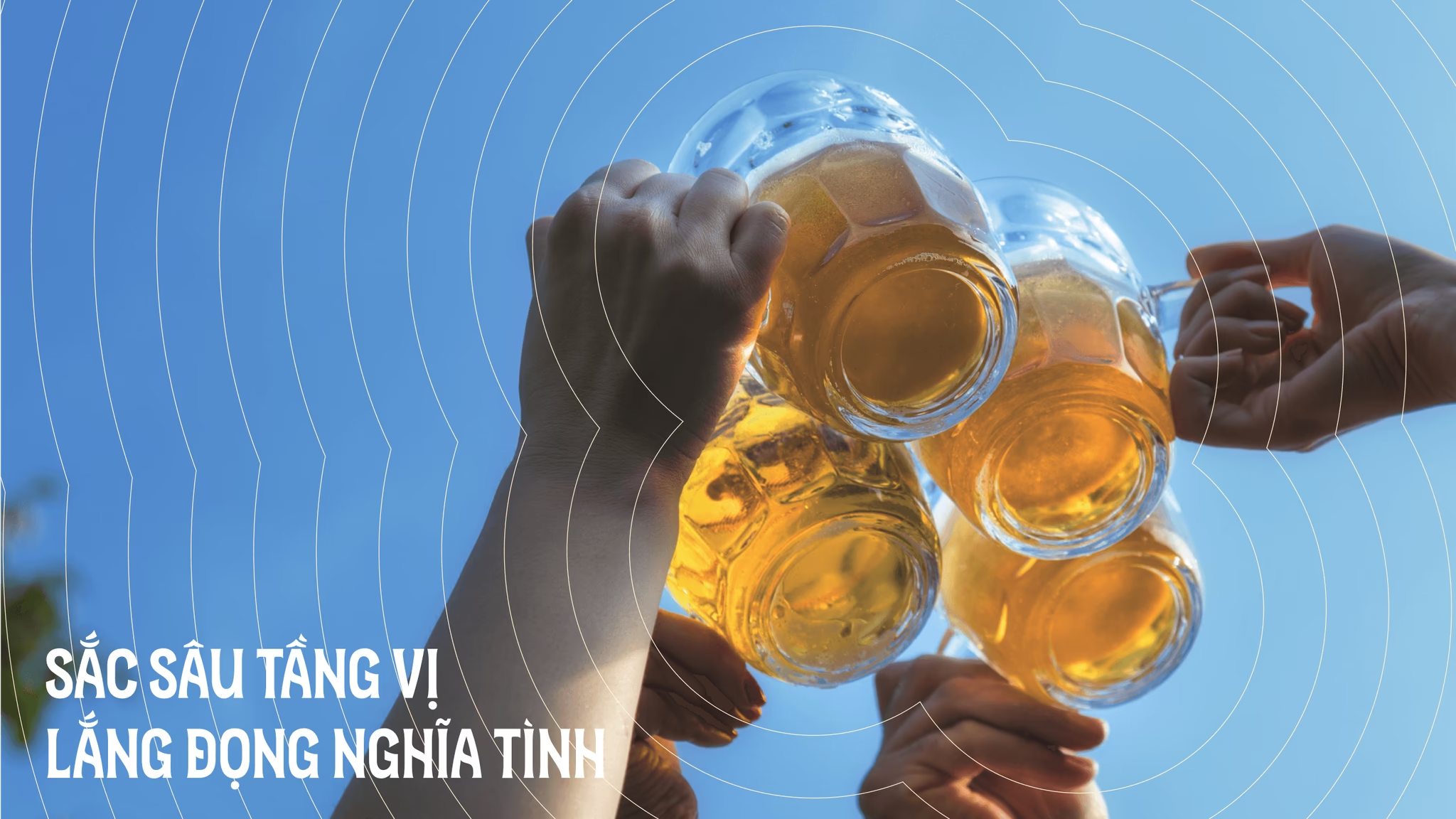
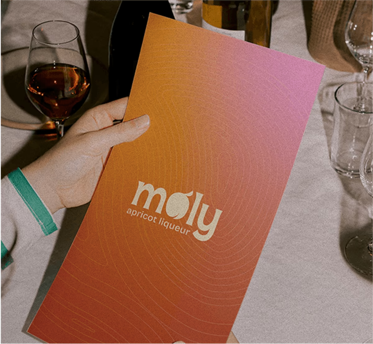
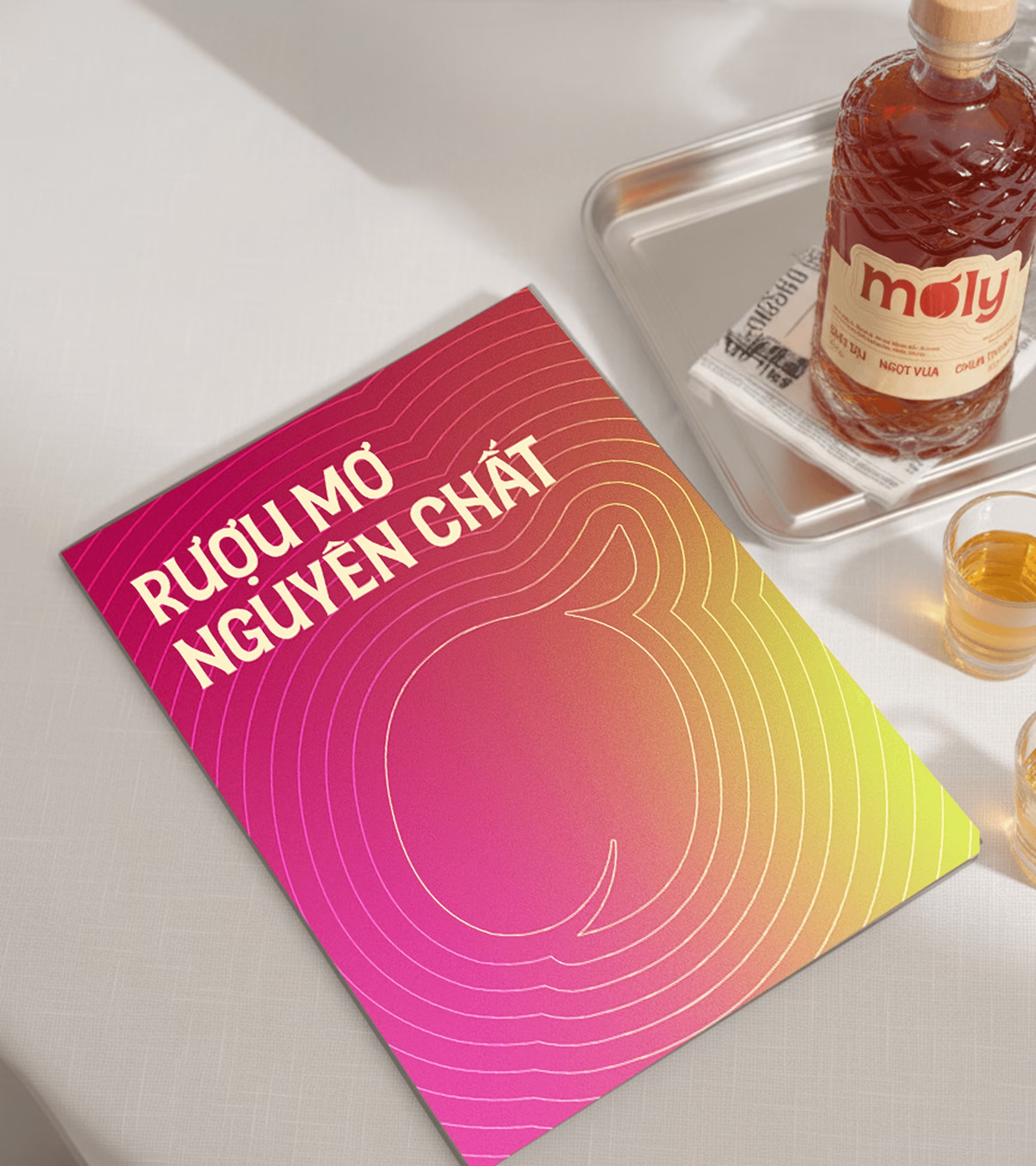
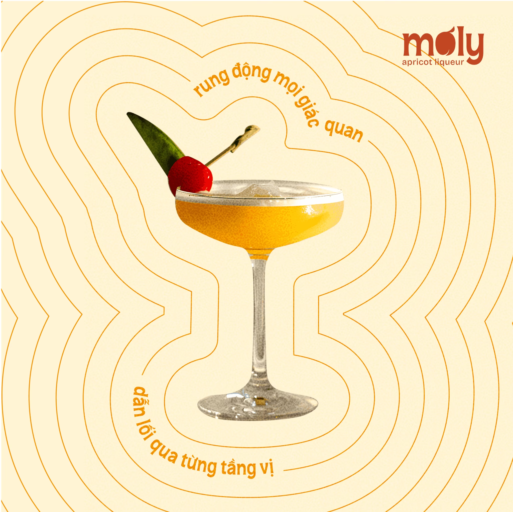
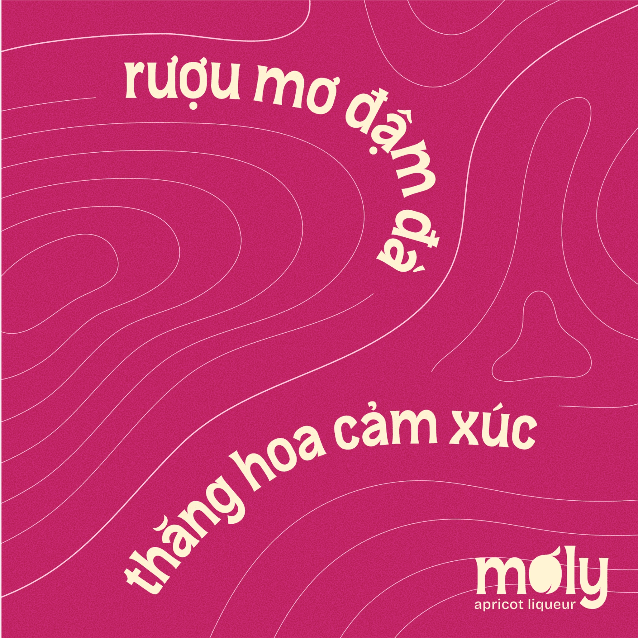
Drawing on hand-drawn lines that echo the layered grains of ancient apricot tree trunks, the design conveys a sense of strength, tradition, and connection. Inspired by concentric circles from topographic maps, it evokes the feeling of expansion while recalling the highland terrain of Mộc Châu the very place where Mơly is nurtured and crafted.

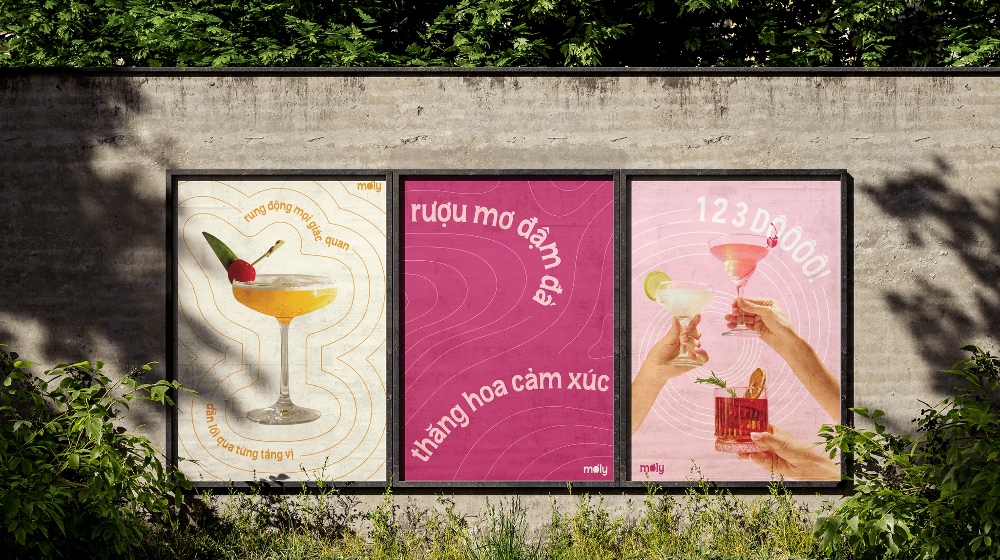
ILLUSTRATION SYSTEM
Joy, relaxation, and connection
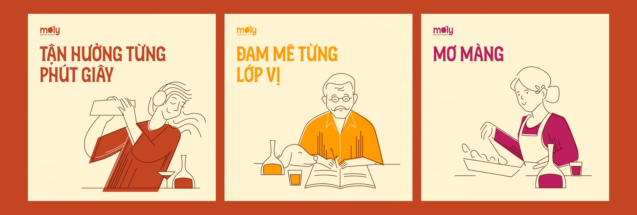
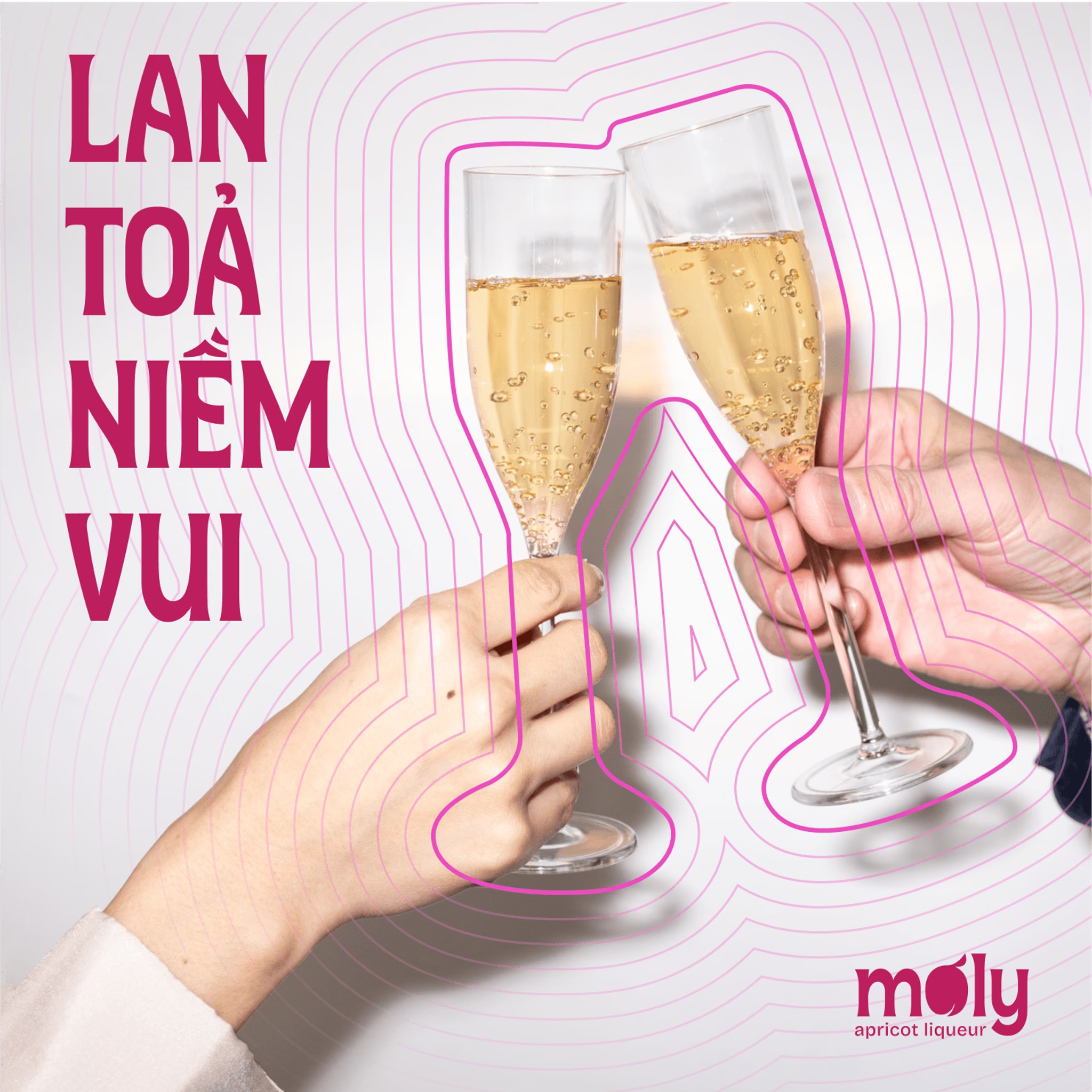
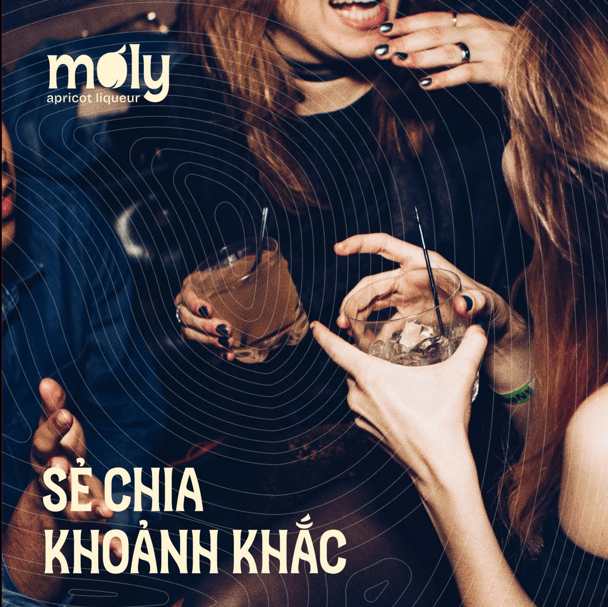
Simple illustrations capture the essence of people savoring their moments with a glass of wine. Each drawing highlights joy, relaxation, and connection whether it’s quiet solitude or lively gatherings turning everyday experiences into memorable stories, with Mơ Ly at the heart of those shared emotions.

APPLICATION
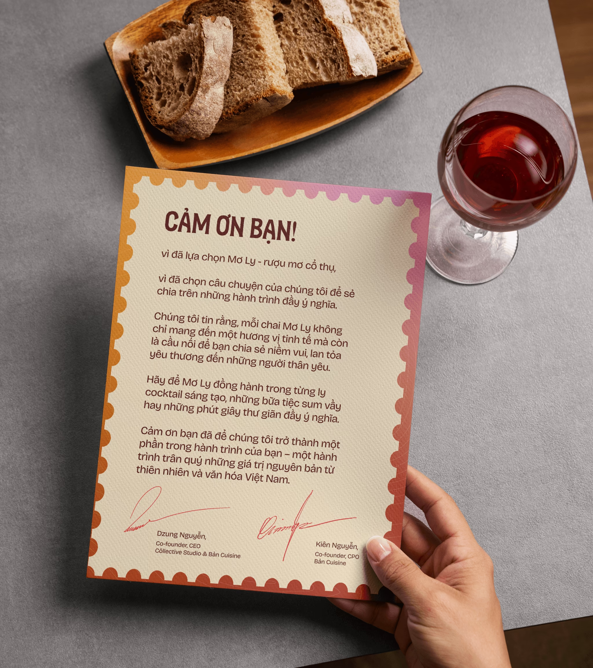
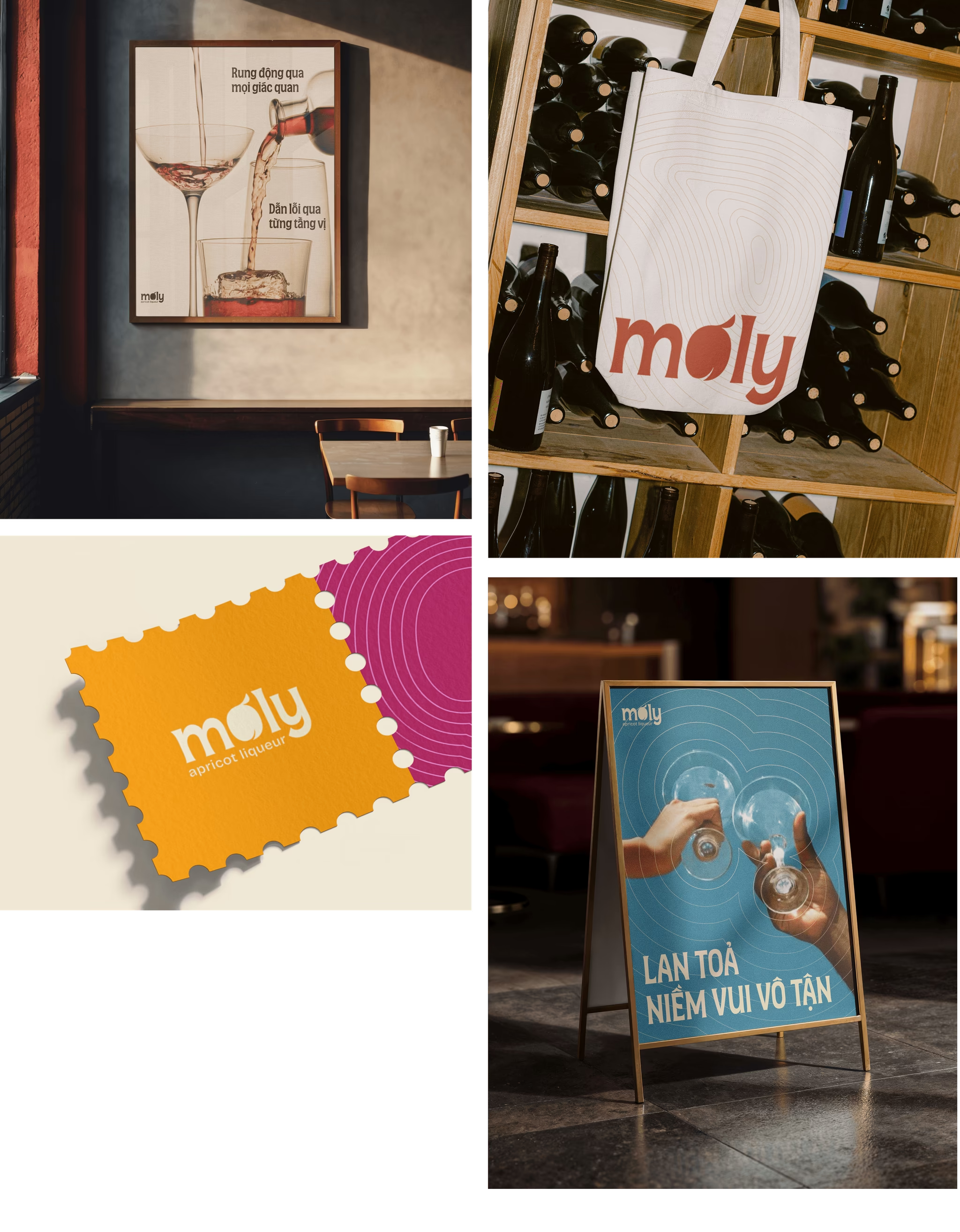
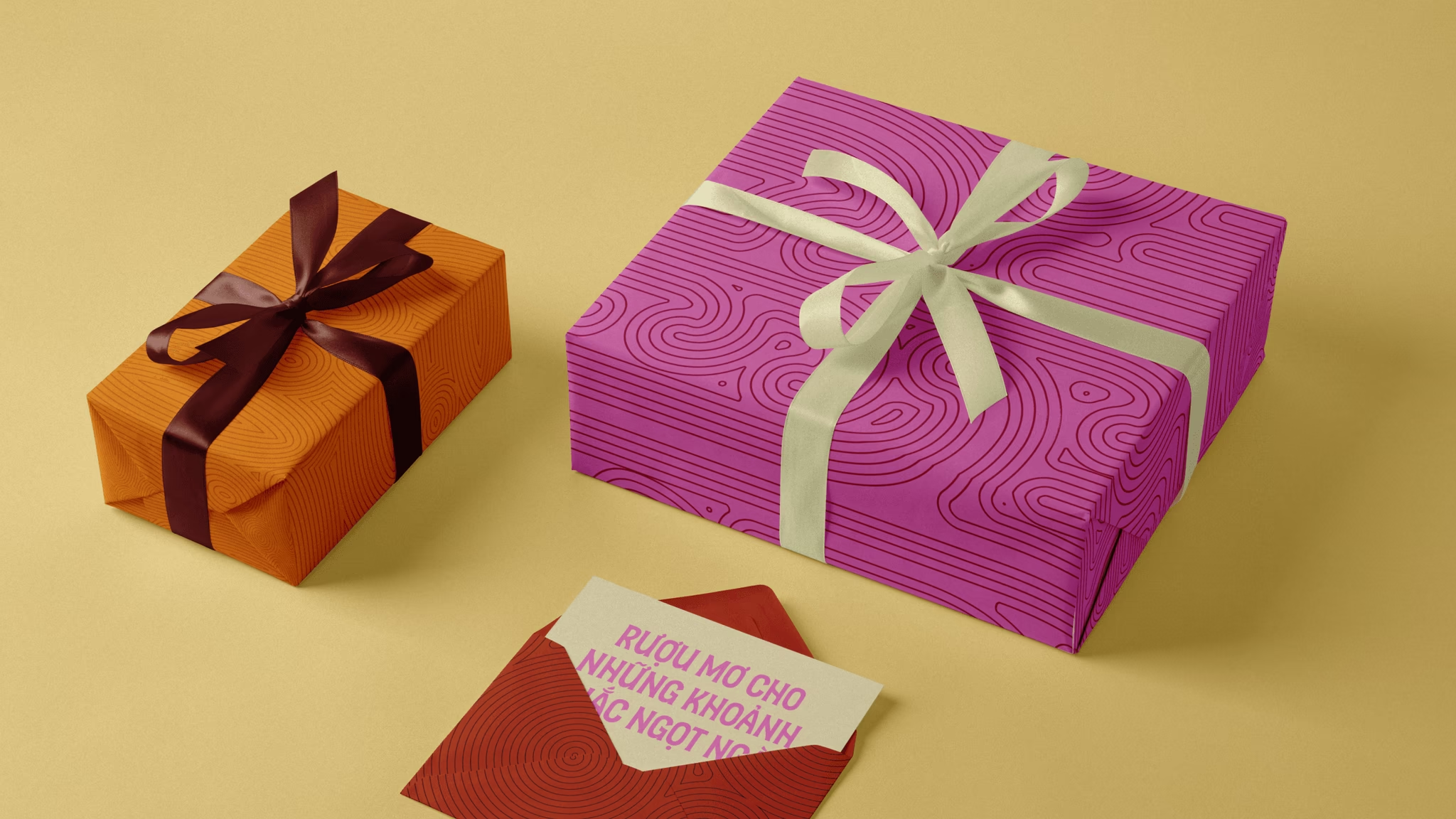
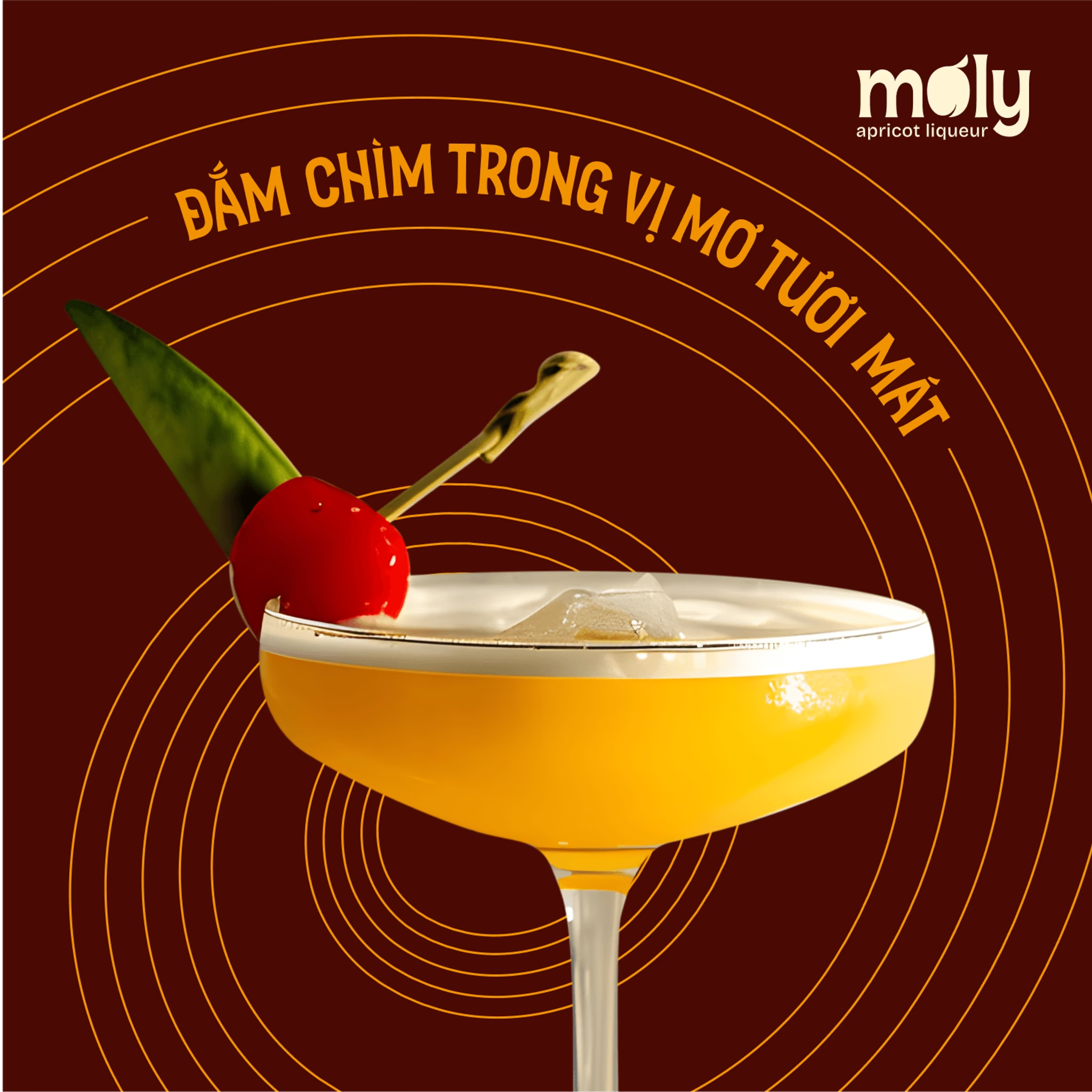
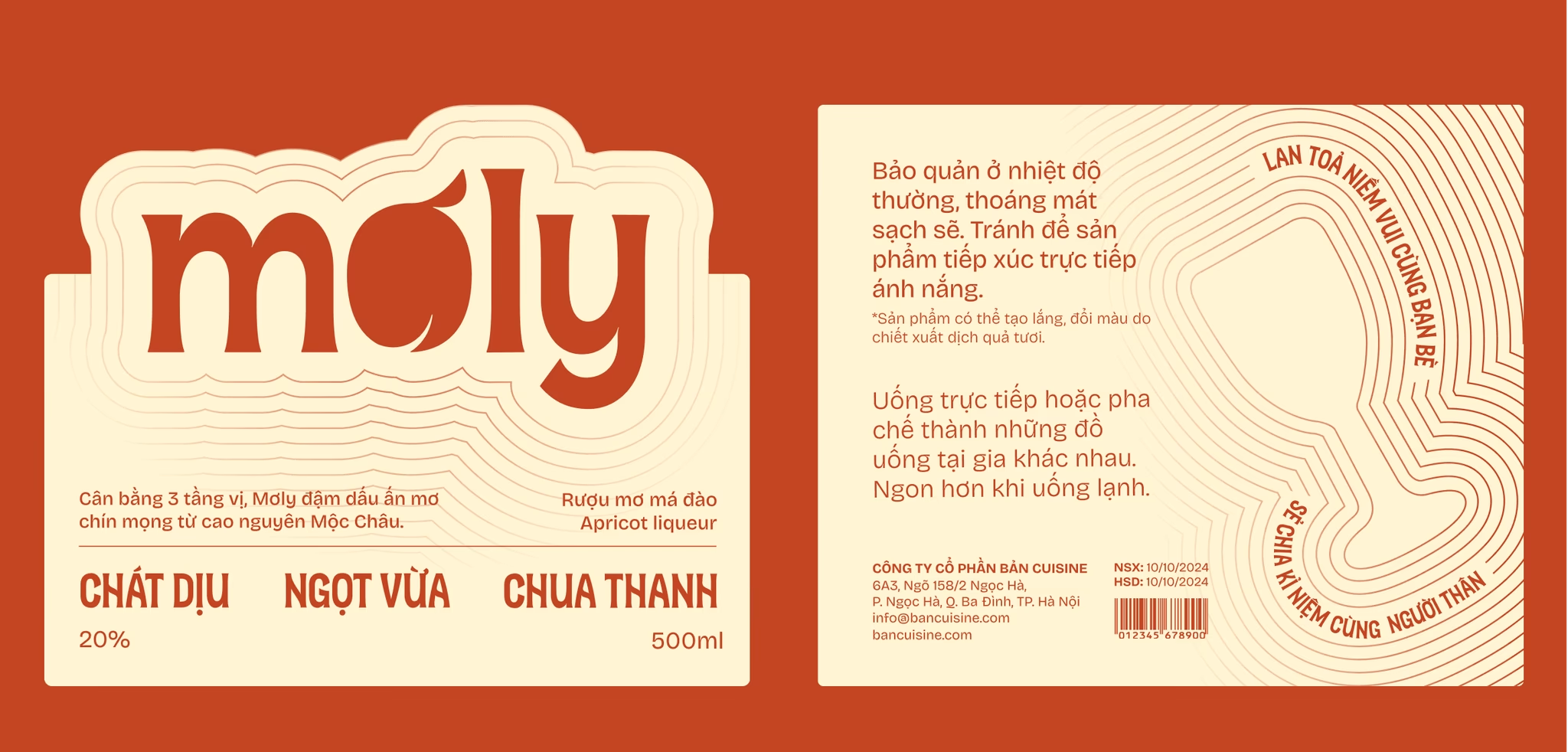
The brand’s designs are applied across diverse touchpoints from packaging and signage to merchandise and digital platforms. Each application reinforces consistency while keeping the spirit of Mơ Ly alive, ensuring the brand feels cohesive, recognizable, and emotionally engaging everywhere it appears.

PRODUCTION DIRECTOR
Minh Nguyen
CREATIVE DIRECTOR
An Bui
PARTNERSHIP
Daisy Nguyen
BRAND STRATEGIST
Minh Do
BRAND DESIGNER
Tram Bui
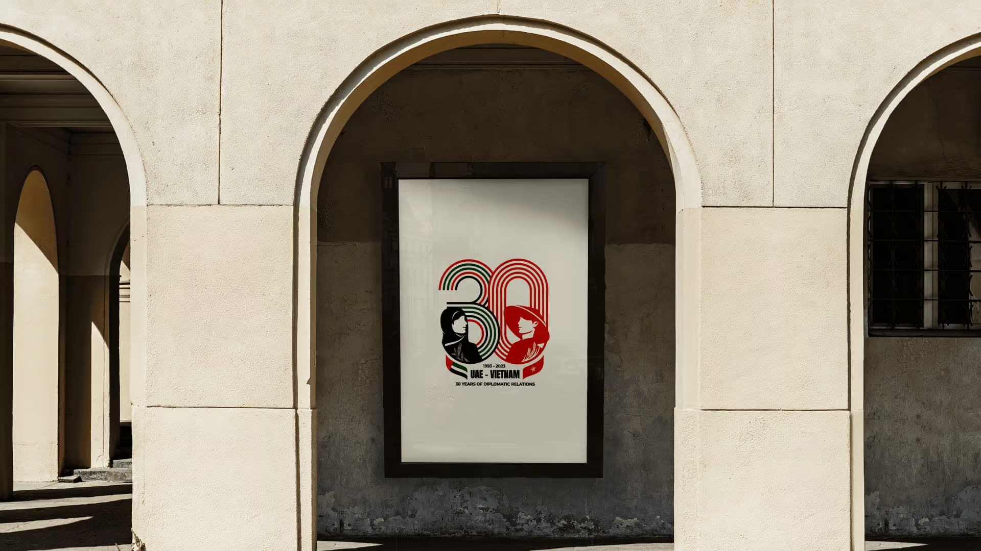
30Y Anniversary Vietnam - United Arab Emirates Logo
We designed the official mark for Vietnam and the United Arab Emirates 30-year diplomatic anniversary. The work gave the celebration in Abu Dhabi a shared visual language rooted in both cultures.
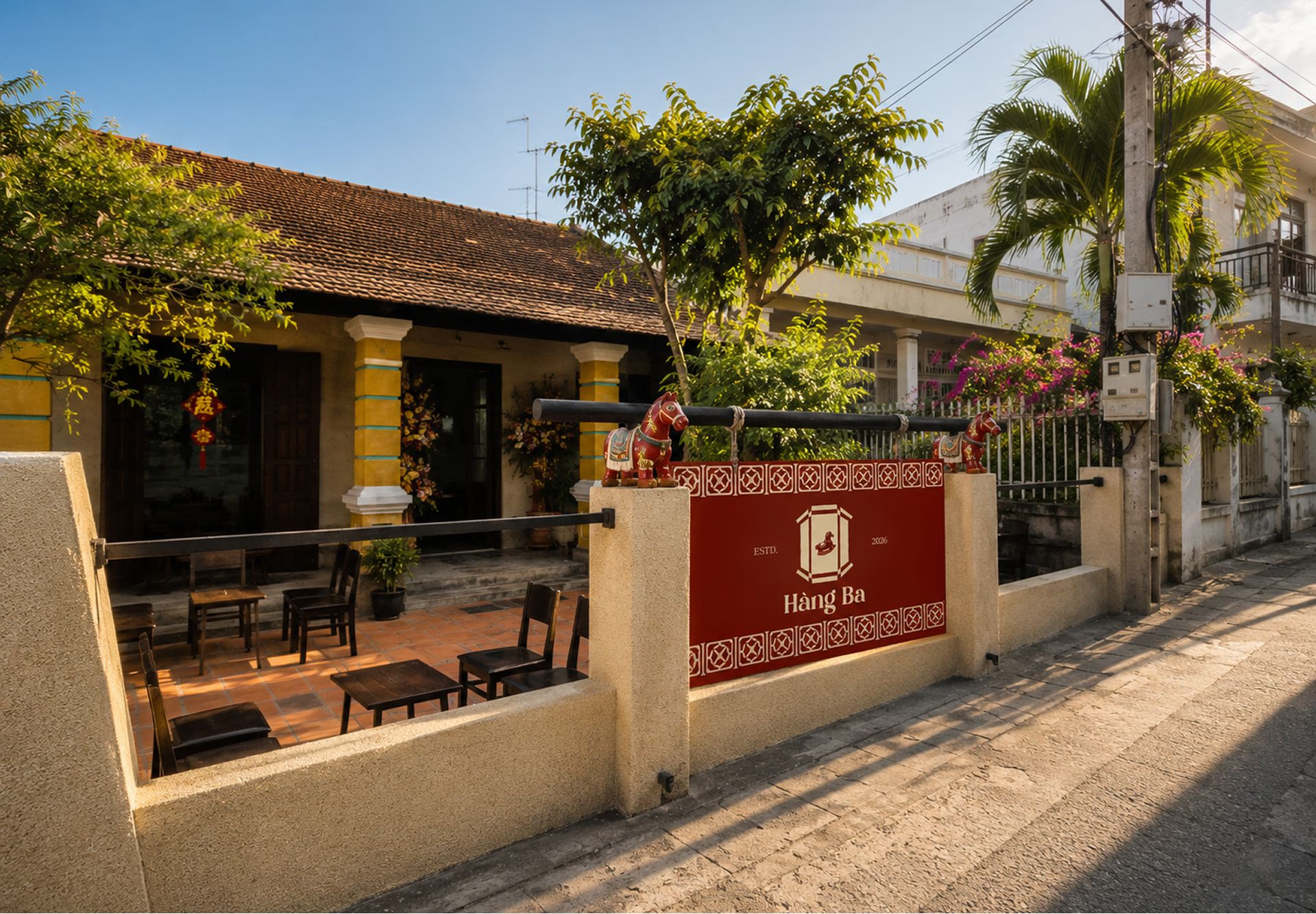
Hàng Ba Cafe
Hàng Ba is a cultural space that uses specialty coffee to tell stories about local materials, Southern architecture, and everyday memories.