

Scroll
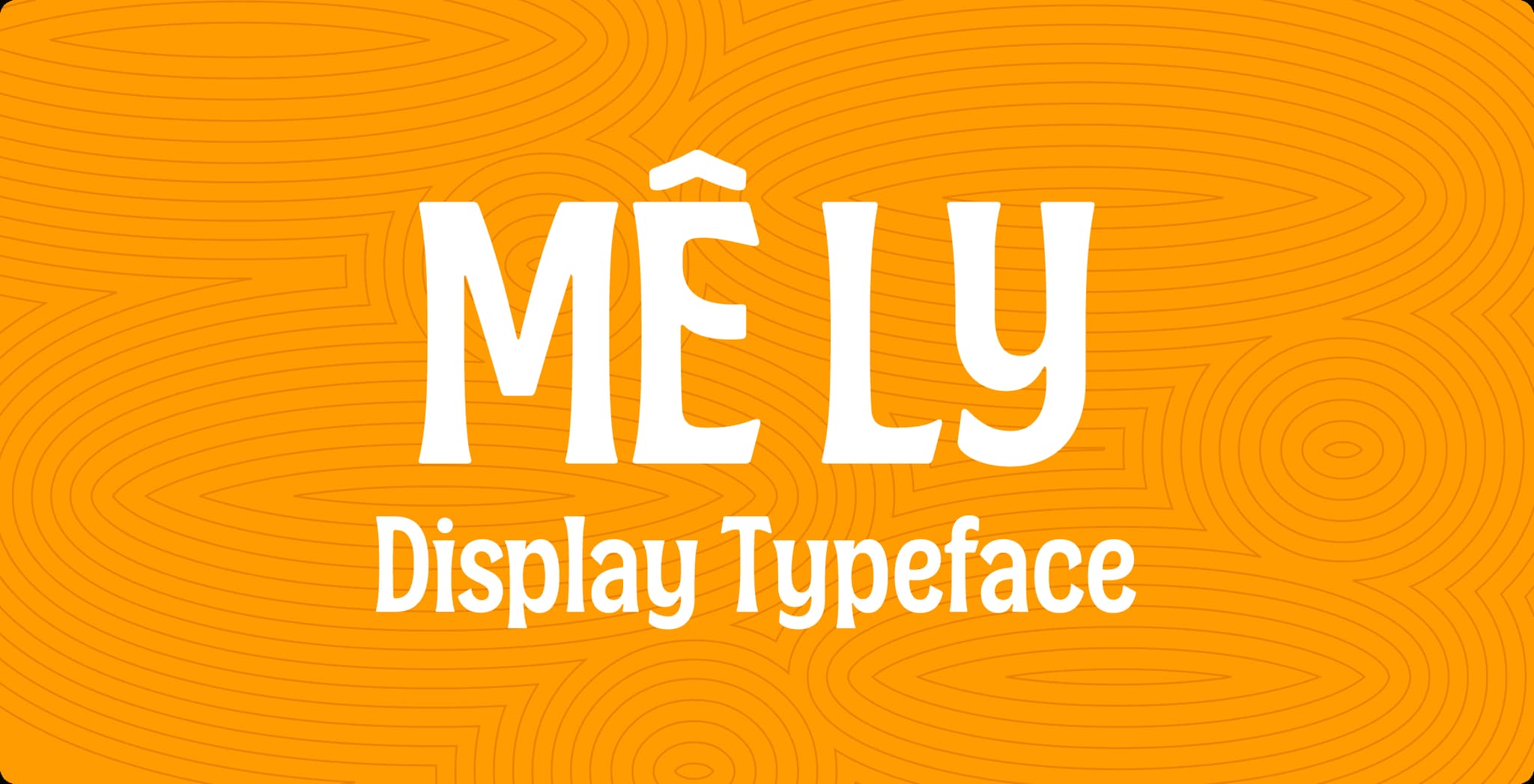
CDA Mê Ly Display Typeface
A contemporary Vietnamese display typeface inspired by the weathered apricot trees of Mộc Châu.
Overview
From Orchard to Letterform
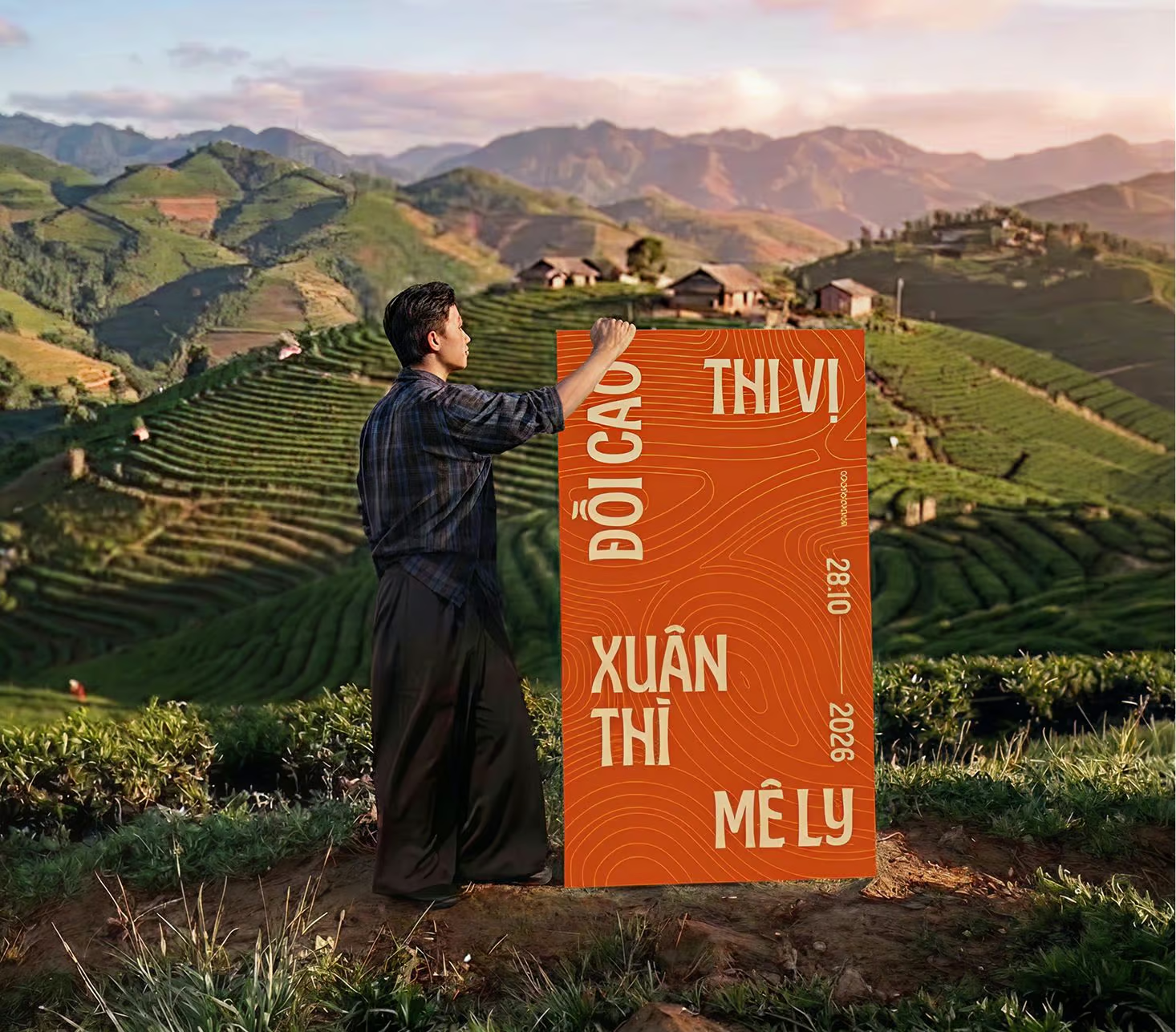
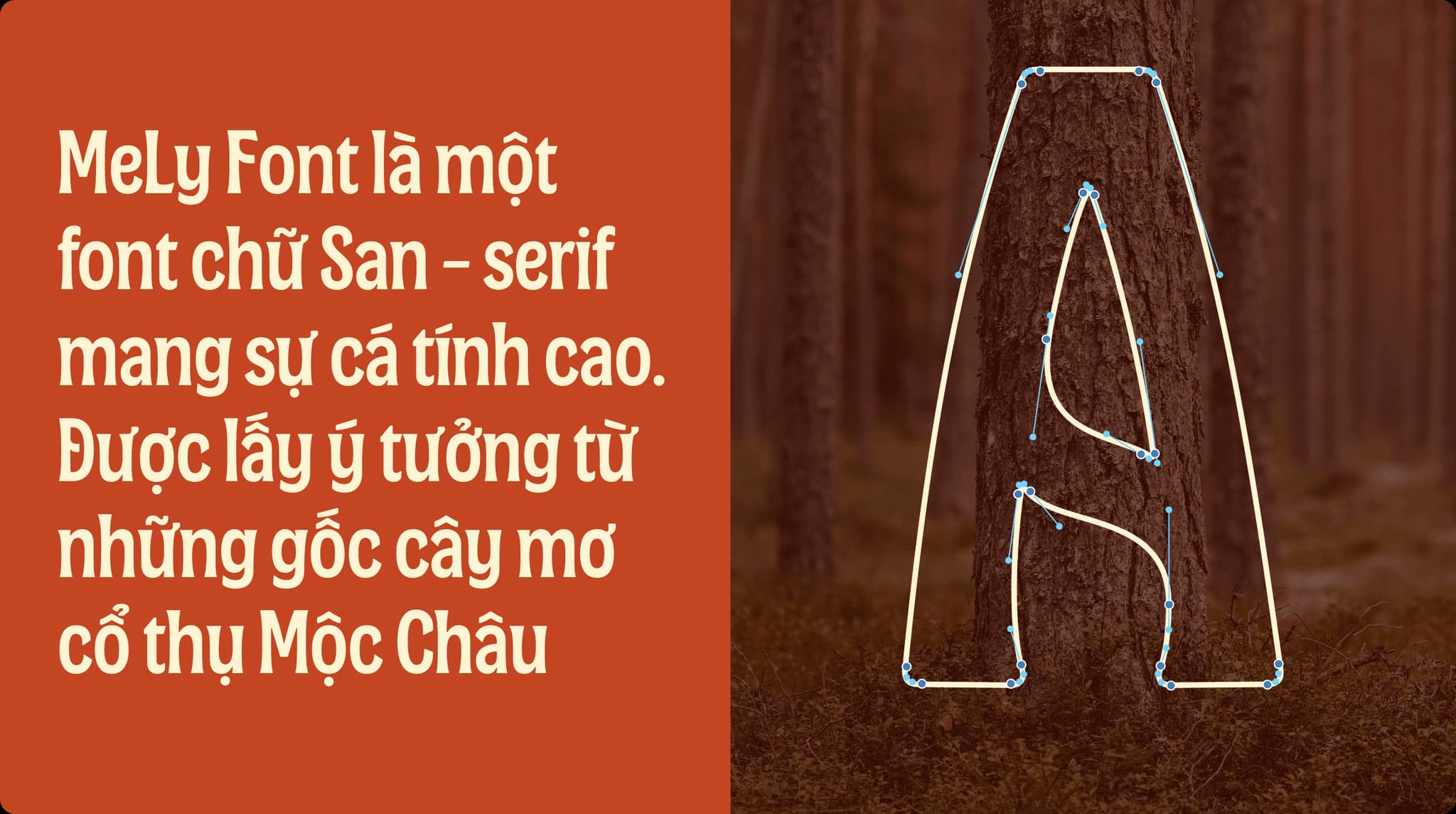
CDA Mê Ly Display began with the old apricot orchards (Prunus armeniaca) of Mộc Châu. Shaped by highland wind, frost and time, their trunks carry a surface that is both rugged and graceful.
Rather than imitate that texture directly, the typeface translates its qualities into form: sturdy structure, soft movement and an irregular rhythm that gives each word a distinctive presence.
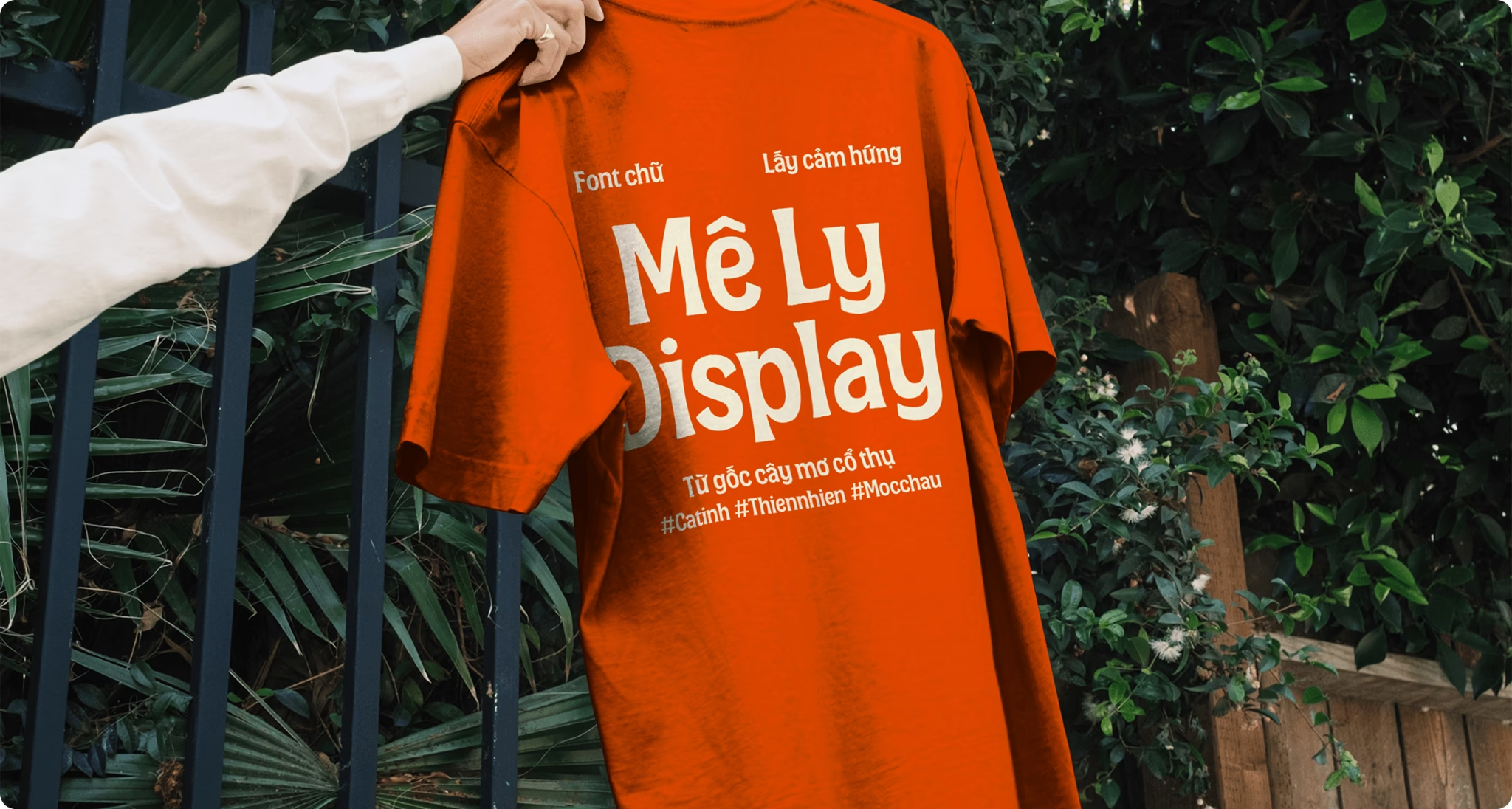
Originally designed for Mơ Ly liqueur, Mê Ly Display turns a sense of place into a visual voice that can travel across new contexts.
Typeface Preview
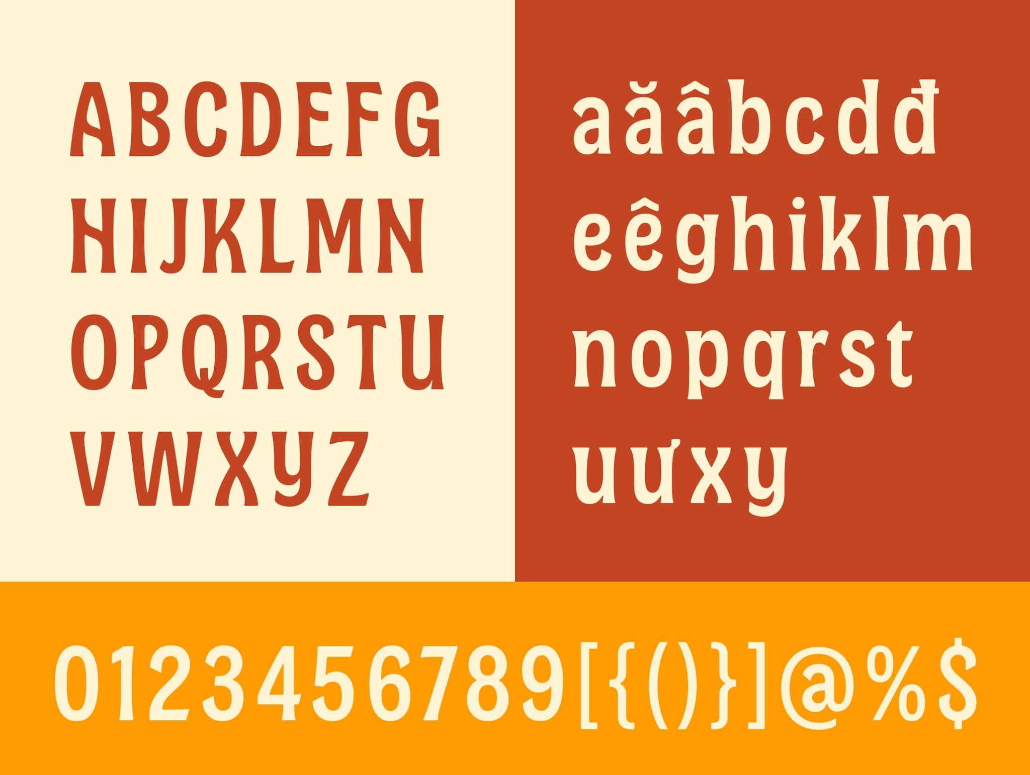
701 Glyphs · 1 styles
Uppercase
Lowercase
Digits
OPPORTUNITY
Making heritage usable
The brief was to create a typeface that could express the world of Mơ Ly without relying on familiar cultural motifs.
We looked to the orchard not as decoration, but as a system of contrasts: weathered yet alive, grounded yet delicate, shaped by time yet renewed every spring. These qualities informed a display typeface that feels rooted in Vietnam while remaining contemporary in use.
Type Structure
Strong in structure, soft in rhythm
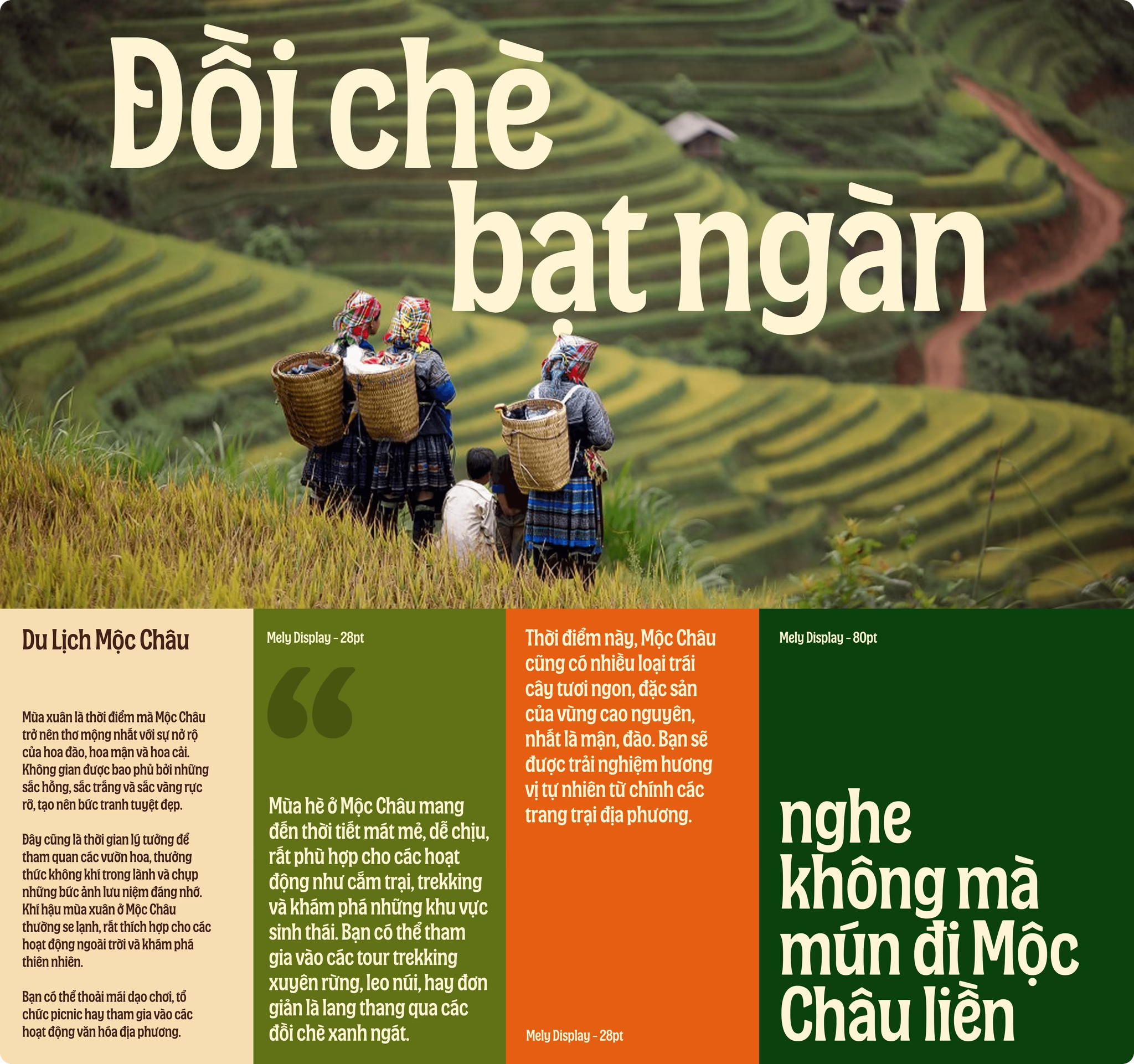
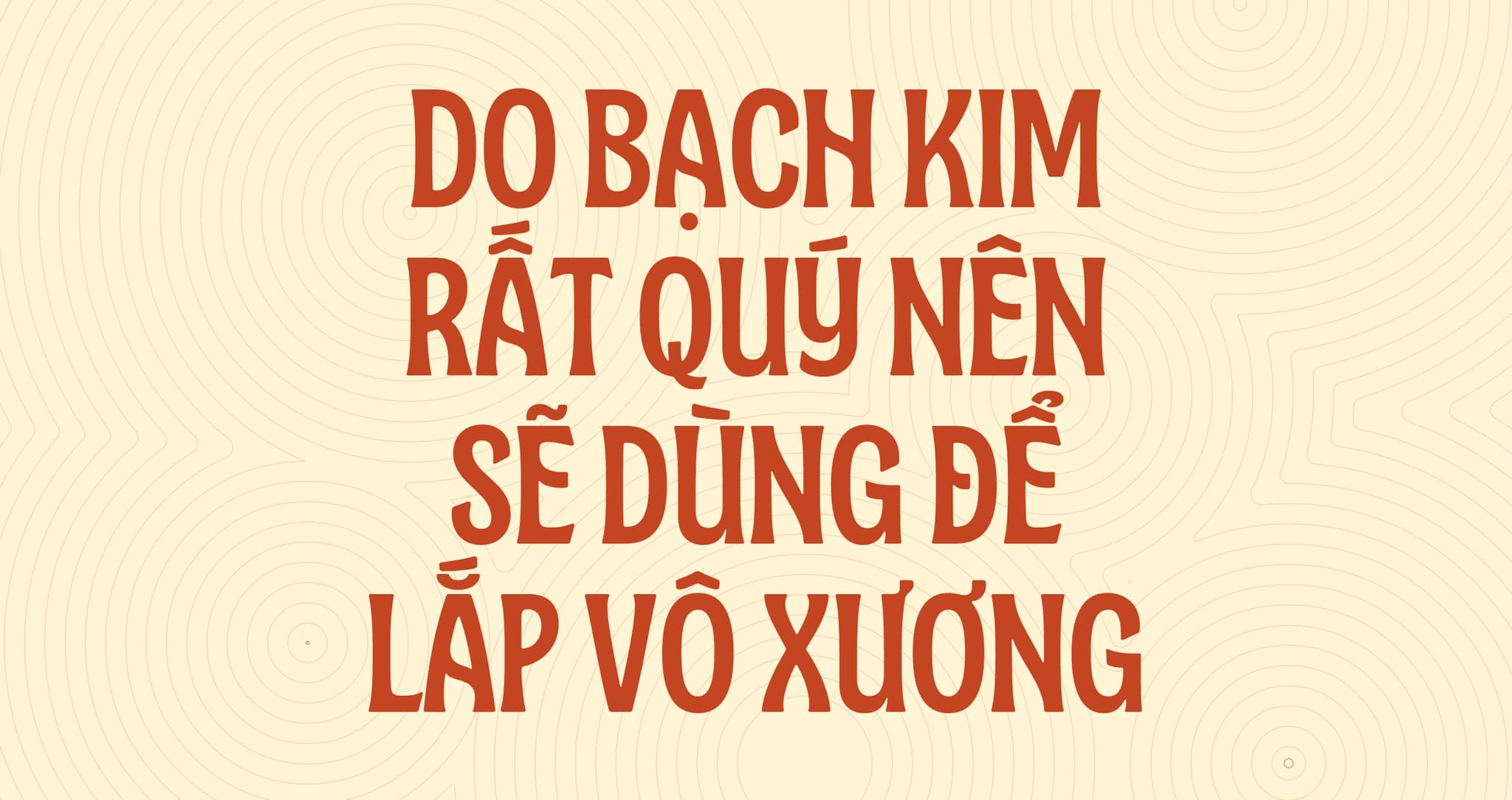
Mê Ly Display combines upright, confident capitals with softer lower-case forms. Its proportions are compact and sculptural, designed to give short words impact at display sizes.
Subtle curves, tapered details and organic transitions prevent the letterforms from feeling rigid. Together, they create a typeface that is bold enough to lead a composition while retaining a sense of warmth and movement.
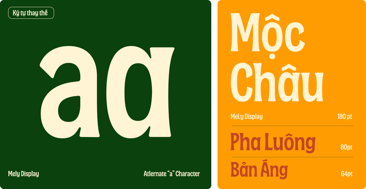
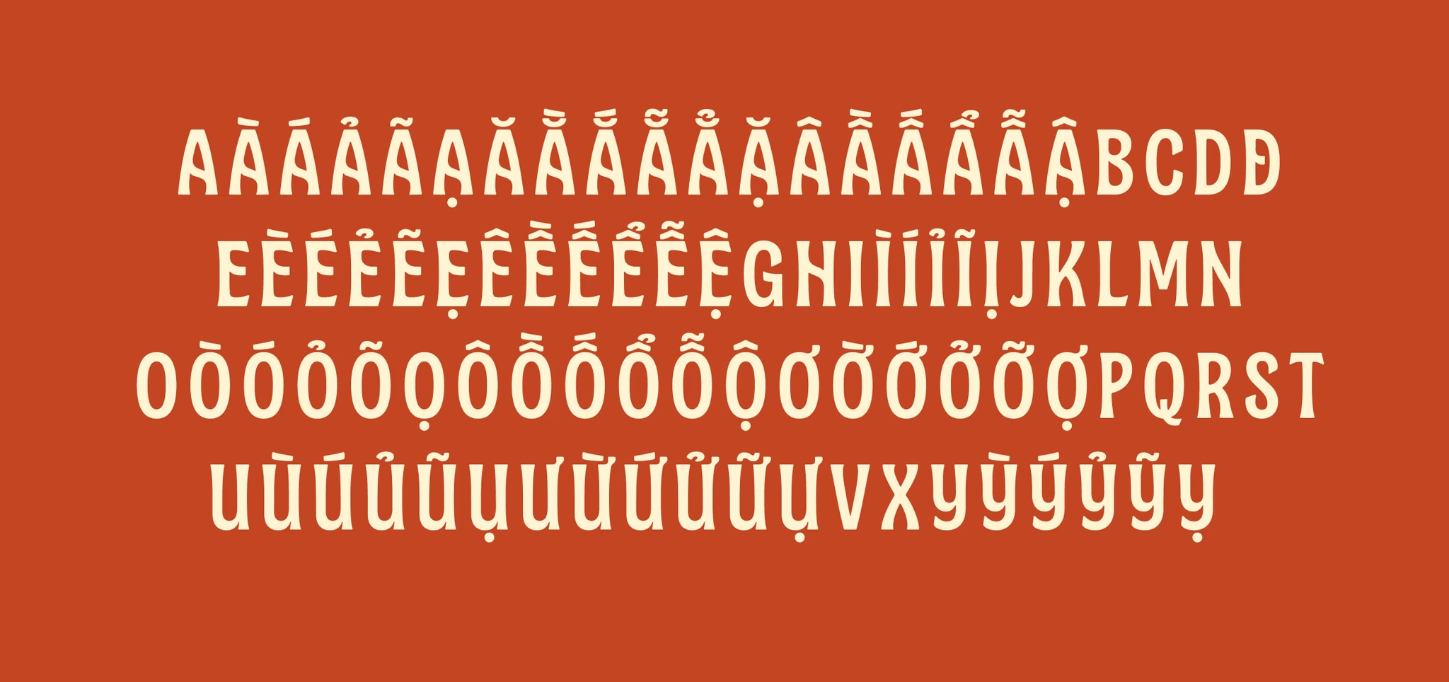
The family includes uppercase and lowercase letters, Vietnamese diacritics, numerals, punctuation and selected alternate characters.
VOWEL & CONSONANT
A rhythm built into the language
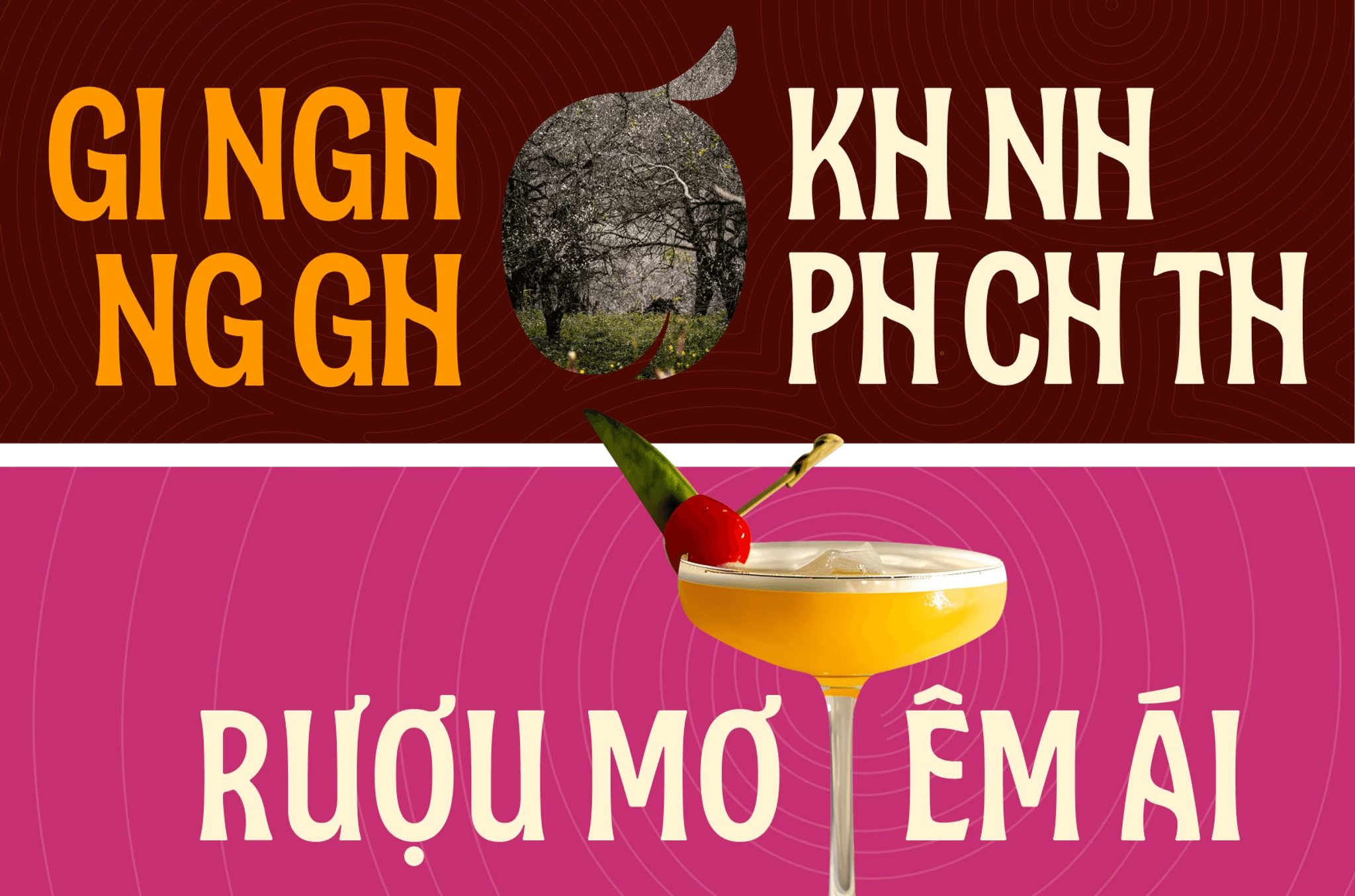
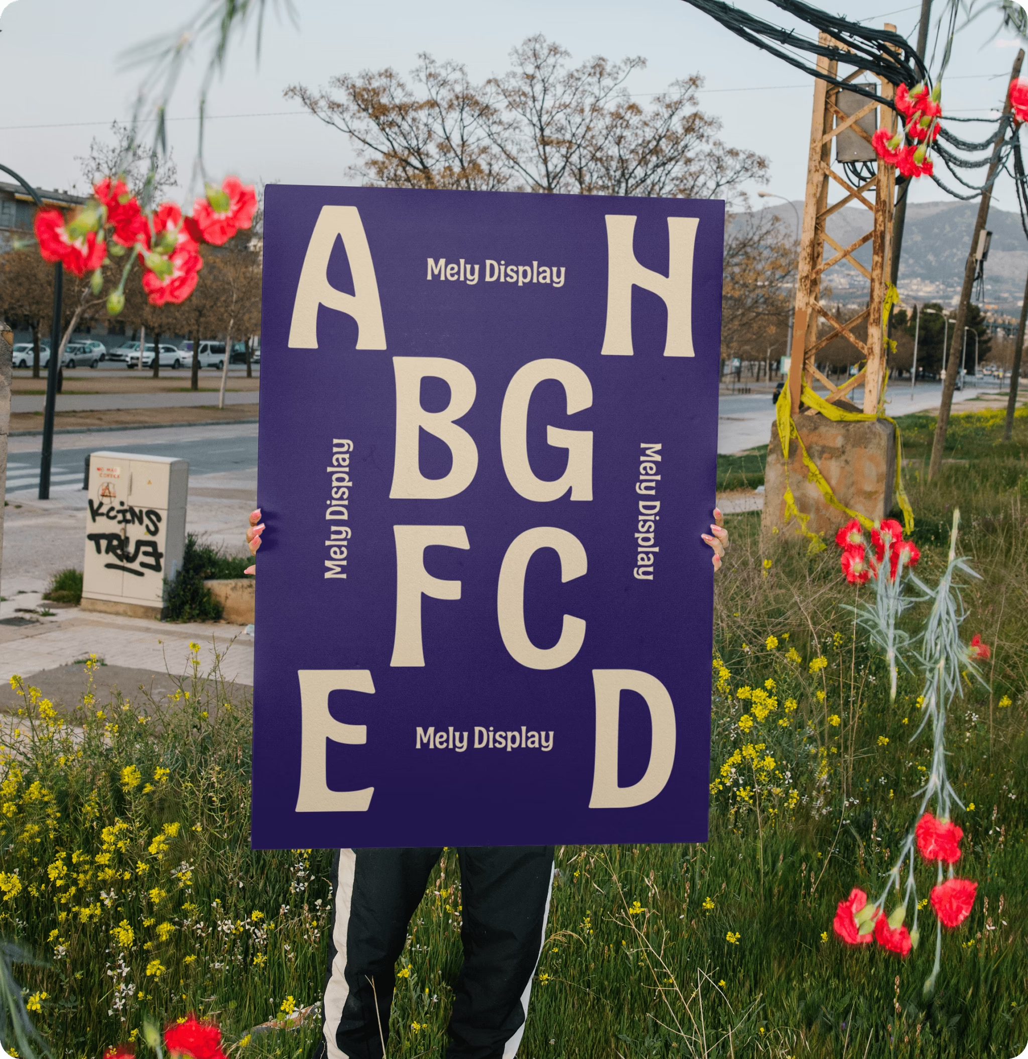
When vowels and consonants come together, they form a rhythmic flow that echoes both harmony and strength. Each letter’s structure, slightly curved yet grounded, recalls the sturdy trunk and textured bark of an old apricot tree rooted in heritage, yet branching outward with timeless vitality.



VIETNAMESE DIACRITICS
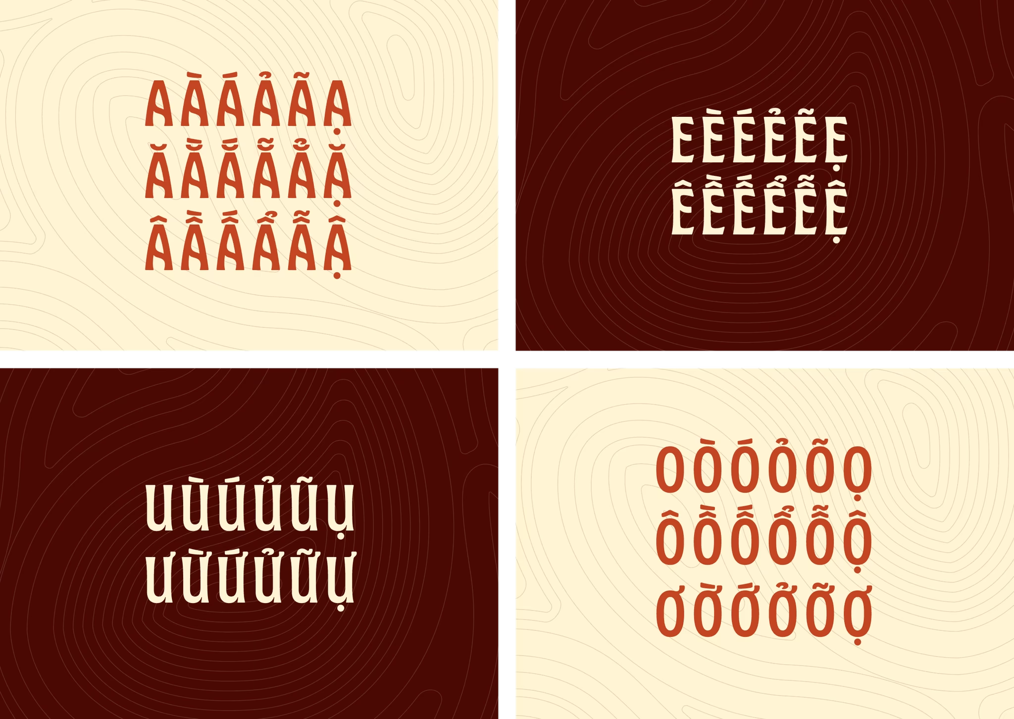
Designed for Vietnamese from the start
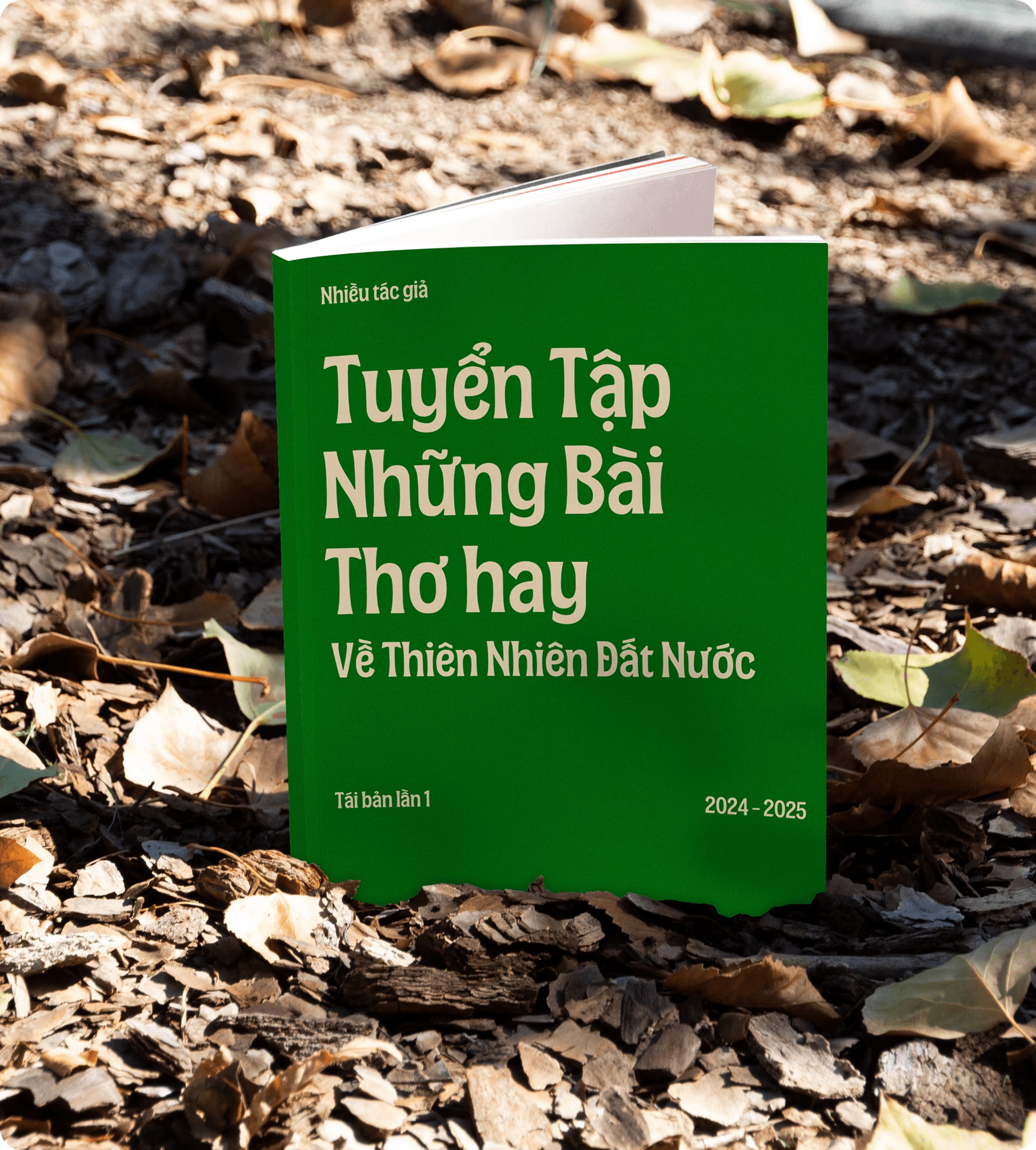
Vietnamese diacritics are integral to Mê Ly Display’s design, not an addition made after the letterforms were complete.
Each accent is drawn and spaced to maintain clarity, balance and expression across tonal combinations. This allows Vietnamese words to hold their rhythm and visual presence, even in large, tightly composed settings.

Usage & Download
CDA Mê Ly Display pays tribute to Mộc Châu's old apricot orchards, where trunks have been sculpted by decades of highland wind and frost, yet still burst into bloom with every spring. This quiet contrast between weathered resilience and delicate renewal became the inspiration behind the typeface.
Mê Ly Display was created for more than one identity. It is designed for headlines, packaging, posters, editorial layouts and any application that calls for a voice with warmth, character and presence.
CDA is a Vietnam-born, globally-minded creative consultancy, and typefaces like this one are how we put a bit of the country's landscape and craft into circulation beyond it.
Get the font here and see where it takes your next project.
Free for personal and commercial use, under the SIL Open Font License 1.1.
PRODUCER
An Bui, Minh Nguyen
CREATIVE DIRECTOR
An Bui
TYPE DESIGNER
An Bui, Duc-Hai "Harry" Dinh
VISUAL DESIGNER
Cao-Duy Nguyen
PROJECT CURATOR
Cao-Duy Nguyen