

Scroll
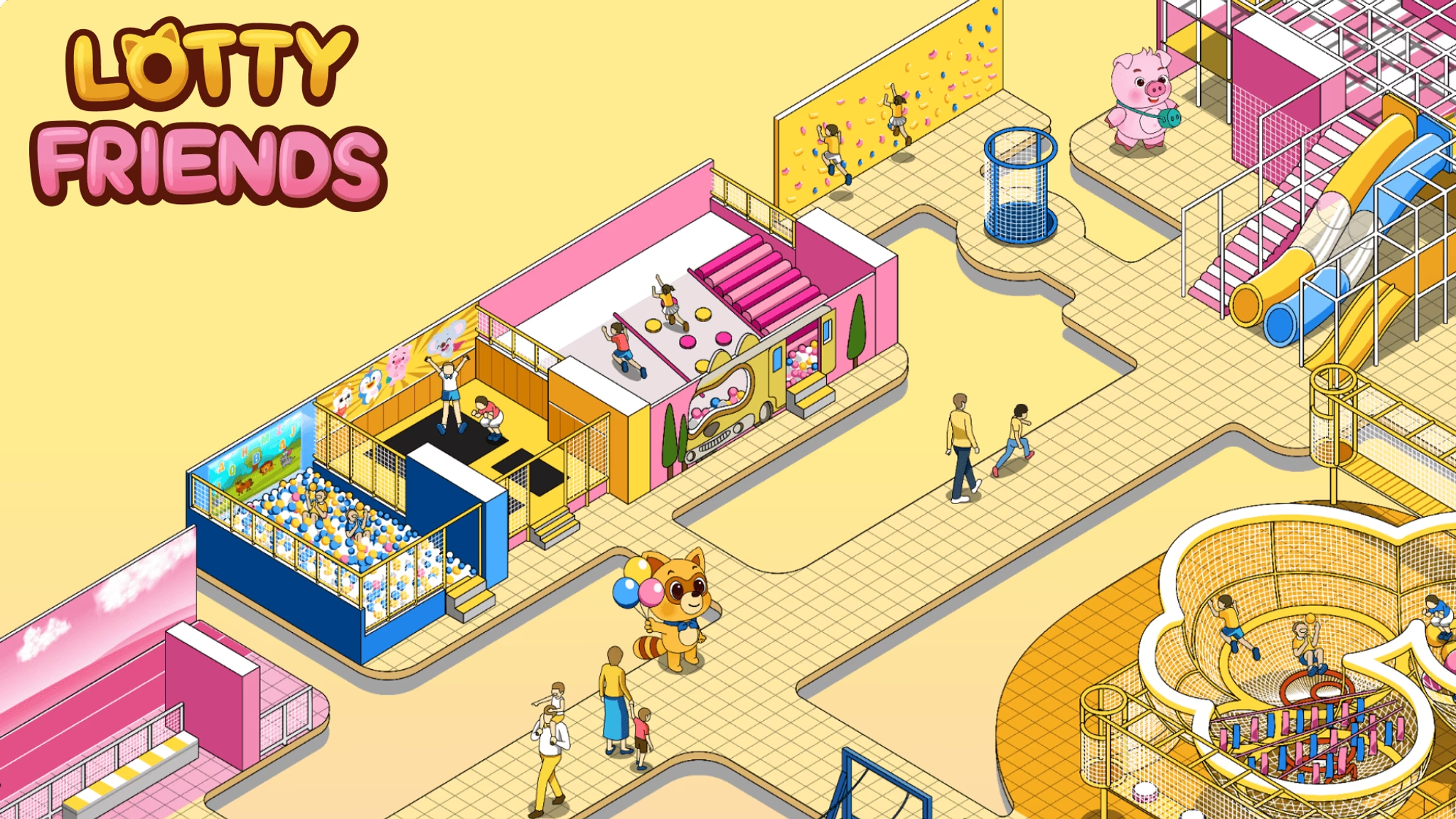
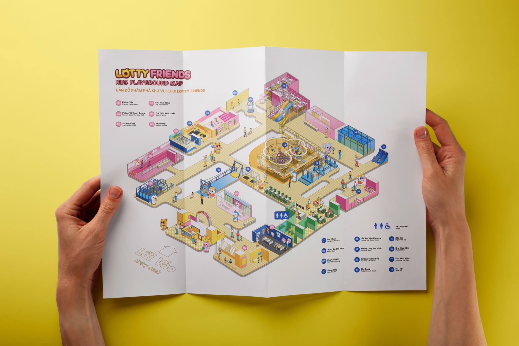
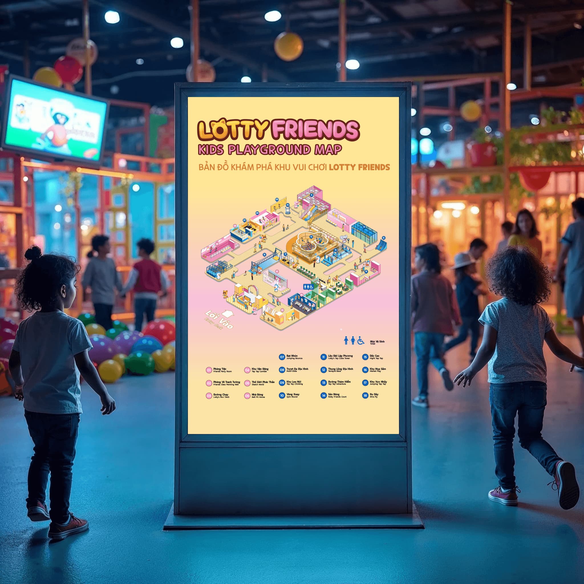
Lotty Friends Kids Playground Map
Mapping where imagination meets exploration.
Overview
The Lotty Friends Kids Playground in Hanoi is more than just a space for children to play—it’s a captivating adventure-themed facility designed to inspire exploration and creativity.
This highly-detailed, immersive environment transforms a simple playground into a dynamic world of interactive play, where each corner reveals a new discovery. With carefully planned spaces, vibrant visuals, and a thoughtfully designed layout, the playground encourages physical and mental development while sparking joy and curiosity in its young visitors.
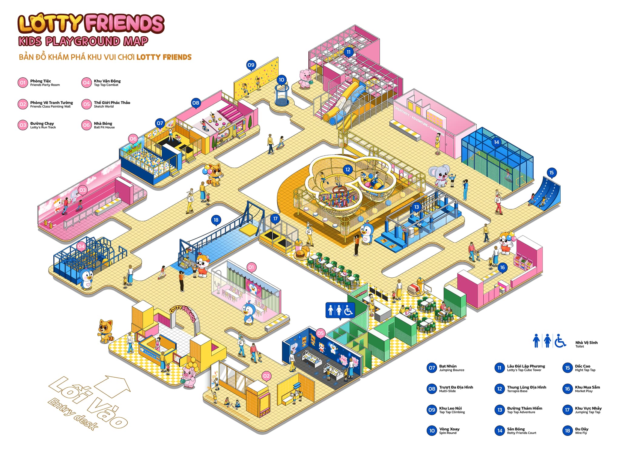
Lotte World entrusted CDA with the critical task of developing a comprehensive and detailed map to bring the playground's adventurous spirit to life. By blending artistic design with strategic planning, our team crafted a map that guides both children and parents through the facility, enhancing the overall experience. Through close collaboration with Lotte World, we ensured that every element of the playground’s design, from the layout to the visual cues, seamlessly aligned with the brand’s vision for fun and exploration.
Sketching a World of Wonder
Designing a playground isn’t just about where the slides go. It’s about capturing imagination, movement, and storytelling in a single frame—and making it look effortless. For the Lotty Friends Playground Map, CDA was invited to bring Lotte’s vision to life, not as a schematic layout, but as a living, breathing universe that a child could explore before even stepping foot inside.
Our sketch process began like most cartographic journeys—with wireframes and spatial logic. But we didn’t stop at “accurate.” We asked ourselves: How do we draw fun? How do you communicate energy in a still image?
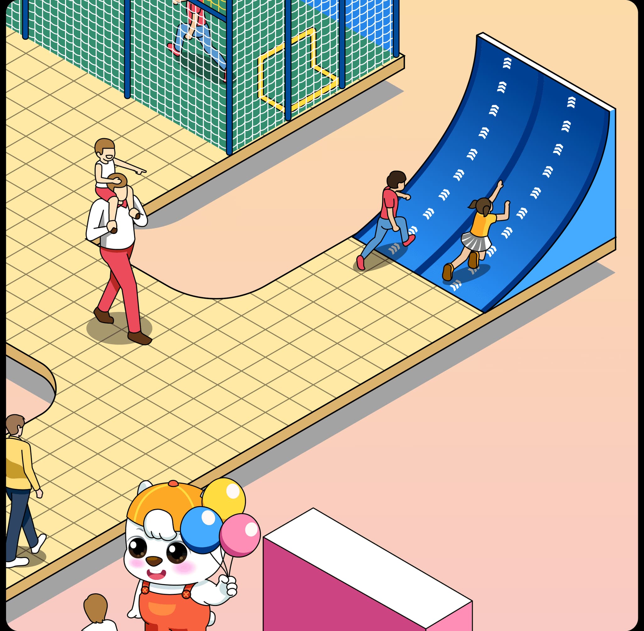
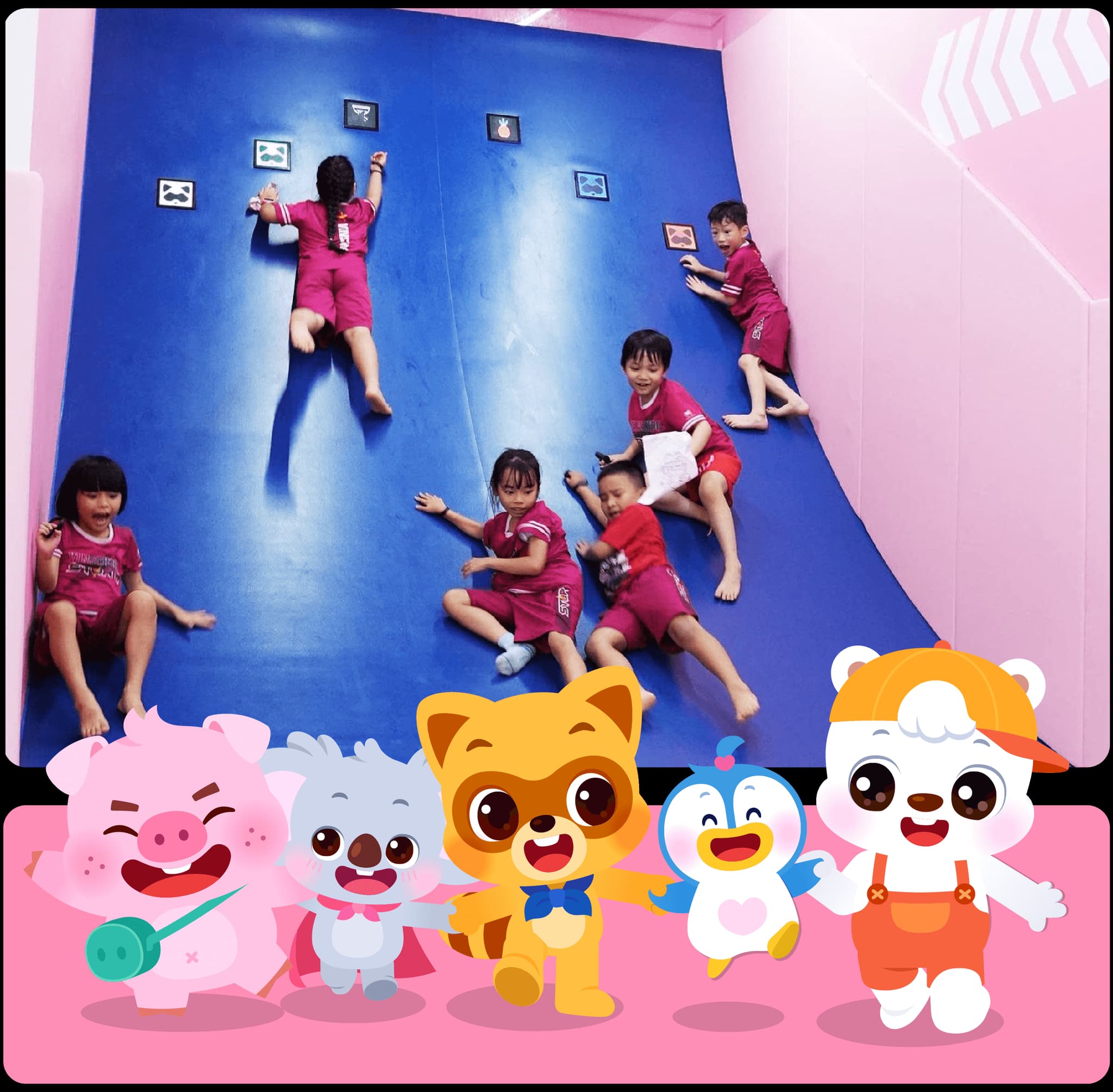
Early sketches served as the skeletal structure, building foundational layouts and area proportions. From there, we layered personality. Characters, curves, color—and a touch of narrative whimsy—transformed the map from blueprint to storybook. The mascots weren’t just cute, they were guides. The colors weren’t just bright, they were directional cues. We approached each design decision with the same care an architect might bring to a gallery or museum—except our visitors were three feet tall and high on sugar.

Zooming into the Funsies
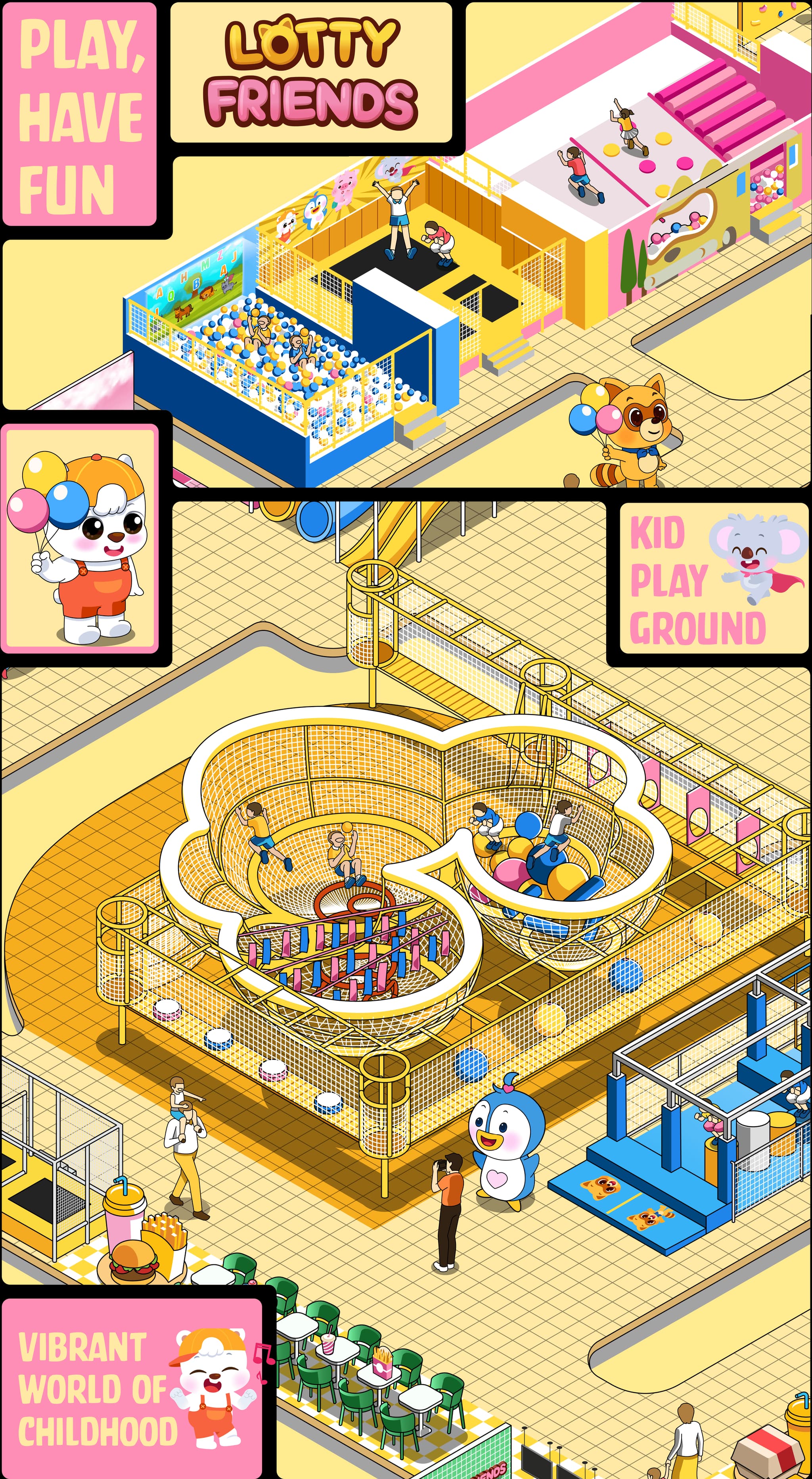
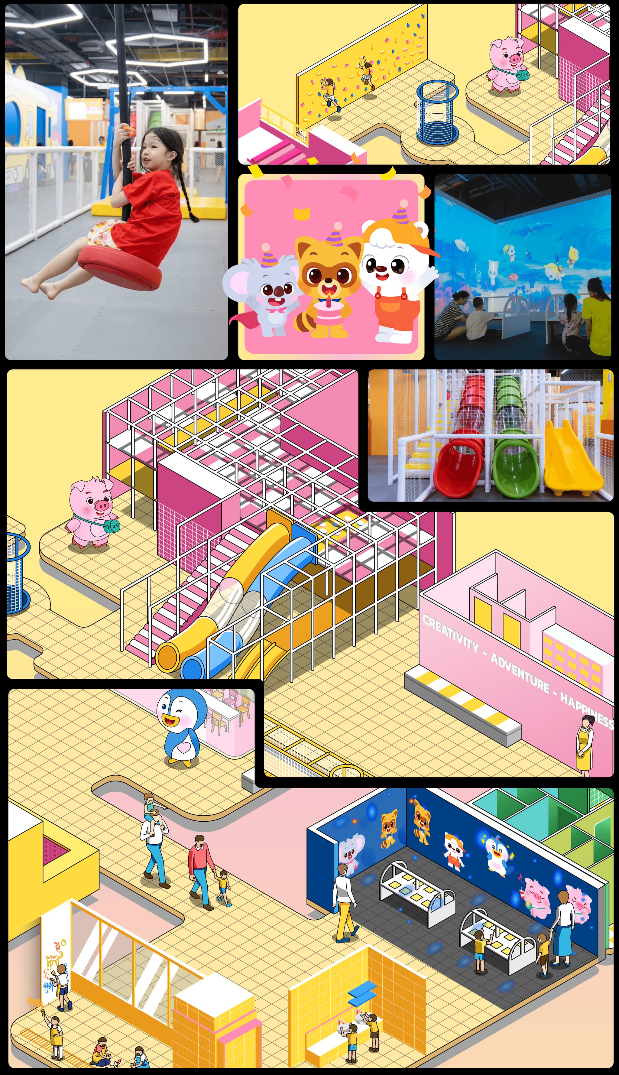
Step into the details and you’ll see more than zones—you’ll see experiences waiting to happen. The map features a kaleidoscope of activity pods: creative playrooms, physical challenge areas, and fan-favorite attractions like the Spin Round and Jumping Bounce—each illustrated with dimensionality and delight.
Every building and pathway has intention behind it. Pathways are highlighted to make navigation intuitive (even for a distracted toddler), while colors and architecture double as wayfinding and mood-setting.
Creative & Communications
Cōllective Design Agency
Producer
Thai-Yves Bui
Creative Director
An Bui
Partnerships
Kathy Nguyen-Tran
Designer / Illustrator
Duy Torao
Project Curator
Duy Nguyen
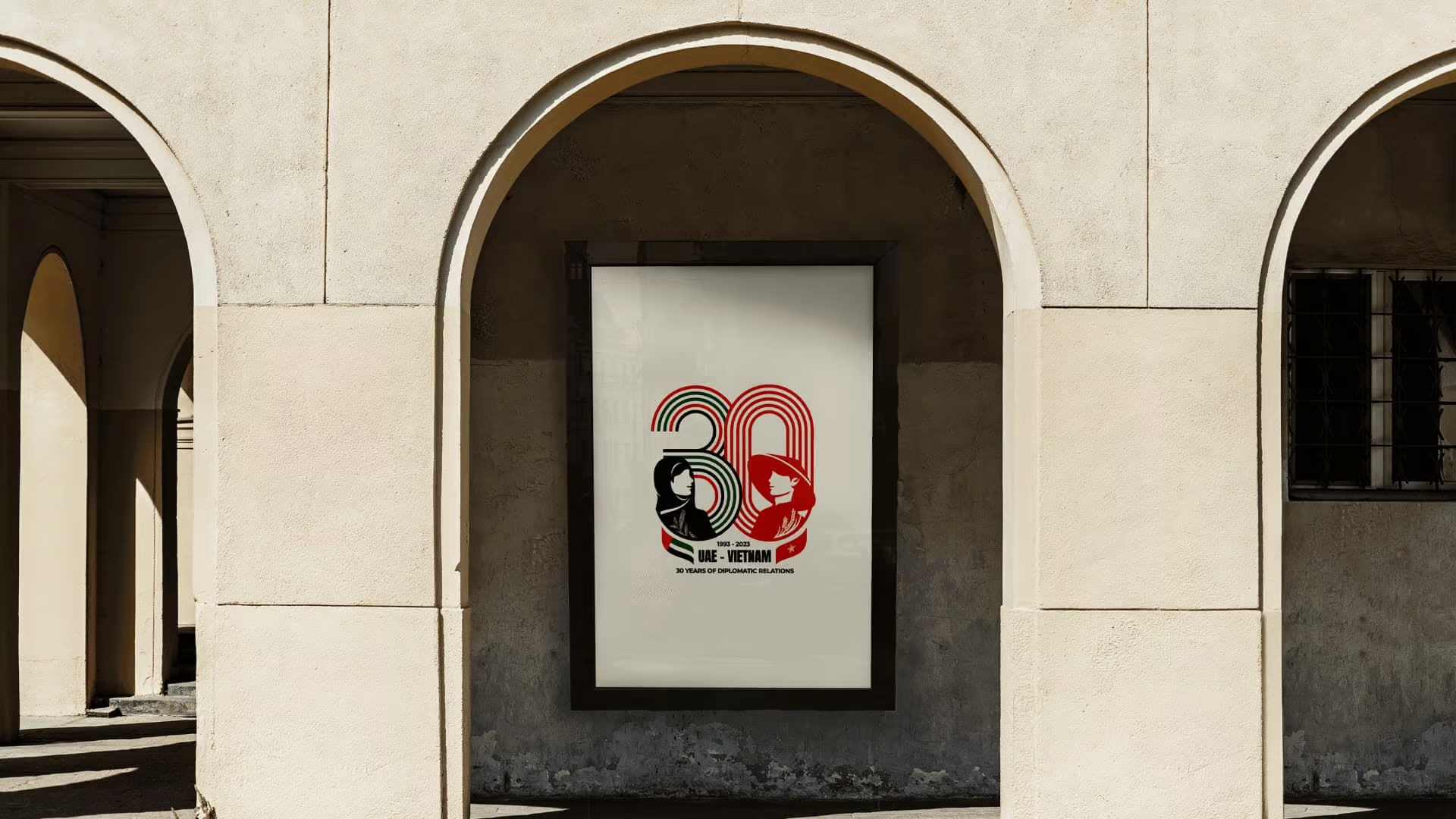
30Y Anniversary Vietnam - United Arab Emirates Logo
We designed the official mark for Vietnam and the United Arab Emirates 30-year diplomatic anniversary. The work gave the celebration in Abu Dhabi a shared visual language rooted in both cultures.
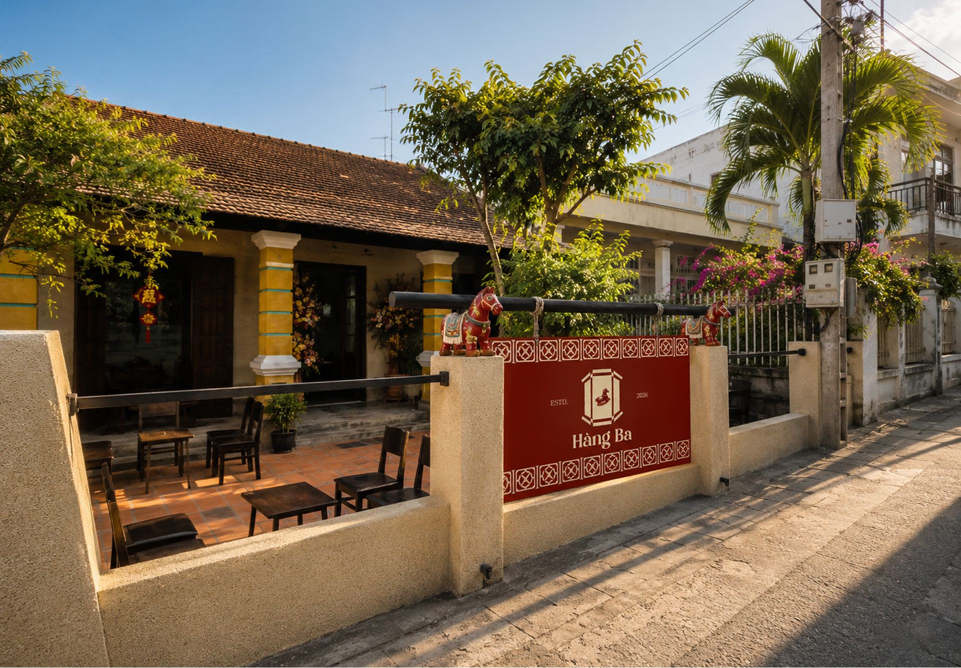
Hàng Ba Cafe
Hàng Ba is a cultural space that uses specialty coffee to tell stories about local materials, Southern architecture, and everyday memories.