


HM21 Ventures
Guiding founders along the Critical Path from vision to unicorn.
Overview
HM21 Ventures is a growth-stage venture capital firm investing across Southeast Asia, with over $12Bn in assets under management and a strong track record of scaling companies to unicorn status.
Distinct from traditional investors, HM21 places equal weight on financial performance and sustainable impact, guided by their proprietary Impact Framework that champions governance, social inclusion, and climate stewardship. Their team—comprised of seasoned operators, ex-founders, and investment professionals—has deep regional expertise, making HM21 a trusted partner for founders navigating the critical path of growth.
CDA partnered with HM21 to translate this philosophy into a cohesive brand and website experience. Our work emphasized “Critical Path” not only as a metaphor for HM21’s investment approach, but also as a visual and narrative anchor across the digital platform. By combining strategic storytelling with refined design systems, we created a digital identity that positions HM21 as both a financial powerhouse and an impact-driven thought leader. This collaboration reflects CDA’s mission of co-creating impactful connections through design, technology, and narrative—helping HM21 express their role as a true partner in the growth journeys of Southeast Asia’s most ambitious companies.
LOGO DESIGN
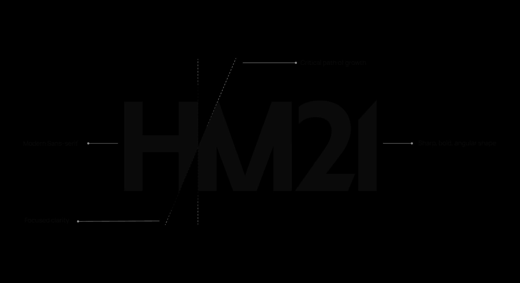
A bold emblem defined by a dynamic diagonal cutting line
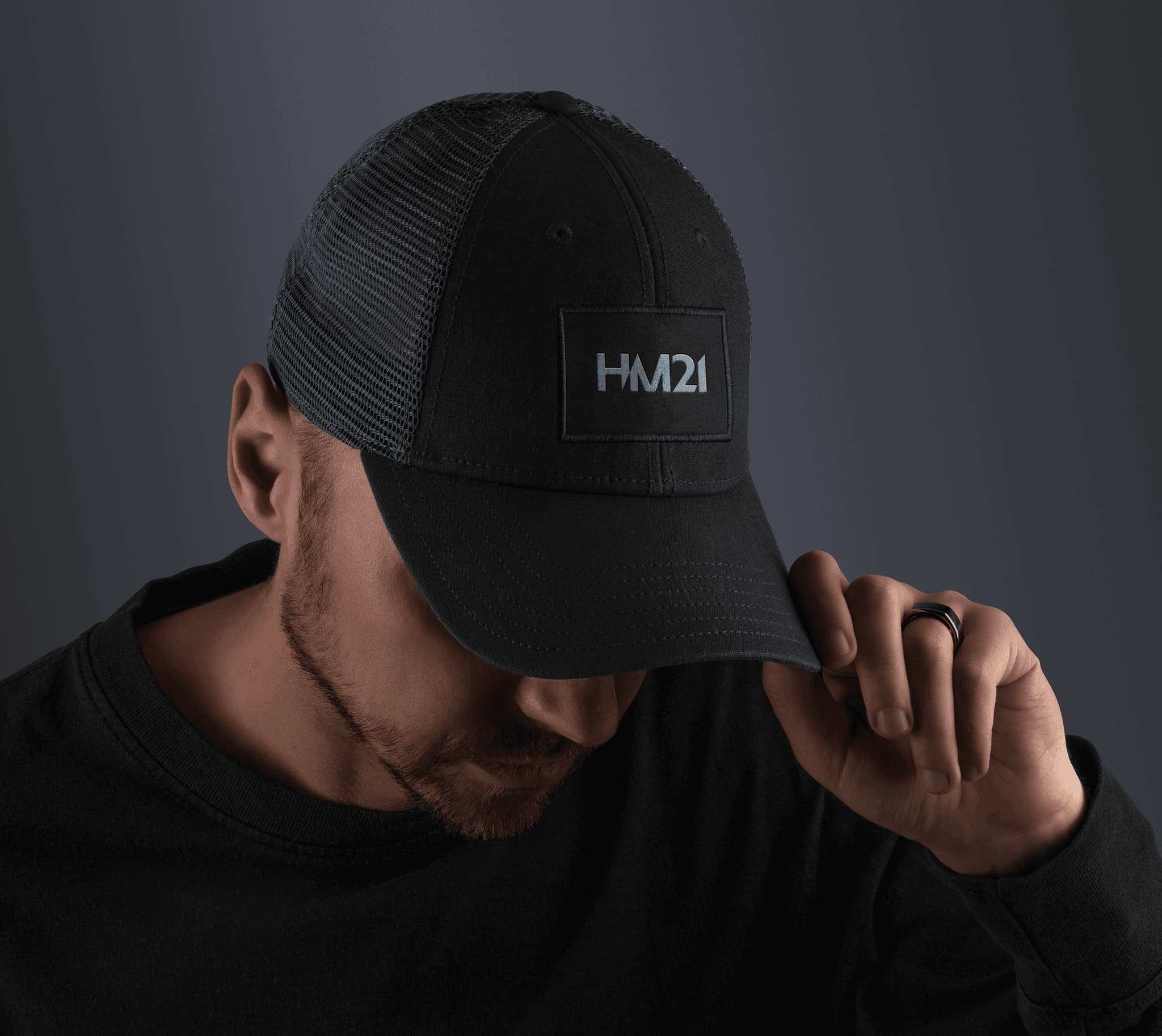
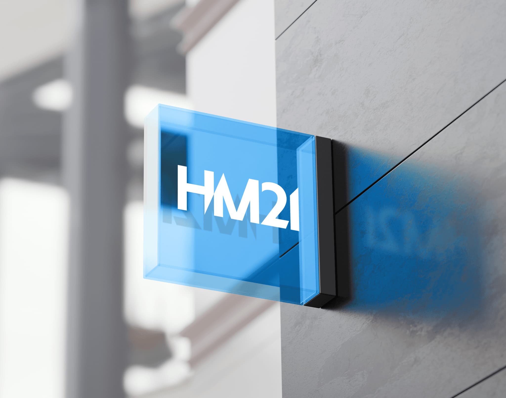
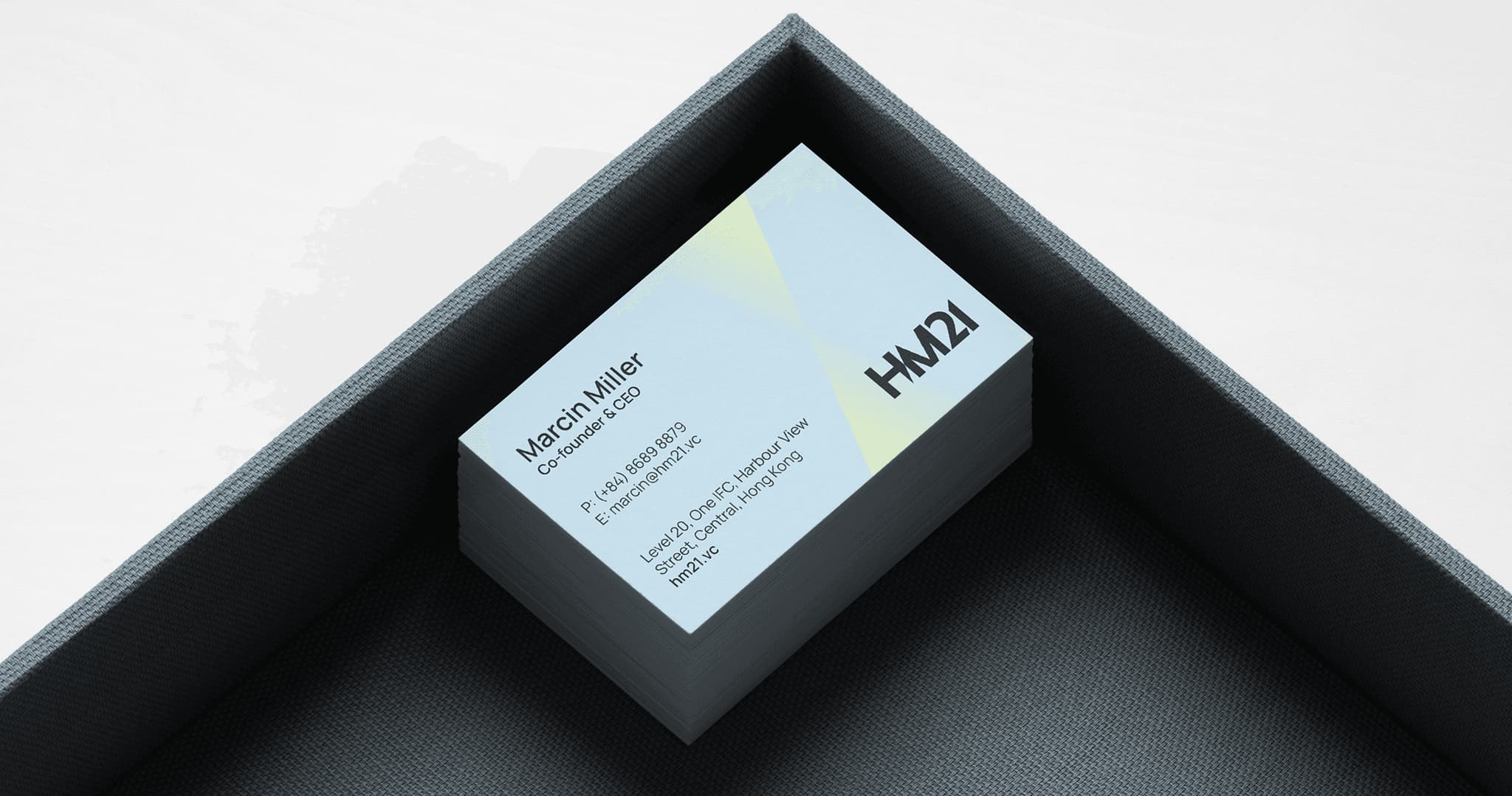
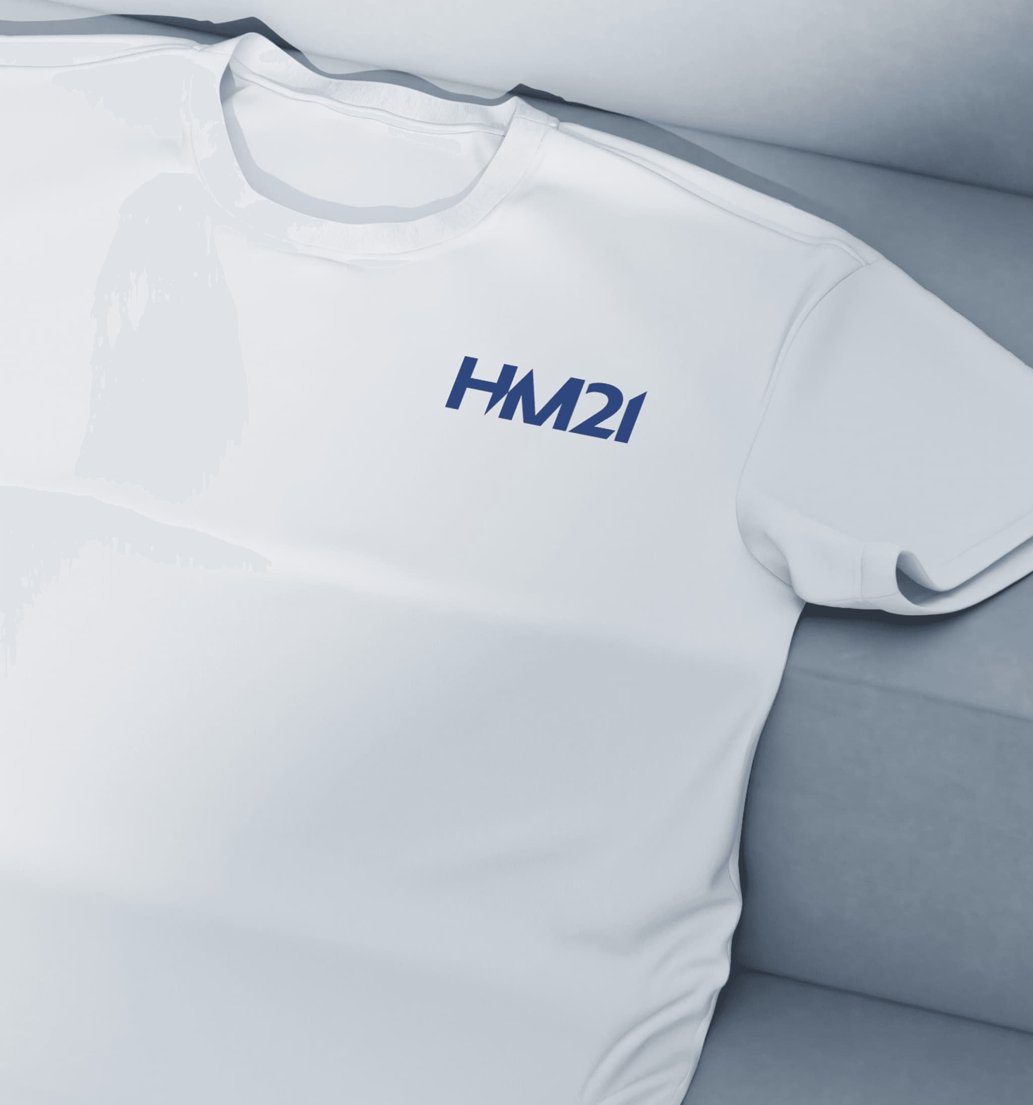
The HM21 logo is built on bold, balanced geometric forms, with a distinctive diagonal cut between the “H” and “M.” This sharp divide introduces a sense of direction and momentum. Each character is constructed with precise proportions, creating a modern look that remains highly adaptable across various brand applications.
CONCEPT
Strategic light - structured growth
This visual identity is built around the metaphor of a lens: a device that brings focus and clarity to what lies ahead. Just as a lens concentrates light to reveal detail and direction, HM21 sharpens the path forward for exceptional companies, channeling investment into ventures with proven potential.


GRAPHIC SYSTEM
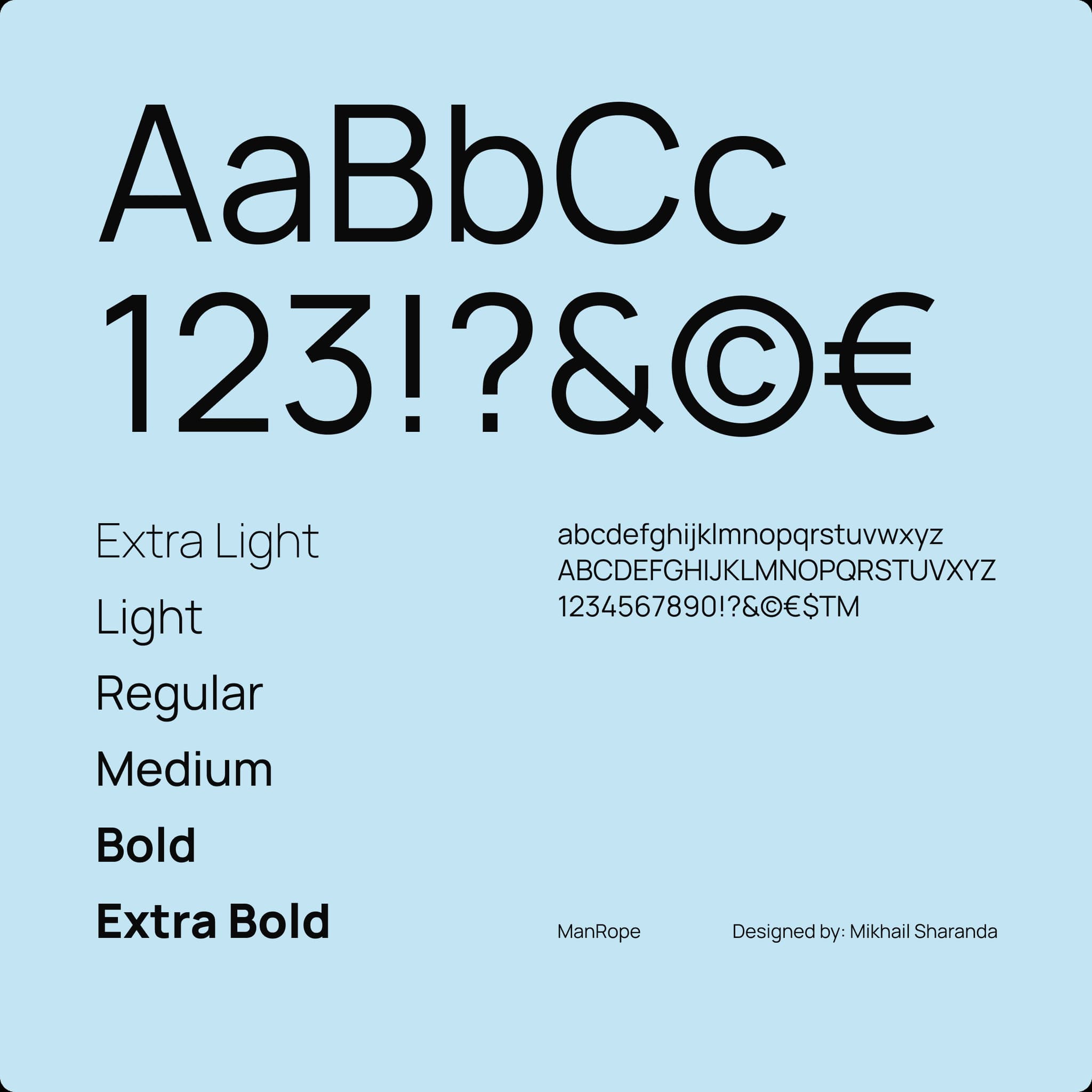
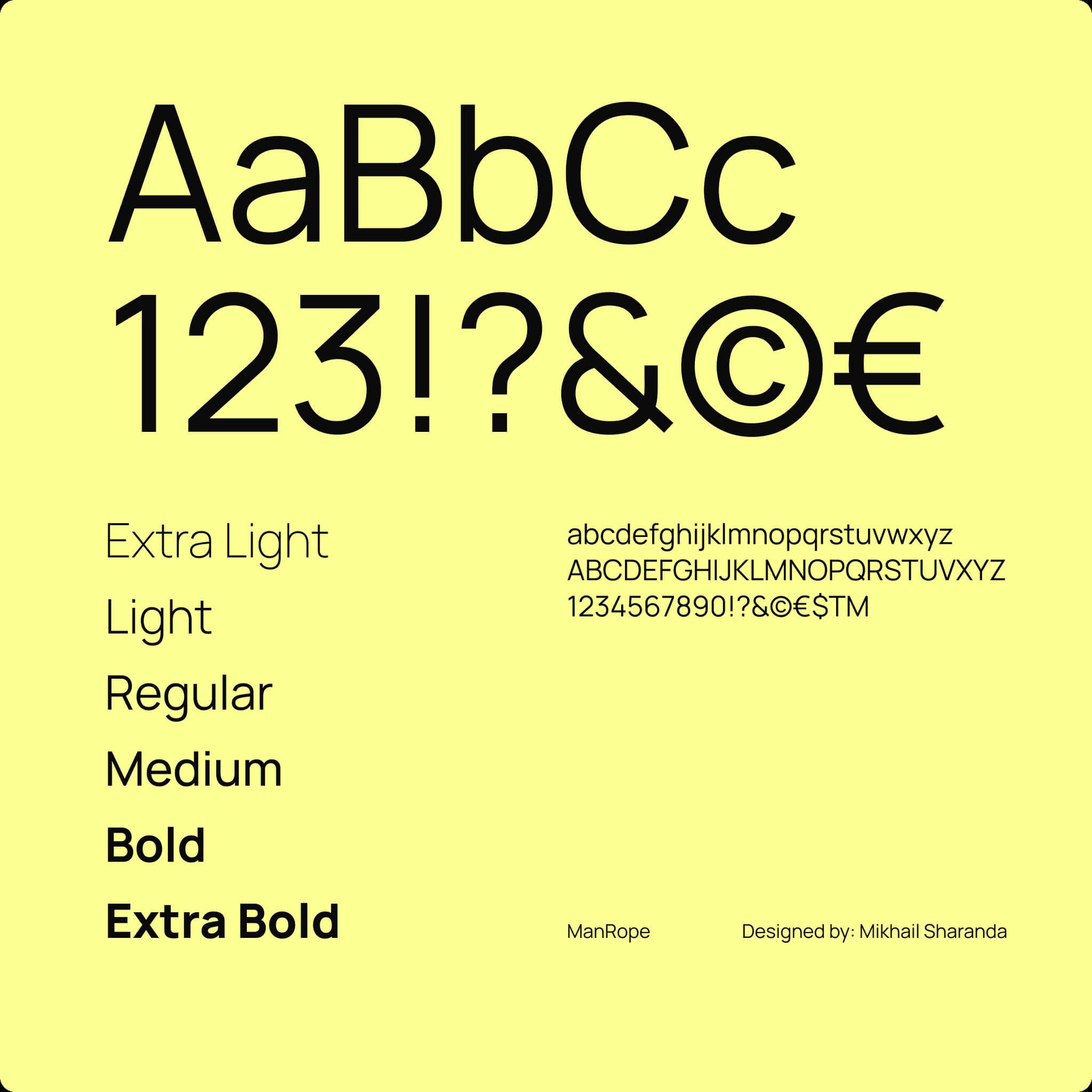
For all HM21 communications and branding materials, we use Manrope – a modern, clean, and accessible typeface.
We apply Manrope Semibold for headings and emphasis, and Manrope Regular for body copy and descriptions. Maintaining consistency in typography ensures our messaging feels clear, trustworthy, and professional.
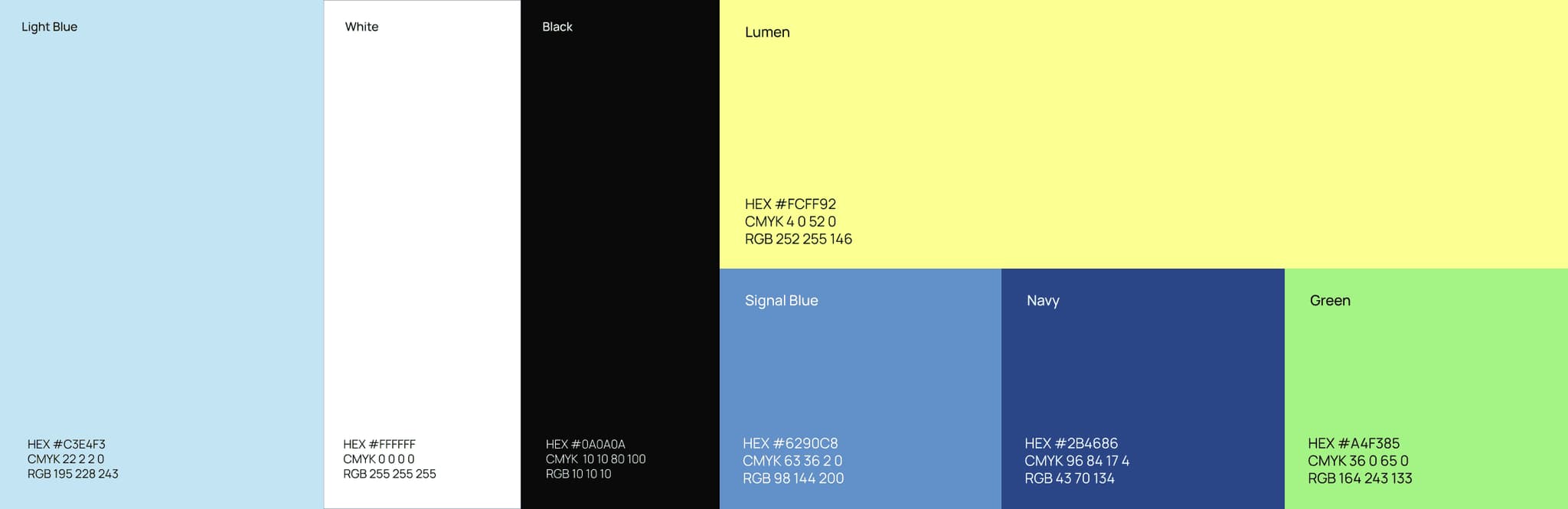
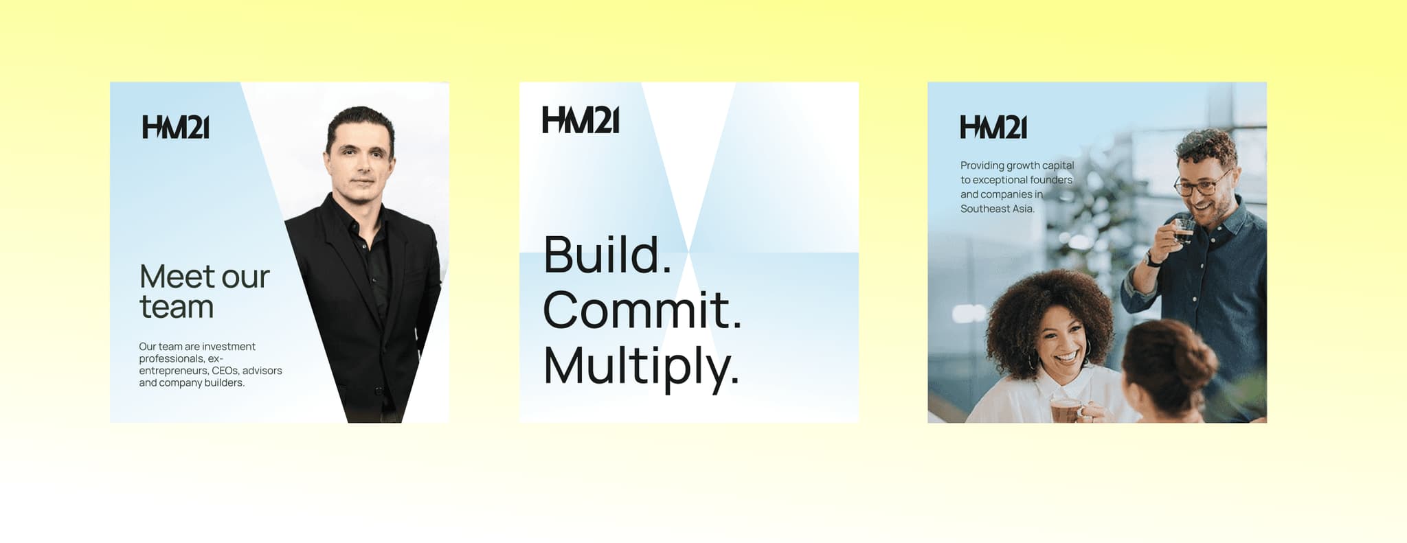
HM21’s primary colors - Light Blue, White, and Black - form the core of our visual identity. Light Blue reflects clarity, innovation, and trust. White provides openness and space, while Black adds strength and contrast. Together, they create a clean, modern, and balanced foundation for all brand communications.
VISUAL MOTIF
Symbolizing clarity and forward movement with a dynamic light motif.
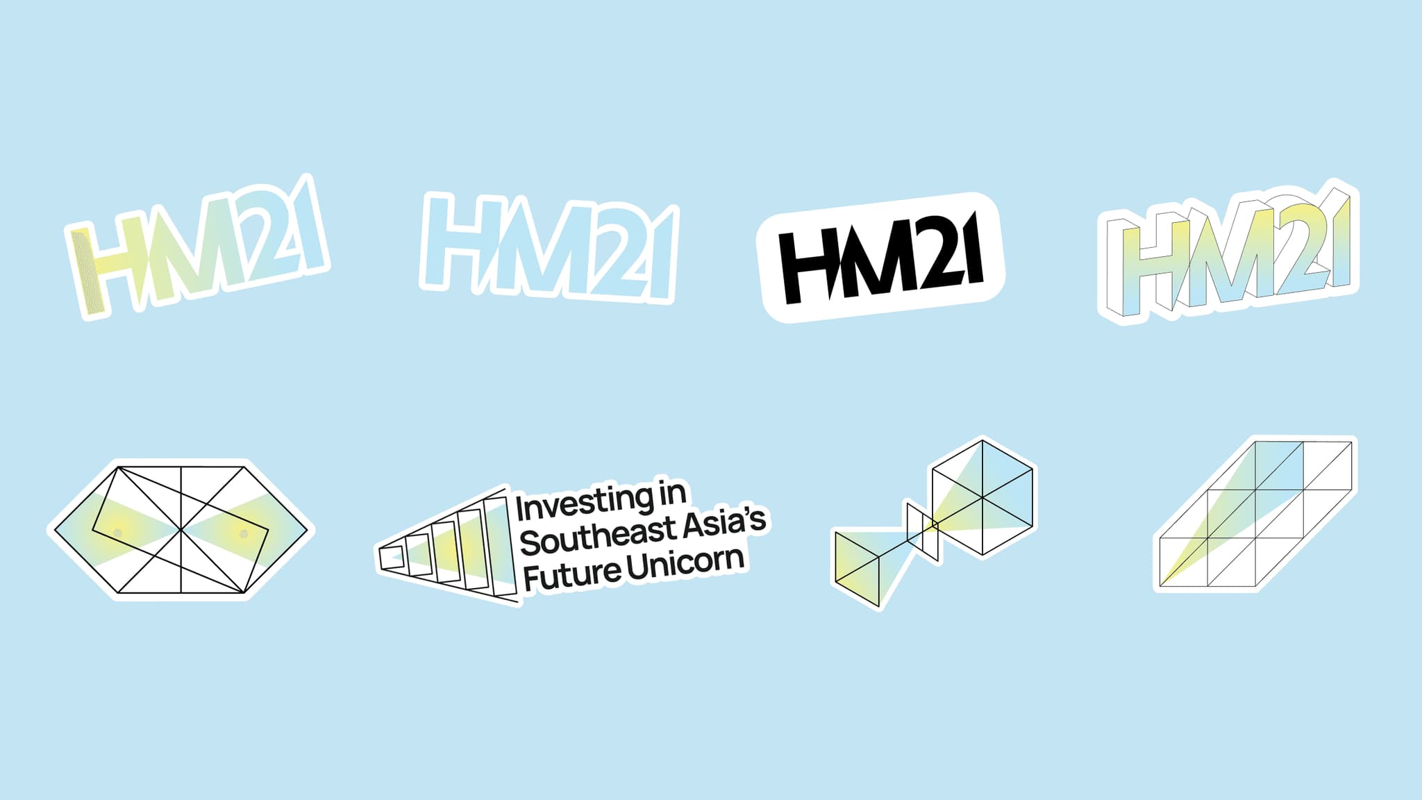
The Light Motif was created as a distinctive visual signature for HM21. When paired with our brand gradient and geometric imagery, it reinforces a consistent and recognizable identity.
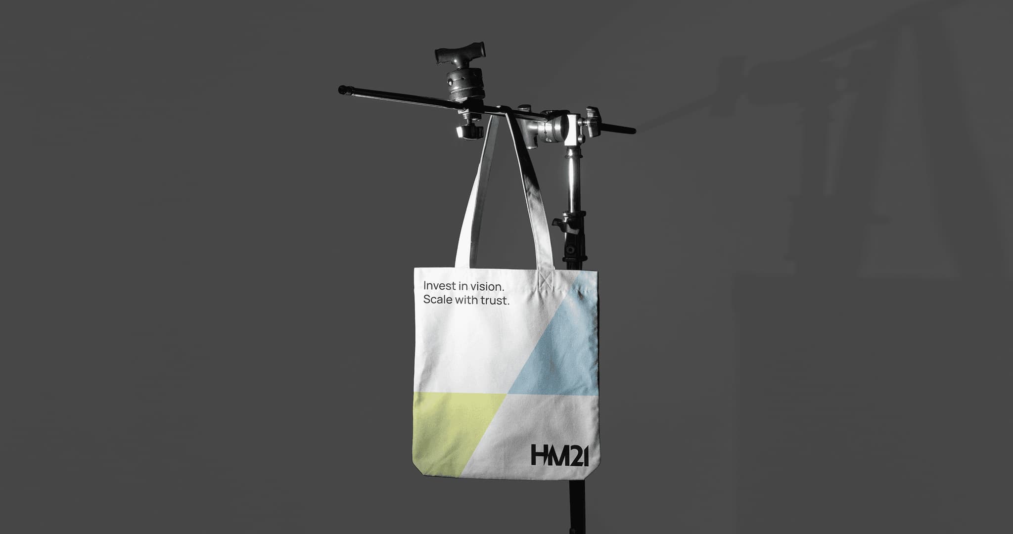
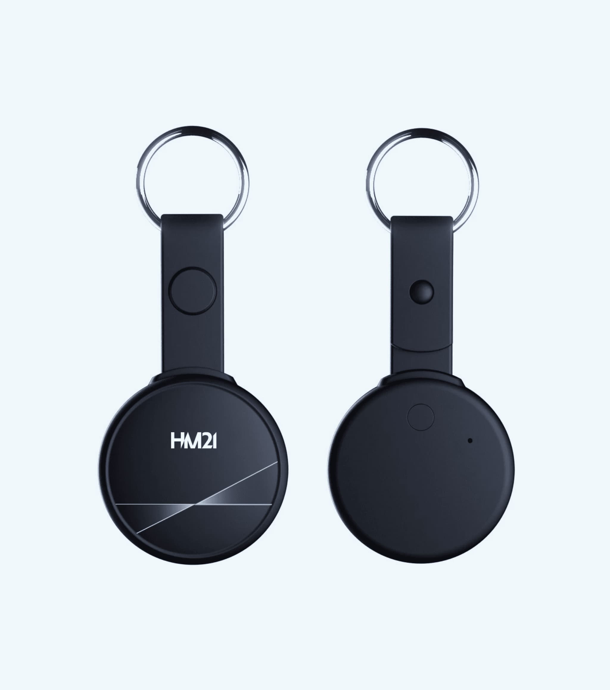
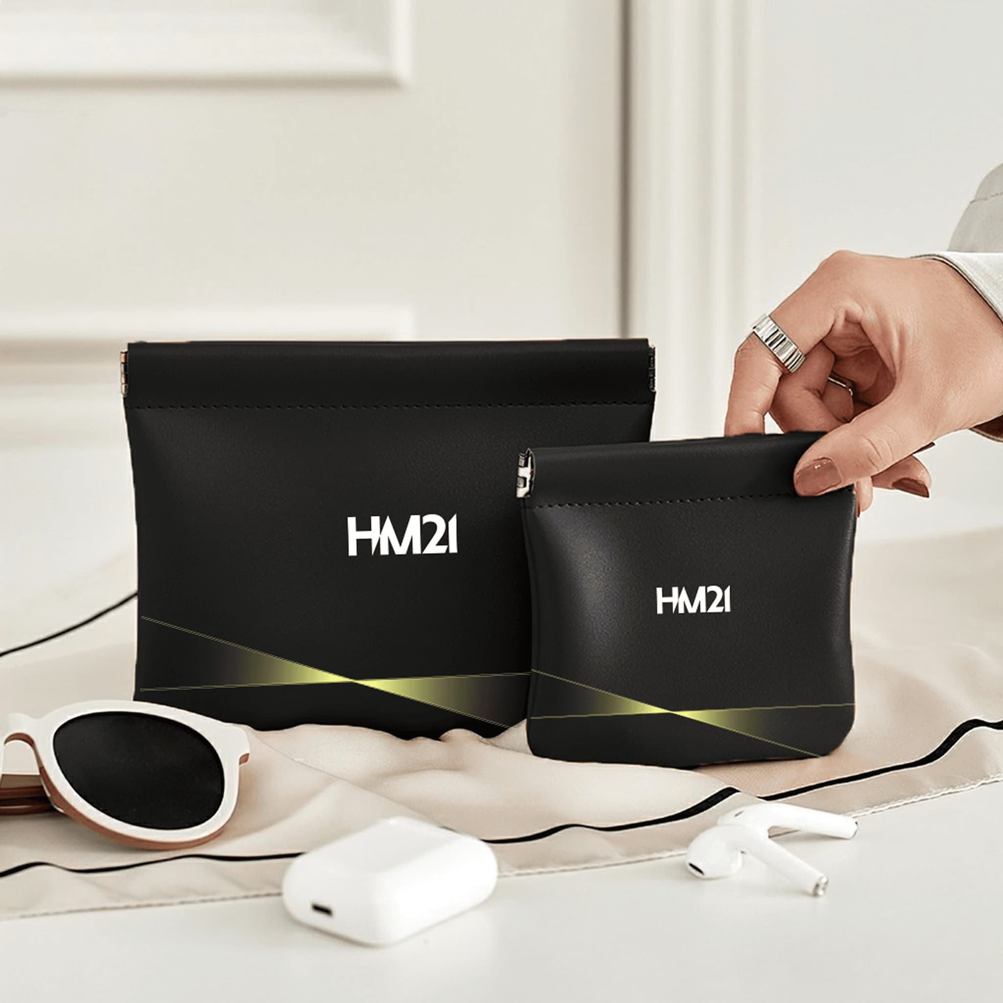
To build a unique visual language that reflects HM21’s directional and growth-focused philosophy, we extracted subtle geometric elements from within the HM21 logotype to develop a modular pattern system. This motif, inspired by beams of light and precise structures, can be used individually or layered into dynamic compositions - symbolizing clarity, focus, and forward movement.
ILLUSTRATIVE SYSTEM
Visualizing abstract brand concepts through geometry and dynamic light effects
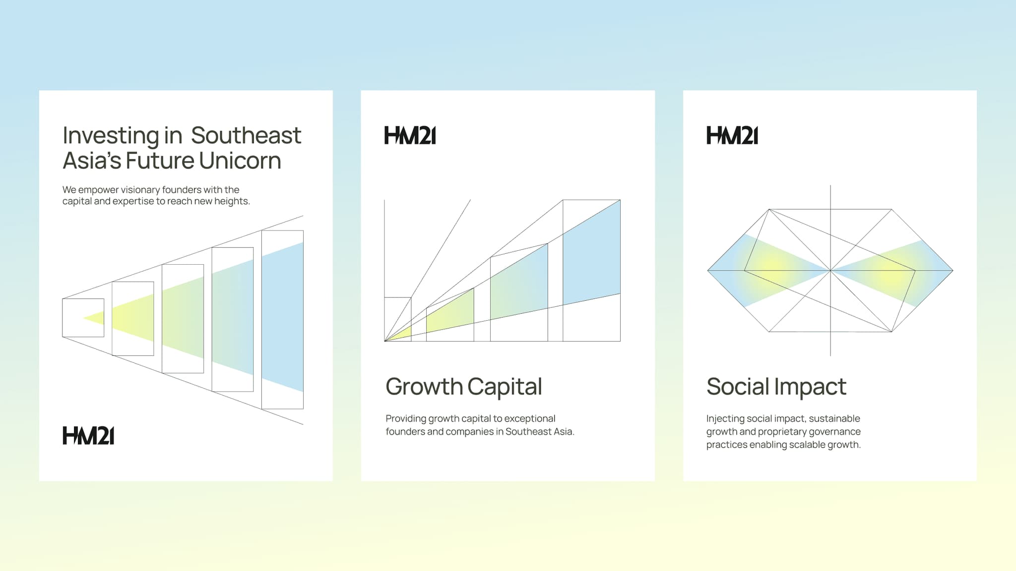
HM21’s illustrations use abstract geometry and light to express our brand concept.
HM21 applies simple geometric shapes combined with light effects to create a sense of motion, depth, and direction. This style helps visualize abstract ideas such as connection, growth, structure, ecosystem, and transformation.
The illustration palette primarily uses Light Blue to convey trust and technology, combined with Lumen Yellow to add energy and a signature “light” effect. When blended thoughtfully, they create the recognizable light motif unique to HM21.
WEBSITE DEVELOPMENT
Translating the abstract light motif into an immersive digital experience
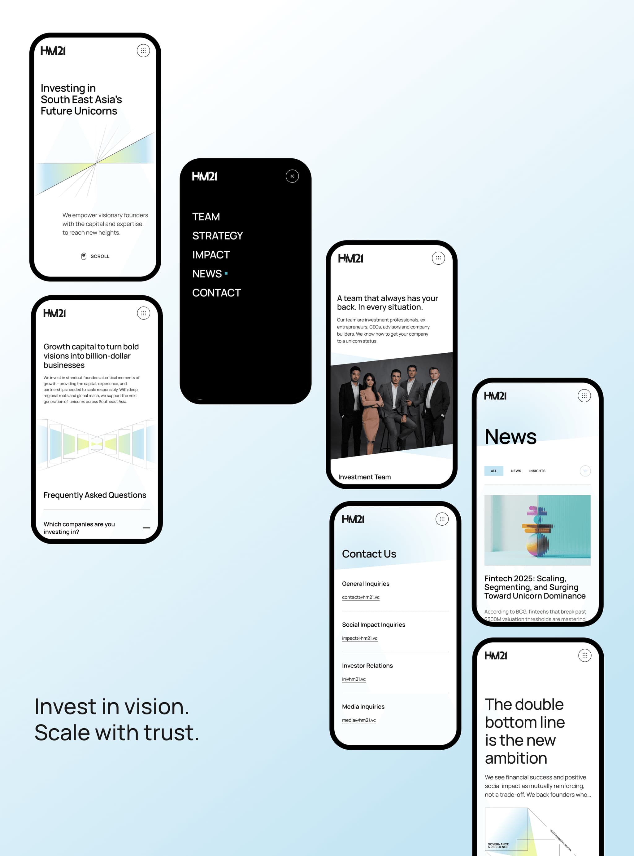
HM21 Venture’s website design represents a sophisticated translation of the "Light Motif" visual language into the digital realm. The interface prioritizes clean geometric structures to organize information, utilizing Lumen Yellow light effects to guide the eye and add depth to interactive touchpoints. Light Blue serves as the foundation, reinforcing a sense of trust and technological sophistication. Overall, the site not only optimizes user experience but also vividly visualizes the HM21 ecosystem’s philosophy of connection and growth.


PRODUCTION DIRECTOR
Minh Nguyen
CREATIVE DIRECTOR
An Bui
PARTNERSHIP
Daisy Nguyen
PRODUCER
Thai-Yves Bui
BRAND STRATEGIST
Minh Do
WEBFLOW DEVELOPER
Nghia Nguyen
VISUAL DESGINER
Simon Le
Bao Tran
PROJECT CURATOR
Duy Nguyen
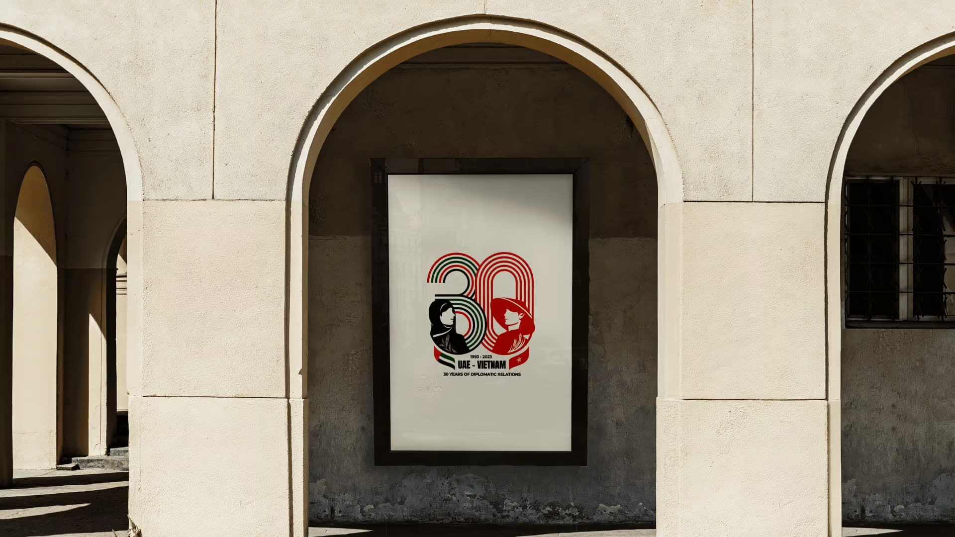
30Y Anniversary Vietnam - United Arab Emirates Logo
We designed the official mark for Vietnam and the United Arab Emirates 30-year diplomatic anniversary. The work gave the celebration in Abu Dhabi a shared visual language rooted in both cultures.
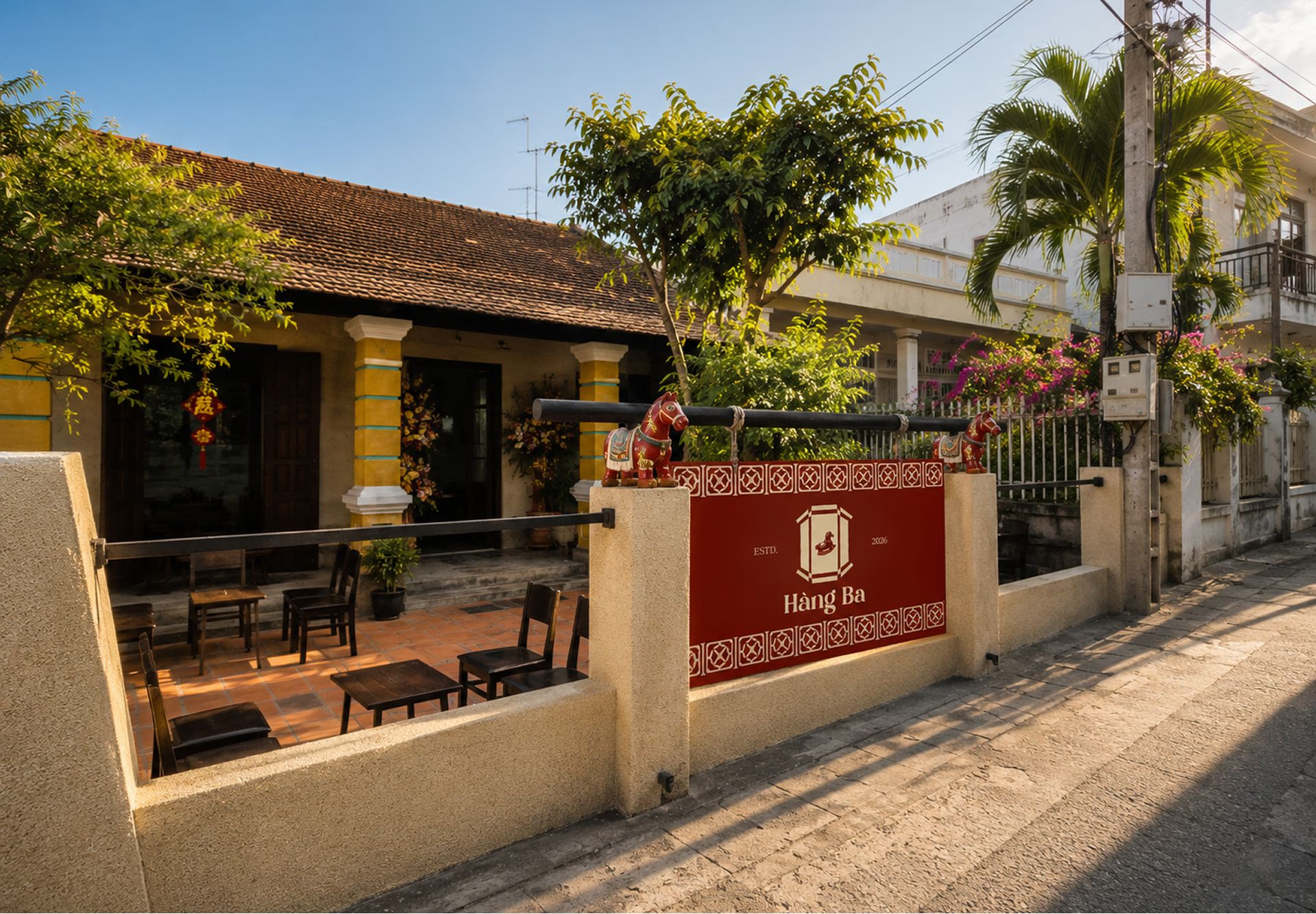
Hàng Ba Cafe
Hàng Ba is a cultural space that uses specialty coffee to tell stories about local materials, Southern architecture, and everyday memories.