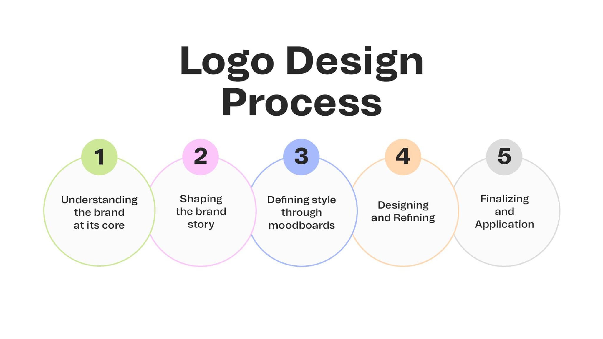
A logo is the end of a process, not the beginning
Summary
A useful logo is not a decoration or a shortcut to brand meaning. It is the visible result of strategic choices about recognition, difference, context, and future use. CDA explains how our logo design process moves from problem definition to a usable identity system.
A logo should make a strategic idea recognizable
A logo is a small part of a brand, but it can become a powerful cue for recognition when it is built on clear meaning. The work starts before the sketches, with the problem the organization needs the identity to help solve.
This article explains CDA’s process for exploring, testing, and delivering a mark that can work as part of a living system.
A logo is the end of a process, not the beginning
A logo is one of the smallest elements in a brand system, but it often carries the biggest expectations. People ask it to make the business distinctive, credible, modern, memorable, and ready for the future. No mark can do all of that alone.
A useful logo is the result of decisions made before the sketch. It gives visible form to a point of view, creates a recognizable cue, and works with the other parts of the identity to help people know what belongs together.
At CDA, we treat logo design as a process of reducing complexity without reducing meaning. The question is not how to draw something attractive. It is what the mark needs to make possible.
The first sketch is a decision about the problem
Before drawing, define what the logo must help people recognize and why that recognition matters. What is changing in the business? What should feel different? Which audience needs a stronger reason to trust or remember the organization?
A good logo brief includes the tension, the point of view, the context of use, and the limits the mark must respect. It leaves the solution open while making the problem precise.
Strategy comes before symbols
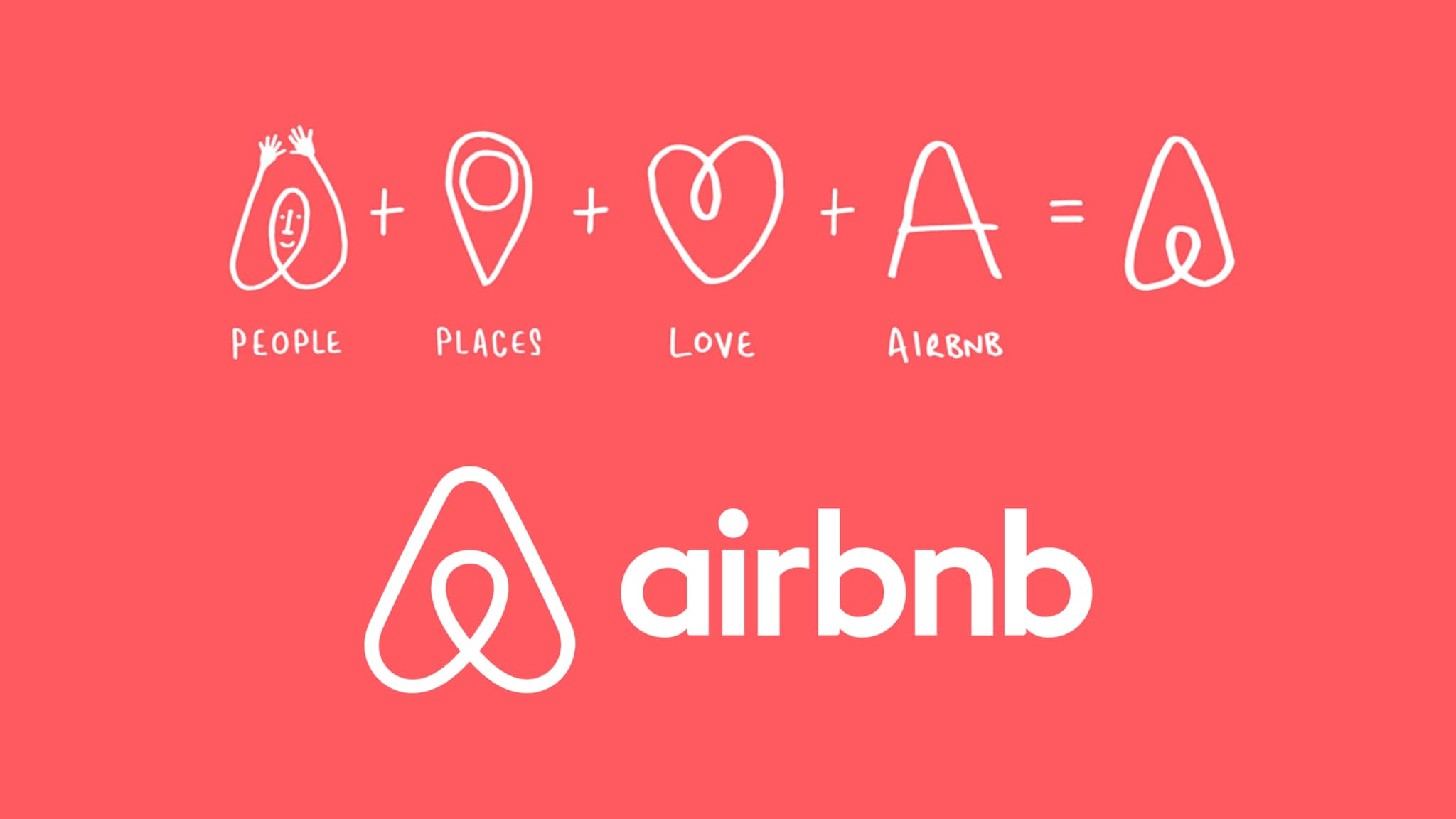
Symbols become generic when they are chosen before the organization has decided what it stands for. A category is full of familiar images and visual shortcuts. They may communicate the right subject while saying nothing distinctive about the brand.
Start with meaning. What does the organization make easier, possible, or different? What should people remember after the mark has disappeared? What should the identity feel like when it is used in a proposal, a product, or a conversation?
The mark does not need to illustrate the answer. It needs to belong to it.
Explore a territory, not a pile of icons
Early exploration should test different ways of expressing the idea. It may look at form, wordmark, symbol, typography, motion, or the relationship between elements. The purpose is not to produce a large number of logos. It is to learn which visual territories have enough meaning and potential to carry forward.
Compare directions against the brief. Which one has a point of view? Which one is only familiar? Which one can work across the places people will encounter it? Exploration becomes useful when every option teaches the team something about the problem.
Simplicity is earned through reduction
A simple mark is not an empty mark. It is a mark from which unnecessary decisions have been removed. That reduction takes judgment. What can disappear without losing the idea? What needs to remain for recognition? Which detail helps at a large scale but becomes noise at a small one?
Resist the pressure to explain the whole strategy inside the logo. A mark should create a memorable point of entry. The wider identity, language, and experience can carry the depth that the mark opens.
A logo has to work with the identity around it
A mark that looks strong in isolation can fail in use. Place it beside the type, color, imagery, layout, and language it will live with. Test the relationship between the mark and the message, not only the quality of the mark itself.
Look at real situations: a small digital header, a social avatar, a presentation cover, a document, a sign, and a moment where the logo has to share attention with information. The mark should be recognizable without making the experience harder to understand.
Choose the direction with criteria, not volume
Logo reviews can become a contest of preference. Reduce that risk by agreeing on criteria before the options arrive.
- Meaning: does the mark express the chosen point of view?
- Difference: can people recognize it without confusing it with the category?
- Use: does it remain clear across the situations that matter?
- Relationship: does it work with the wider identity system?
- Future: can it evolve without losing the idea that makes it valuable?
Criteria do not remove taste. They make taste accountable to the problem.
The deliverable is a usable system, not a file
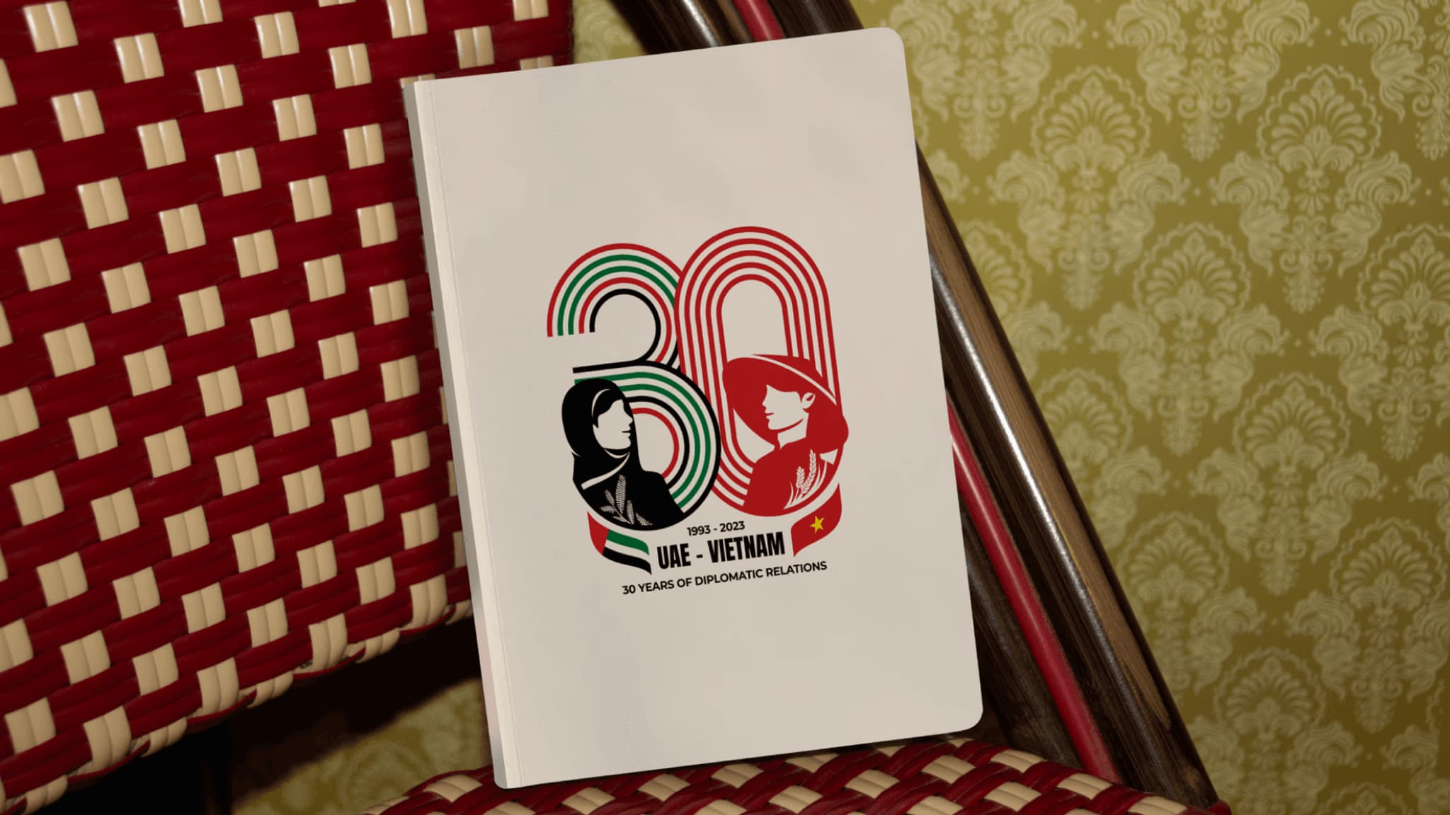
A logo package should help people use the mark well. It should explain the relationships that matter, show how the system behaves in different contexts, and make the important decisions clear enough for teams to carry forward.
That may include variations, scale guidance, clear space, color relationships, motion behavior, accessibility considerations, and examples of what not to do. The exact contents should follow the brand’s real needs. More rules are not automatically more useful.
Recognition grows through repeated use
A logo does not become memorable because a team declares it iconic. It becomes recognizable through consistent, meaningful use over time. Let the mark appear where the relationship needs orientation, not everywhere simply to prove that it exists.
As the organization changes, review the system against new contexts. Protect the parts that create recognition. Adjust the parts that make the mark difficult to use. A good identity can grow without turning every new application into a redesign.
A logo gives the organization a shared beginning
The final mark belongs to the people who use it. It should give them a recognizable starting point, a clear relationship to the wider identity, and enough confidence to make responsible adaptations.
Design the mark with the future applications in mind. When the strategy is clear, the expression is considered, and the system is usable, a small symbol can carry more than its size suggests.
