


Foods Of Europe
A rebrand rooted in 37 years of relationships, precision, and British quality - now visible to the world
Overview
Building a global export brand rooted in British character
Foods of Europe has spent nearly four decades building one of Britain's most trusted food export businesses - a global operation rooted in precision, partnership, and an uncompromising commitment to British quality. As they stepped into their next chapter, we partnered with them to build a brand identity that could carry that story to the world - one that speaks the language of international trade while never losing sight of where it comes from.
Challenge & goal
When a brand needs to catch up with its own ambition
Foods of Europe carries a lot within one business - globally operating but proudly British, family-led but enterprise-trusted, warm but operationally rigorous - and the challenge was holding all of that together without losing any of it. In a market where trust is decided before the first conversation, their brand needed to signal the same credibility their partners already knew from experience.
Our goal was a brand identity coherent enough to carry every dimension of who they are.
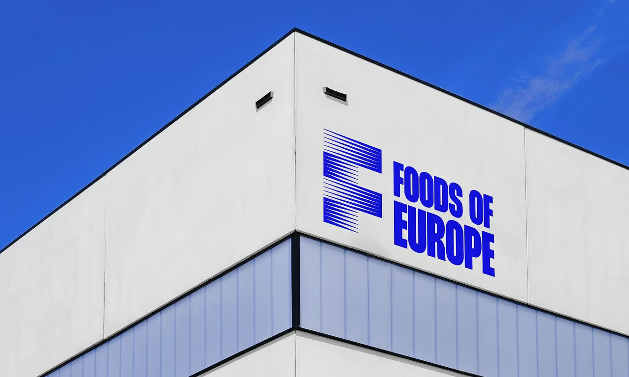
Logo
A single letter that carries the weight of global movement
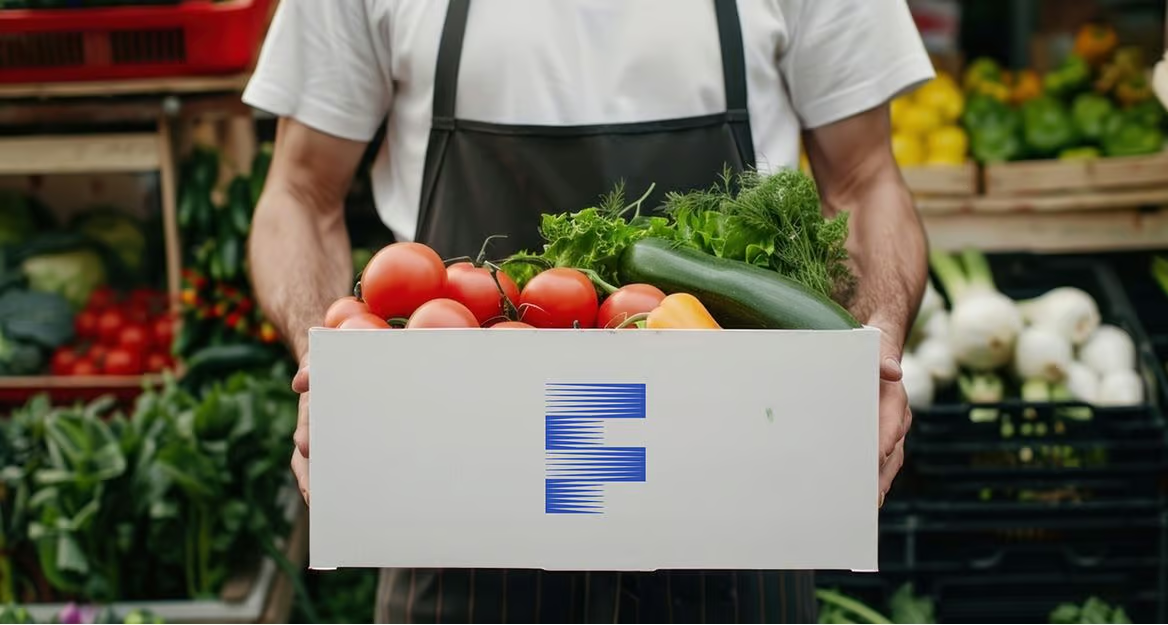
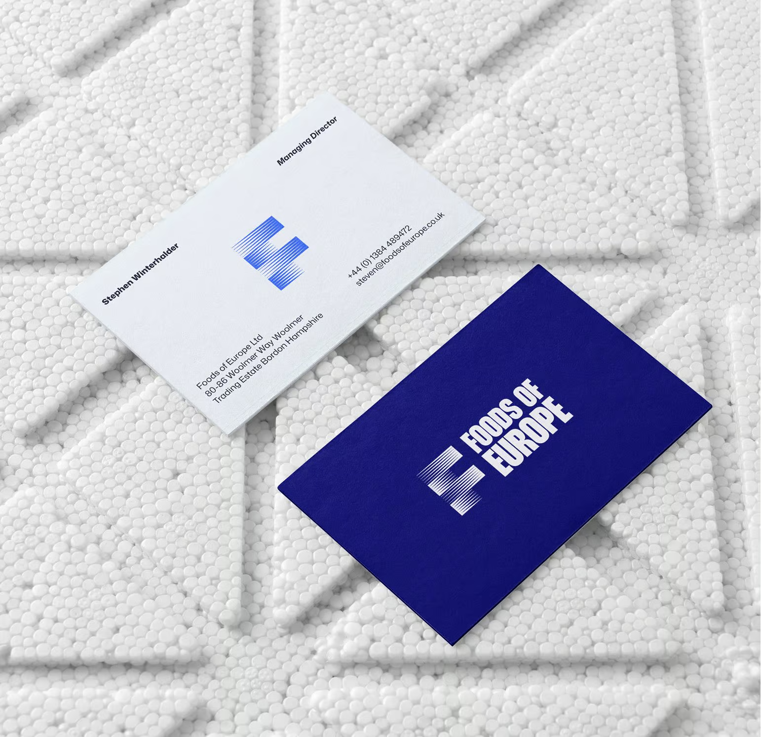
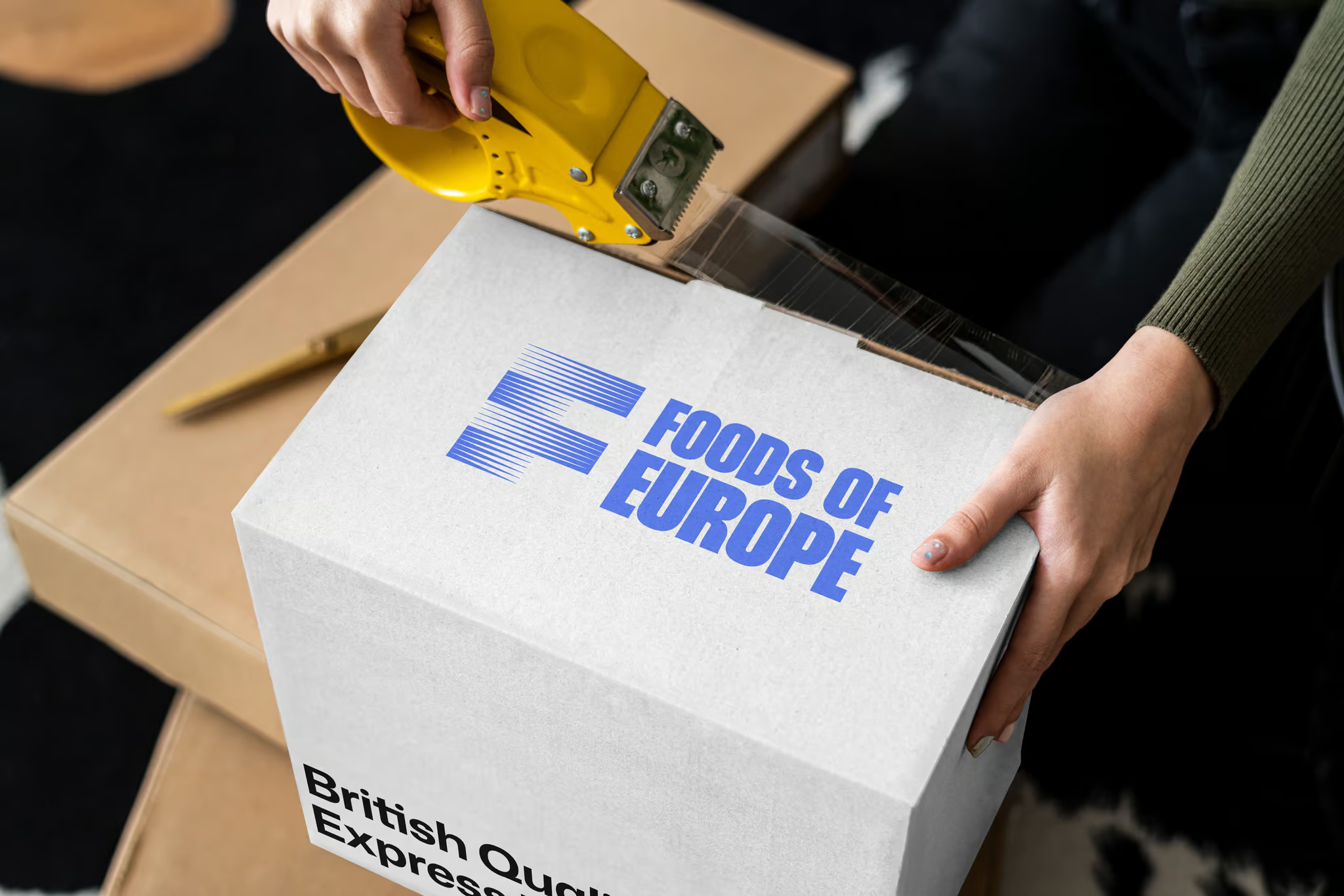
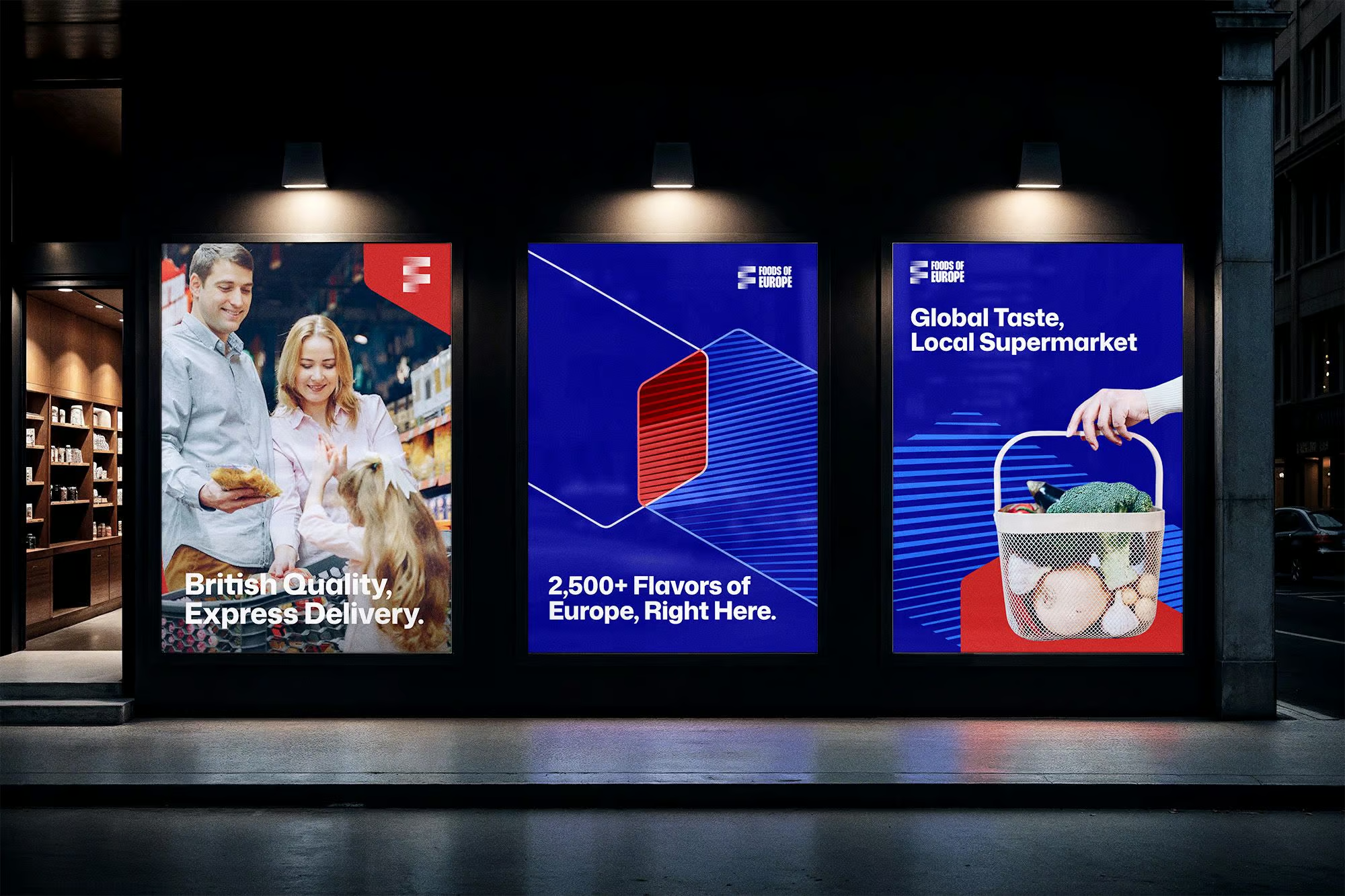
For a business built on the precision of getting things from one place to another, the identity had to reflect that same sense of purposeful motion. The "F" mark - constructed from horizontal forms shifting in opposing directions - captures the constant flow of goods, routes, and relationships that define how Foods of Europe operates every single day.
Structured enough to command trust, dynamic enough to signal momentum, it's a mark that works as hard as the business behind it.
Typography
Giving the brand a consistent voice across every touchpoint
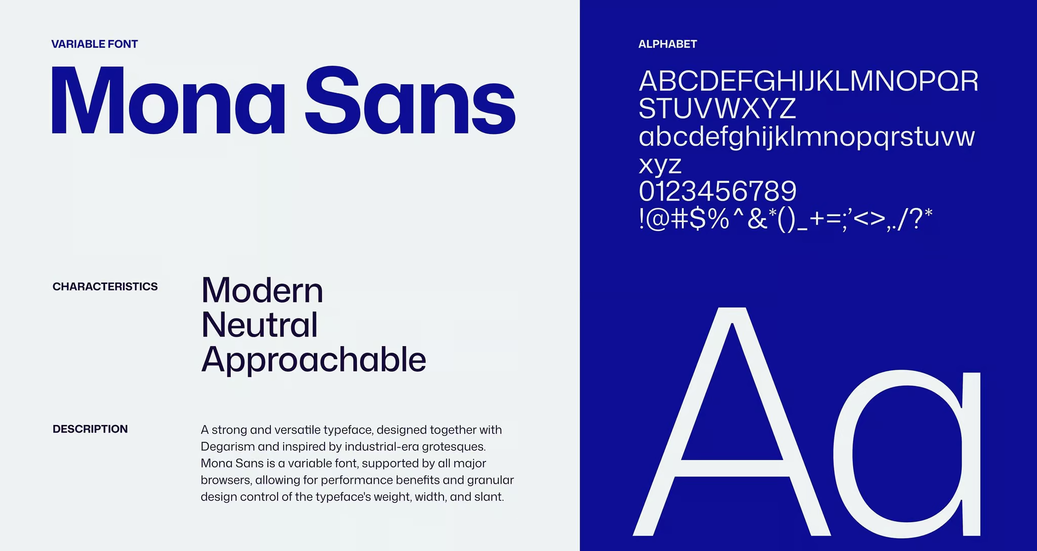
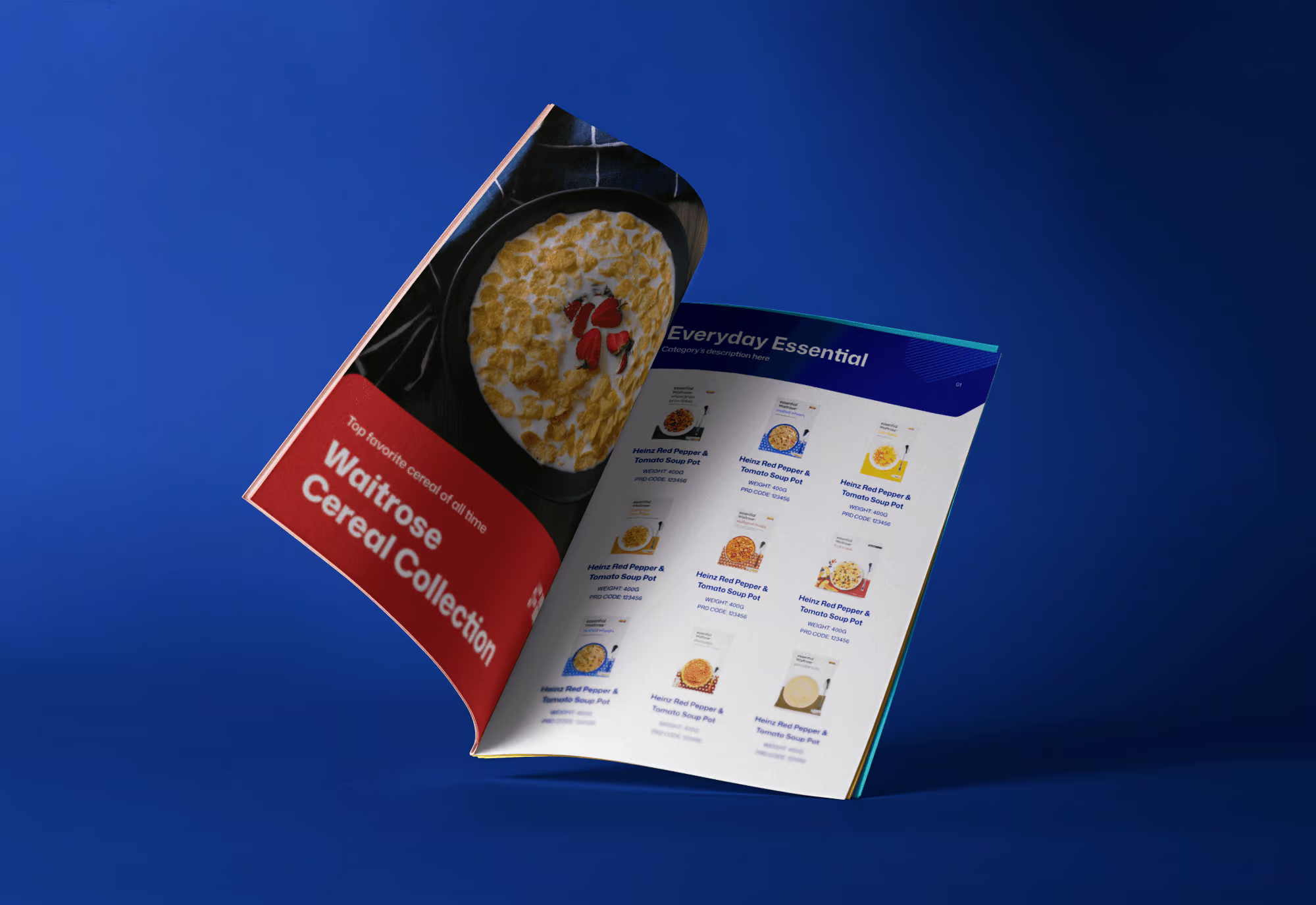
Mona Sans is a variable grotesque - modern and structured, but with enough openness to feel human rather than cold. In a brand built on both operational precision and long-term relationships, it carries both sides of that character naturally across every touchpoint.
Color System
The color system that connects two worlds in one palette
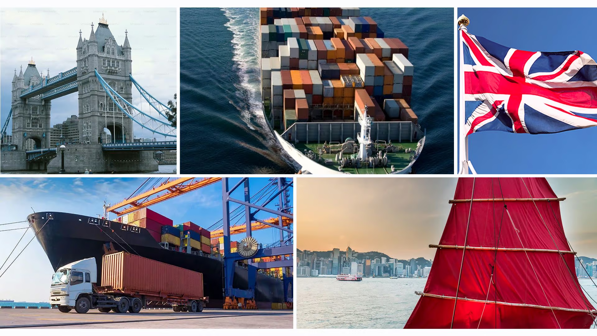
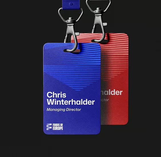
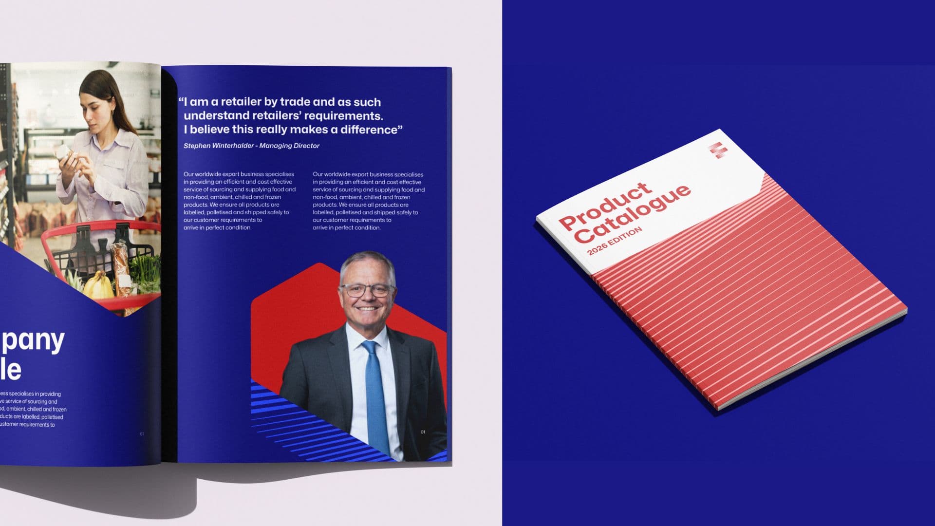
The blues speak to open water and the confidence of global trade. The red is a quiet nod to both British heritage and the red-sailed junks of Hong Kong harbour the place that shaped the business before it became what it is today.

Visual motif
A visual language borrowed from the world the brand lives in
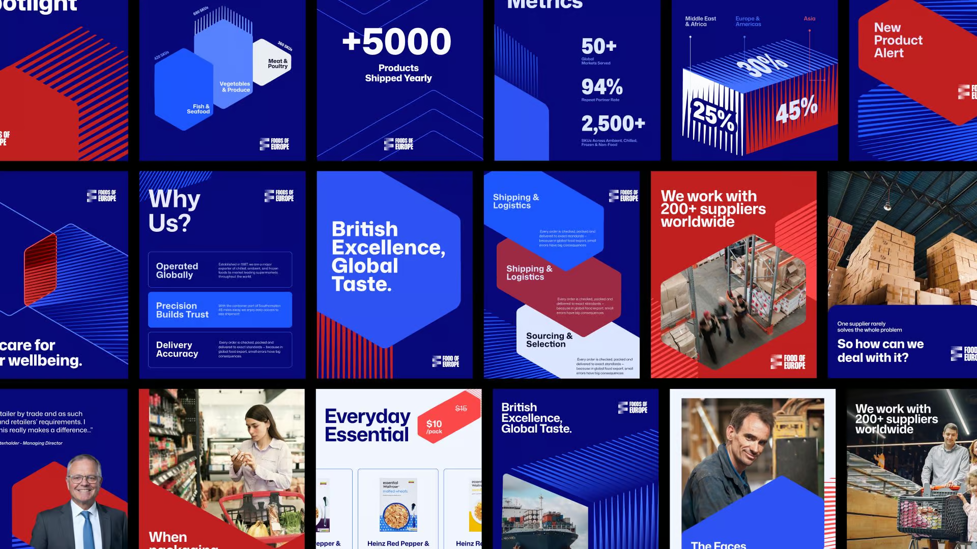
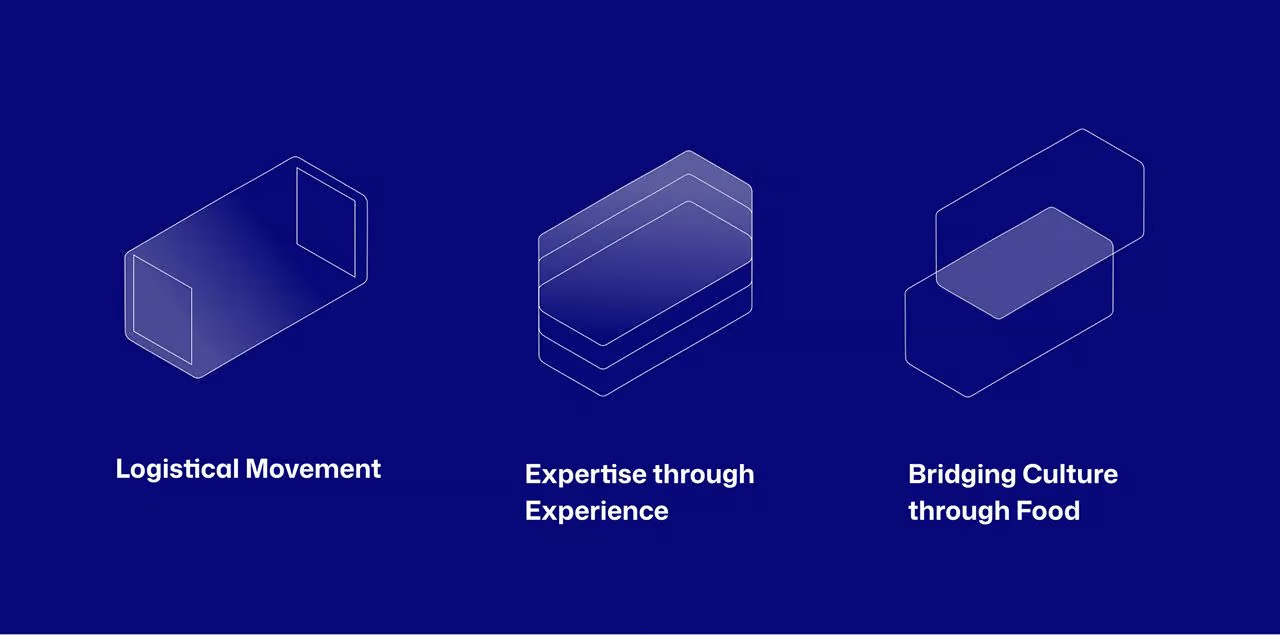
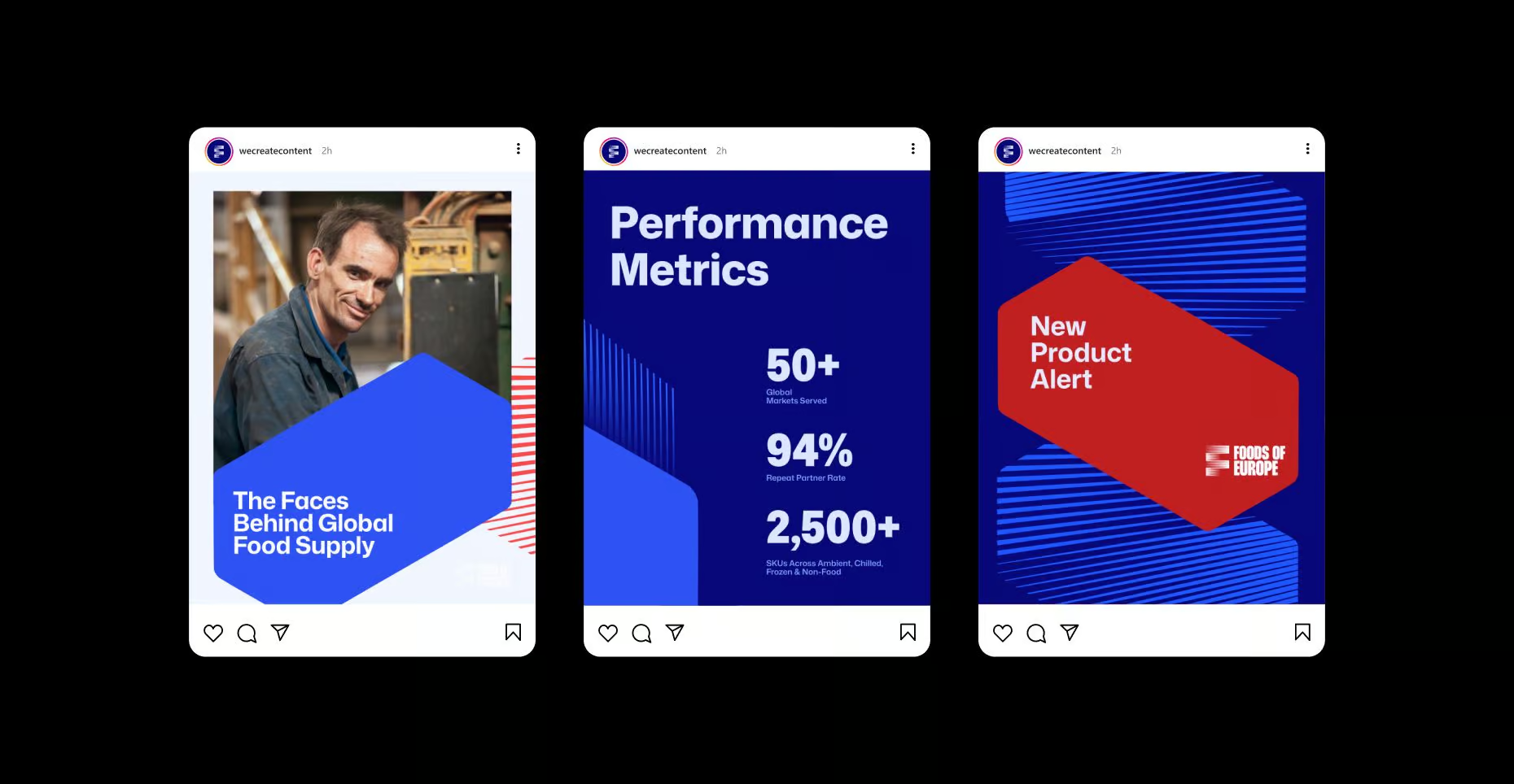
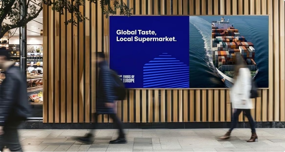
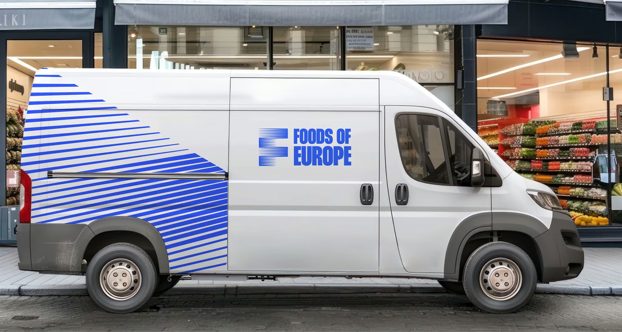
Every line in this system reflects the movement of goods, routes, and relationships that define the business. Horizontal forms drawn from shipping containers and maritime heritage become a flexible graphic system that scales across every touchpoint, quietly reinforcing what Foods of Europe stands for: precision, momentum, and the confidence of a brand that knows exactly where it's going.

BRAND IDENTITY
Collective Design Agency
PRODUCTION DIRECTOR
Minh Nguyen
CREATIVE DIRECTOR
An Bui
PRODUCER
Thai-Yves Bui
BRAND STRATEGIST
Minh Do
BRAND DESIGNER
August Truong, Nam-Bao Tran
SPECIAL THANKS TO
Dzung Nguyen
Daisy Nguyen
PROJECT CURATOR
Nam Bao Tran
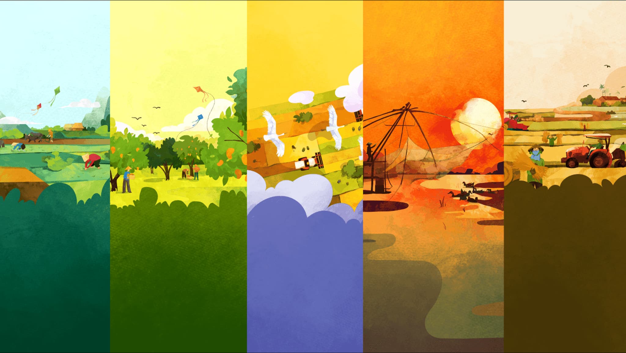
CIAT Agro-climatic Bulletins & Communications
Empowering Mekong Delta farmers with agro-climatic bulletins (ACBs) for localized crop guidance.